Comparing COVID19 data by countries is complicated for many reasons. No metric is perfect. Too many variables involved.
If we still want a graph with the evolution in different countries, normalize by population could be to worth to explore. Lets look at Belgium.
(EN version)
If we still want a graph with the evolution in different countries, normalize by population could be to worth to explore. Lets look at Belgium.
(EN version)
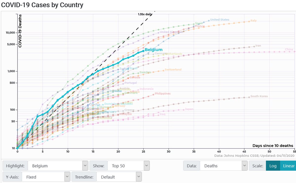
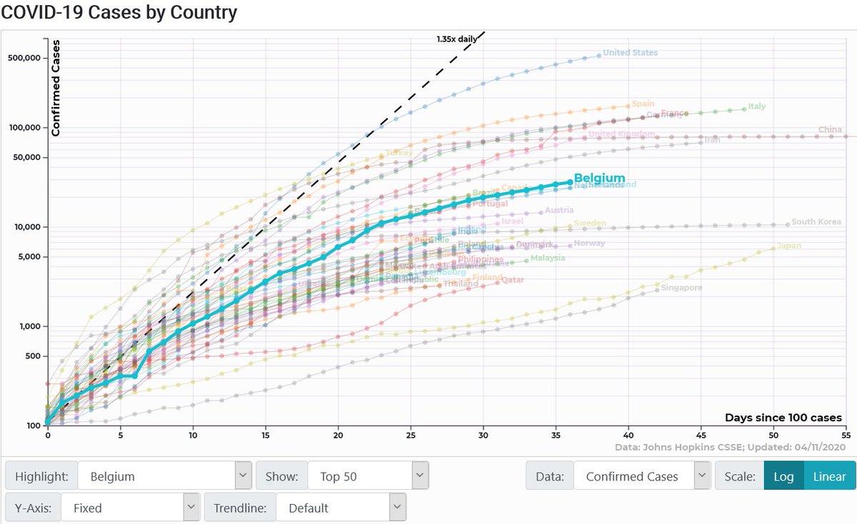
If we look at the logarithmic graphs of total cases and deaths, it could seem that Belgium is doing fairly well. It is in the average of the European countries.
Source: https://91-divoc.com/pages/covid-visualization/">https://91-divoc.com/pages/cov...
Source: https://91-divoc.com/pages/covid-visualization/">https://91-divoc.com/pages/cov...
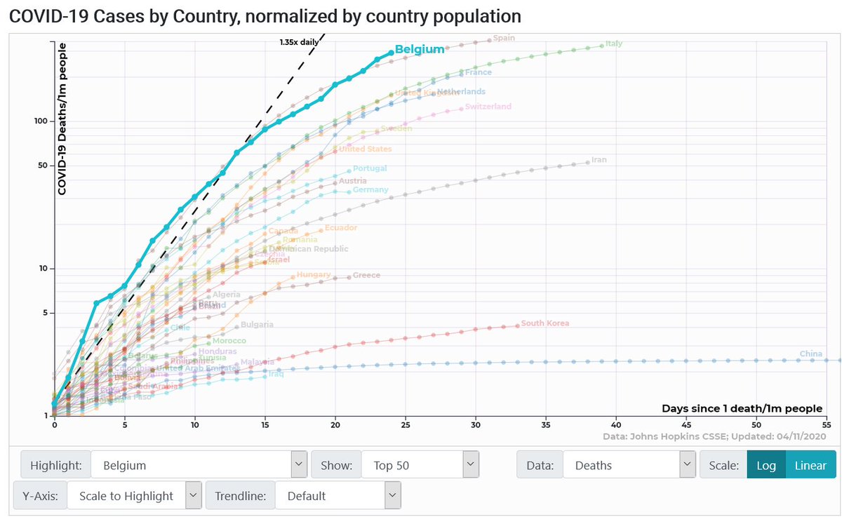
But, oh! Belgium has 11M inhabitants (4 times less than Spain, 6 less than Italy).
These are the normalized graphs by population:
Source: https://91-divoc.com/pages/covid-visualization/">https://91-divoc.com/pages/cov...
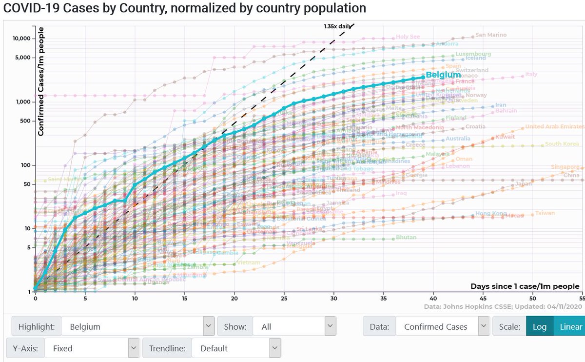
These are the normalized graphs by population:
Source: https://91-divoc.com/pages/covid-visualization/">https://91-divoc.com/pages/cov...
290 deaths/ 1M inhabitants. Third country, only behind SP and IT. And on the way to take the lead.
2431 confirmed / 1M inhabitants. Ahead of FR, catching up to IT (although, this comparison is less reliable due to the differences in the number of tests done by each country)
2431 confirmed / 1M inhabitants. Ahead of FR, catching up to IT (although, this comparison is less reliable due to the differences in the number of tests done by each country)
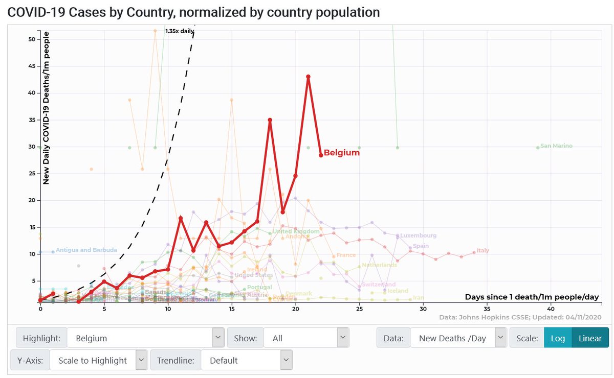
But, moreover, the new daily deaths are growing. Today 327 and yesterday almost 500, but yet increasing trend.
Graph: new daily cases / 1M inhabitants.
Source: https://91-divoc.com/pages/covid-visualization/">https://91-divoc.com/pages/cov...
Graph: new daily cases / 1M inhabitants.
Source: https://91-divoc.com/pages/covid-visualization/">https://91-divoc.com/pages/cov...
So, my dear Belgian friends (birth or foster):
We all really want to go out. It& #39;s sunny, beautiful weather, flowers are everywhere. But please, PLEASE, #RestezChezVous https://abs.twimg.com/hashflags... draggable="false" alt="">
#blijfthuis https://abs.twimg.com/hashflags... draggable="false" alt="">
#StayHome https://abs.twimg.com/hashflags... draggable="false" alt="">
We all really want to go out. It& #39;s sunny, beautiful weather, flowers are everywhere. But please, PLEASE, #RestezChezVous
#blijfthuis
#StayHome

 Read on Twitter