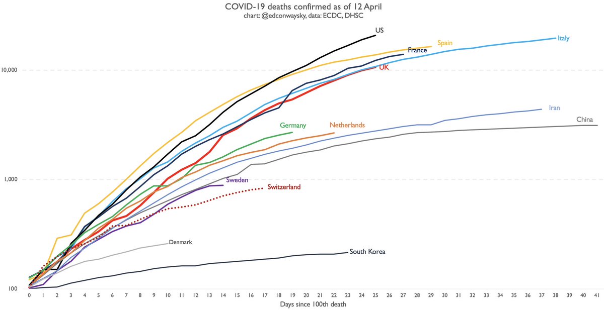
Confirmation via @DHSCgovuk: UK #COVID19 death toll has surpassed 10k, hitting 10,612.
Updated chart of UK trajectory https://abs.twimg.com/emoji/v2/... draggable="false" alt="👇" title="Down pointing backhand index" aria-label="Emoji: Down pointing backhand index">
- UK still hugging Italian line. May overtake it in coming days, indicating comparatively more severe outbreak
- NB weekend figs sometimes an understatement
Updated chart of UK trajectory
- UK still hugging Italian line. May overtake it in coming days, indicating comparatively more severe outbreak
- NB weekend figs sometimes an understatement
The UK #COVID19 figs are dismaying.
These are not datapoints but families losing loved ones.
Lesson from other countries: UK trajectory need not have looked like this.
Small piece of good news: a week ago deaths were doubling every three days. Now they& #39;re doubling every six days.
These are not datapoints but families losing loved ones.
Lesson from other countries: UK trajectory need not have looked like this.
Small piece of good news: a week ago deaths were doubling every three days. Now they& #39;re doubling every six days.
Wondering why my #COVID19 charts have that odd logarithmic axis? Why they include China? Why they don& #39;t have a population adjusted chart or indeed what that would look like? Answers to those questions and more here: https://www.edmundconway.com/2020/04/covid-19-data-qa/">https://www.edmundconway.com/2020/04/c...

 Read on Twitter
 - UK still hugging Italian line. May overtake it in coming days, indicating comparatively more severe outbreak- NB weekend figs sometimes an understatement" title="Confirmation via @DHSCgovuk: UK #COVID19 death toll has surpassed 10k, hitting 10,612.Updated chart of UK trajectory https://abs.twimg.com/emoji/v2/... draggable="false" alt="👇" title="Down pointing backhand index" aria-label="Emoji: Down pointing backhand index">- UK still hugging Italian line. May overtake it in coming days, indicating comparatively more severe outbreak- NB weekend figs sometimes an understatement" class="img-responsive" style="max-width:100%;"/>


