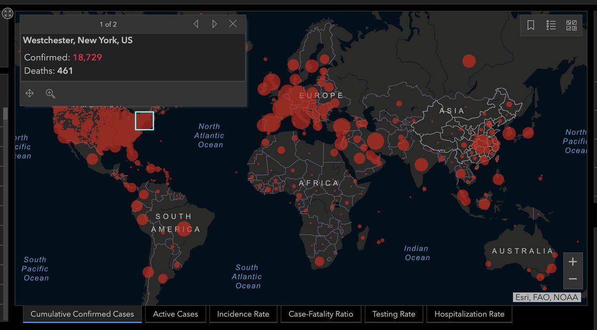
You aren& #39;t wrong. The challenge with circle maps is often overlap. There are more challenges with the Johns Hopkins dashboard and other similar graphics, though 1/x https://twitter.com/page88/status/1249095556024147969">https://twitter.com/page88/st...
This map shows data at various levels of aggregation: sometimes there& #39;s one circle per country, sometimes (the U.S) one per county. Besides, circles aren& #39;t sized proportionally so. Westchester& #39;s bubble (16K) seems to be similar to Spain& #39;s (166K) http://www.thefunctionalart.com/2020/04/interviews-in-cnn-and-cbc.html">https://www.thefunctionalart.com/2020/04/i... 2/x
3/x Regarding this question, cartographic orthodoxy (cc @kennethfield) suggests that this type of map (choropleth) should be used just with rates/percentages, not total counts https://twitter.com/page88/status/1249095192868724738">https://twitter.com/page88/st...
4/x One reason among others is varying area size: big and sparsely populated states may look more prominent than small states with high density. However, I have my doubts about whether this orthodoxy always apply, so I& #39;m not opposed to choropleth maps for counts in specific cases
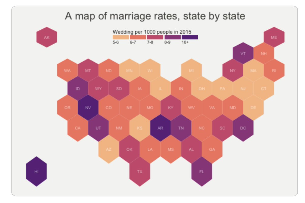
5/5 That said, there are many alternatives to explore: hexbin maps, cartograms, etc. There are even maps that get rid of area size, like the one below (it& #39;d be hard to do something like this with a world map, though!)
It& #39;s also possible to greatly reduce overlap in bubble maps.
It& #39;s also possible to greatly reduce overlap in bubble maps.
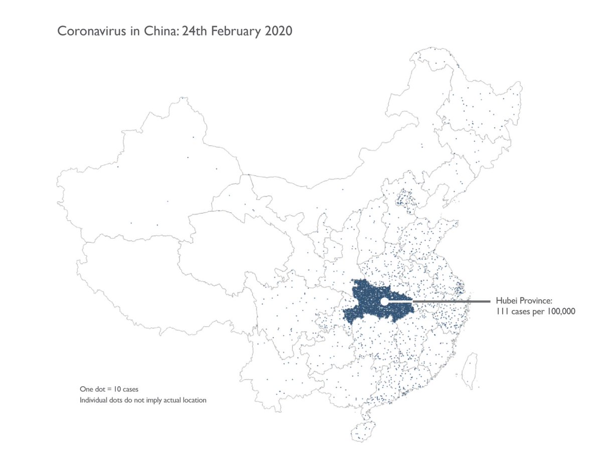
One more tweet added to the thread, @page88: This article by @kennethfield is a very good summary: https://www.esri.com/arcgis-blog/products/product/mapping/mapping-coronavirus-responsibly/">https://www.esri.com/arcgis-bl... Dot density plots are yet another alternative worth exploring to show counts

 Read on Twitter


