1. Last night I started working on a #Covid19 dashboard for New Zealand that scrapes data from https://www.health.govt.nz/our-work/diseases-and-conditions/covid-19-novel-coronavirus/covid-19-current-situation/covid-19-current-cases
Today">https://www.health.govt.nz/our-work/... I& #39;m trying to work out how I can best serve up the data experience I want given the strengths, constraints of the tool. I& #39;ll live tweet thoughts as I go.
Today">https://www.health.govt.nz/our-work/... I& #39;m trying to work out how I can best serve up the data experience I want given the strengths, constraints of the tool. I& #39;ll live tweet thoughts as I go.
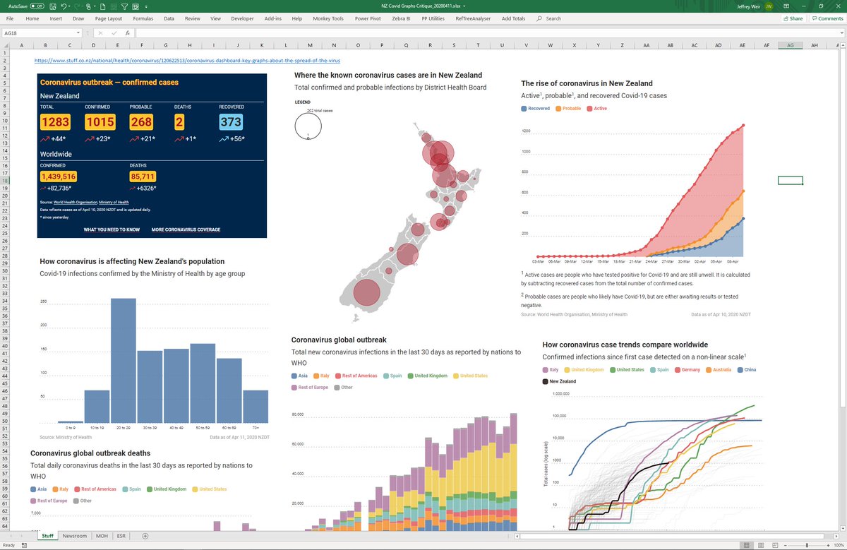
2. First up, I did a critique of existing charts and dashboards covering the NZ situation. I cut them into an Excel doc, with one tab for each provider. Here& #39;s a collection of vis from the page at https://www.stuff.co.nz/national/health/coronavirus/120622513/coronavirus-dashboard-key-graphs-about-the-spread-of-the-virus">https://www.stuff.co.nz/national/...
3. Then I did a review. I tweeted some of this. Lots of viz that was intermediate at best. Opportunity lost.
Newsroom: https://twitter.com/InsightsMachine/status/1248723812947877889
Ministry">https://twitter.com/InsightsM... of Health: https://twitter.com/InsightsMachine/status/1248843664656175104
ESR:">https://twitter.com/InsightsM... https://twitter.com/InsightsMachine/status/1248836163286134784
Stuff">https://twitter.com/InsightsM... (yet to do more critique): https://twitter.com/InsightsMachine/status/1248718645292748800">https://twitter.com/InsightsM...
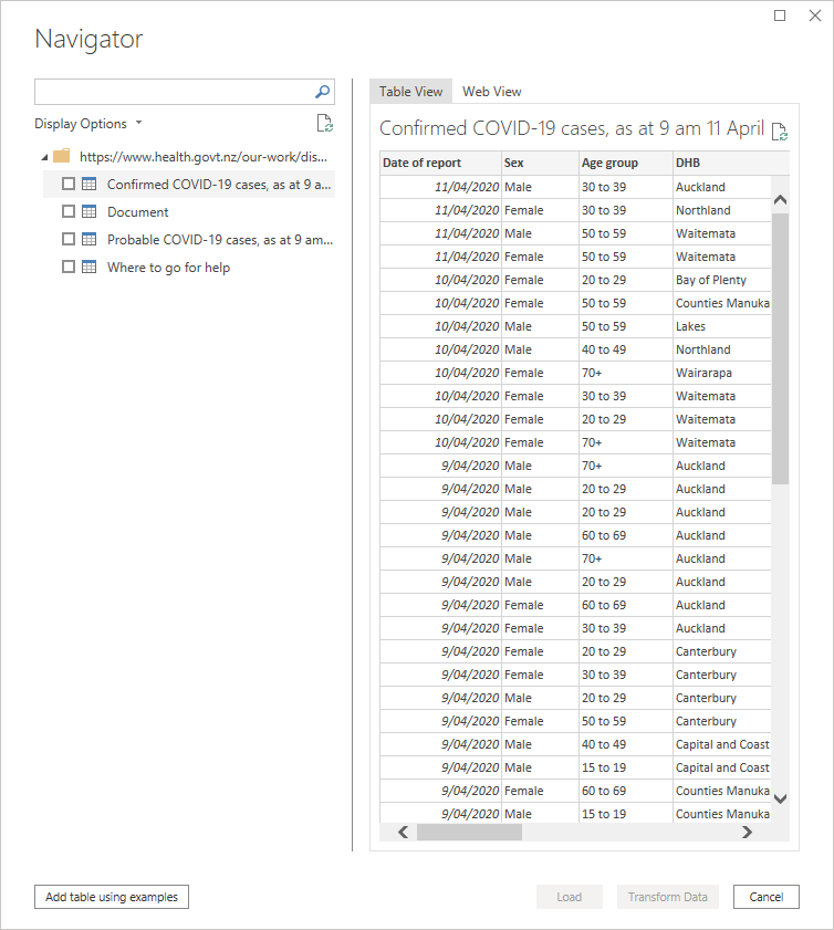
4. Next I tried to find the best place to grab data from. The NZ Ministry of Health doesn& #39;t make this data accessible enough. It is hard to find, tables have datestamped names, many images without links to underlying data, some time sync issues. Piss poor. https://www.health.govt.nz/our-work/diseases-and-conditions/covid-19-novel-coronavirus/covid-19-current-situation">https://www.health.govt.nz/our-work/...
5. I fired up #PowerBI and used PowerQuery to get data. While it can be downloaded as XLS, I& #39;m scraping it direct from the page. @minhealthnz add datetime to all table names that unnecessarily makes this harder. Not cool, MOH.
#probable">https://www.health.govt.nz/our-work/diseases-and-conditions/covid-19-novel-coronavirus/covid-19-current-situation/covid-19-current-cases/covid-19-current-cases-details #probable">https://www.health.govt.nz/our-work/...
#probable">https://www.health.govt.nz/our-work/diseases-and-conditions/covid-19-novel-coronavirus/covid-19-current-situation/covid-19-current-cases/covid-19-current-cases-details #probable">https://www.health.govt.nz/our-work/...
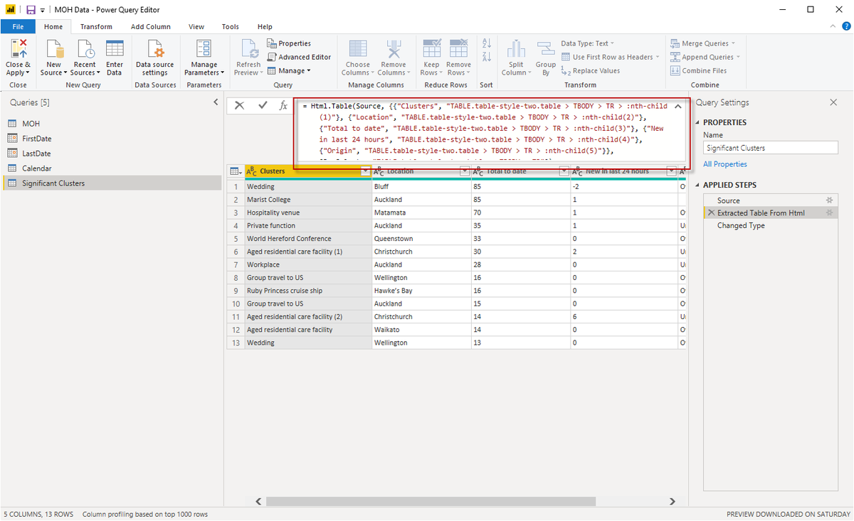
6. In some cases I& #39;m using PowerQuery& #39;s very cool Add Table Using Examples to get around @minhealthnz& #39;s bad table naming. This functionality makes it childs play to scrape from the web, and produces the PowerQuery M code shown below. When the hell will this come to #Excel?
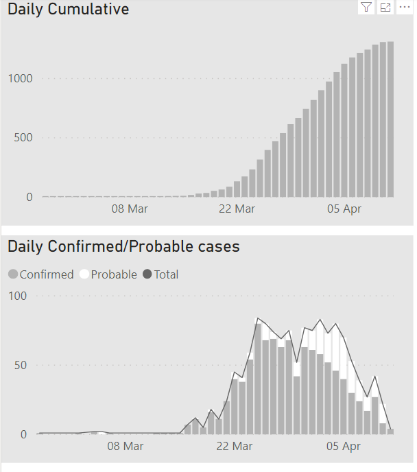
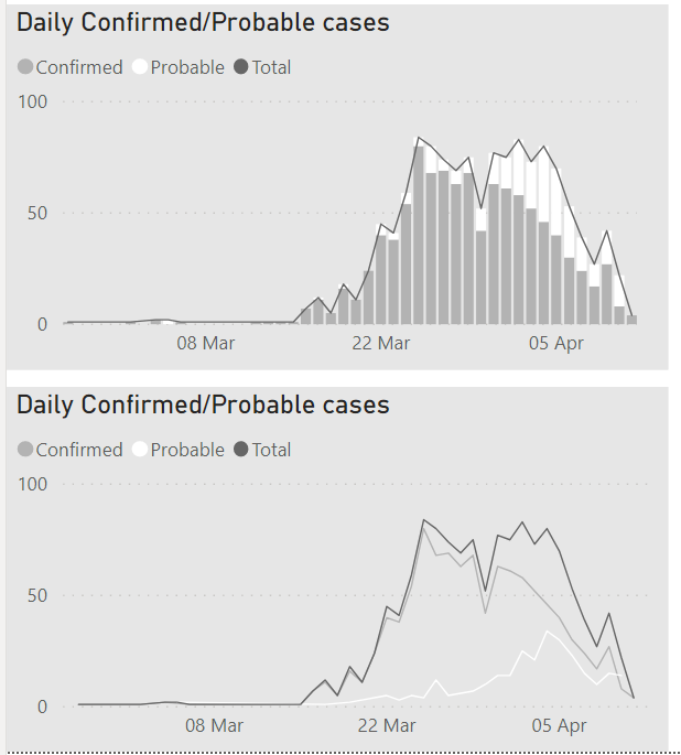
7. Next its time to work out how best to present the data.Cumulative vs daily totals seems like the best starting point. I& #39;ve seen dashboards that put this on one graph - either at the same time, or via a toggle. Why would you impose that on the user? Just use two graphs.
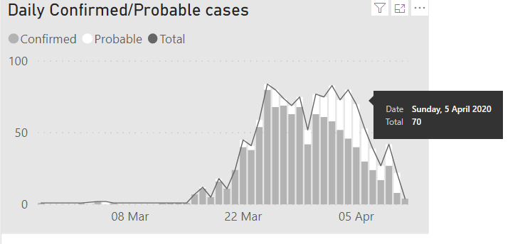
8. The reason I used a line for Total here is that this is the only way I could work out how to get #PowerBI to show the total in a tooltip. @MSPowerBI there should be an options to display totals (and all series values in bar at once) for stacked columns. https://ideas.powerbi.com/forums/265200-power-bi-ideas/suggestions/32082391-totals-in-stacked-column-charts">https://ideas.powerbi.com/forums/26...
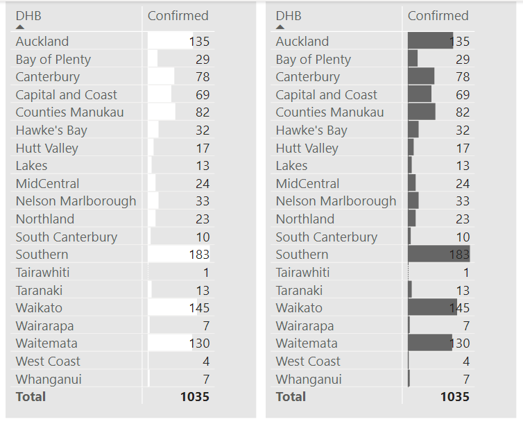
10. Next stop is to think about how to show regional totals and trends. On the totals front, sticking with the same grey theme here& #39;s a couple of options. I like the white bars, but perhaps there& #39;s not enough contrast. But moving to dark, some numbers become illegible
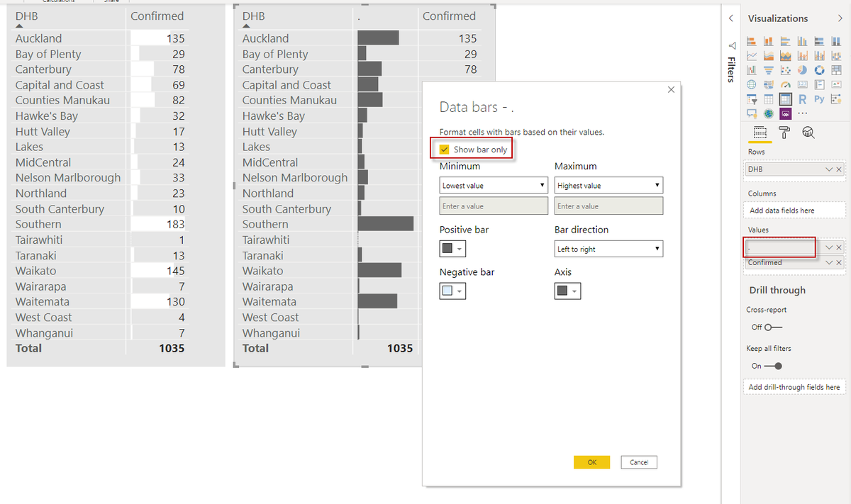
11. The way around this is to use two series; one of which has the Show Bar Only option ticked. (It has to be a different measure too...if you use the same exact measure, changes to DataBars appear to be global. @Will_MI77 maybe a bug?) I don& #39;t want a column name so I used ".".
12. (I haven& #39;t tested if you can use non printing characters as column headers, but I really wish #PowerBI would respect my choice of renaming columns as " " or " " or even " X ".
I tried to add an idea for this, but I can& #39;t lodge ideas any more. https://ideas.powerbi.com/forums/265200-power-bi-ideas/suggestions/40150345-let-me-use-space-empty-string-in-column-headers">https://ideas.powerbi.com/forums/26...
I tried to add an idea for this, but I can& #39;t lodge ideas any more. https://ideas.powerbi.com/forums/265200-power-bi-ideas/suggestions/40150345-let-me-use-space-empty-string-in-column-headers">https://ideas.powerbi.com/forums/26...
14. Here& #39;s what I plan to add:
*Comparison to Australia
*Ethnicity/Age breakdown, weighted by demographic popn
*Map of incidence by DHB with spikes (probably thin bars) rather than bubbles.
*Small multiples allowing comparison between regional trends
* Whatever else U want to see
*Comparison to Australia
*Ethnicity/Age breakdown, weighted by demographic popn
*Map of incidence by DHB with spikes (probably thin bars) rather than bubbles.
*Small multiples allowing comparison between regional trends
* Whatever else U want to see
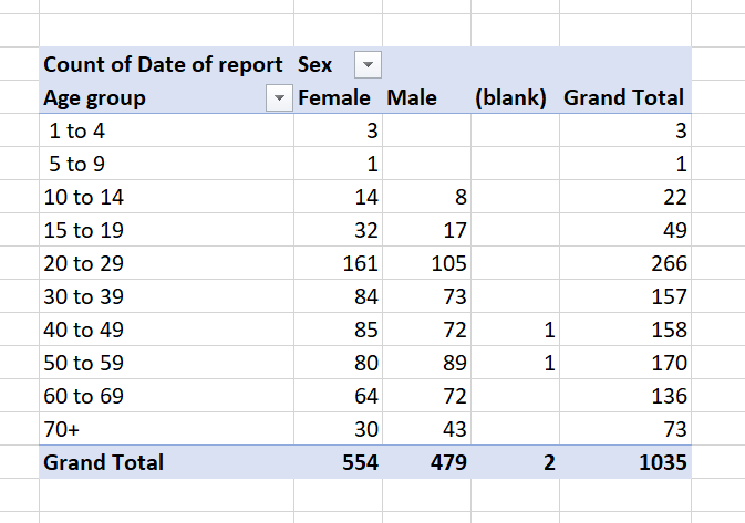
15. #Covid19 incidence data from @minhealthnz uses unequal age-groups, with 4 bands covering folk aged 1 to 20, but just 1 band for 70+. In a pandemic that disproportionately impacts older folk.
Please give us better access to better data @minhealthnz
https://www.health.govt.nz/our-work/diseases-and-conditions/covid-19-novel-coronavirus/covid-19-current-situation/covid-19-current-cases/covid-19-current-cases-details">https://www.health.govt.nz/our-work/...
Please give us better access to better data @minhealthnz
https://www.health.govt.nz/our-work/diseases-and-conditions/covid-19-novel-coronavirus/covid-19-current-situation/covid-19-current-cases/covid-19-current-cases-details">https://www.health.govt.nz/our-work/...
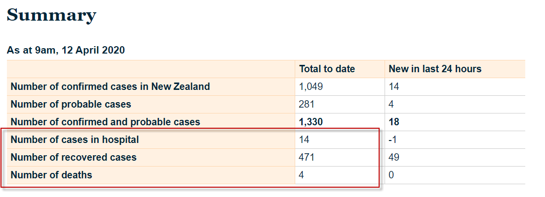
16. It& #39;s also hard to build a dashboard when the publicly available datasources are at different levels of granularity. @minhealthnz give us daily confirmed cases by Dist. Health Board, but only give us hospitalised/recovered/deaths on a national basis.
https://www.health.govt.nz/our-work/diseases-and-conditions/covid-19-novel-coronavirus/covid-19-current-situation/covid-19-current-cases">https://www.health.govt.nz/our-work/...
https://www.health.govt.nz/our-work/diseases-and-conditions/covid-19-novel-coronavirus/covid-19-current-situation/covid-19-current-cases">https://www.health.govt.nz/our-work/...
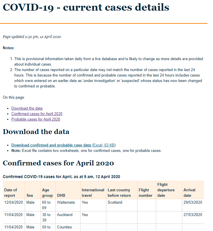
17. Jeez: the web tables on the MoH website is for April only, and the only way to get all the data is to download an Excel file. Which is hard to automate because @minhealthnz hardcode the date in the filename like so:
case-list-12-april-2020-for-web.xlsx
Another fail. C& #39;mon!
case-list-12-april-2020-for-web.xlsx
Another fail. C& #39;mon!
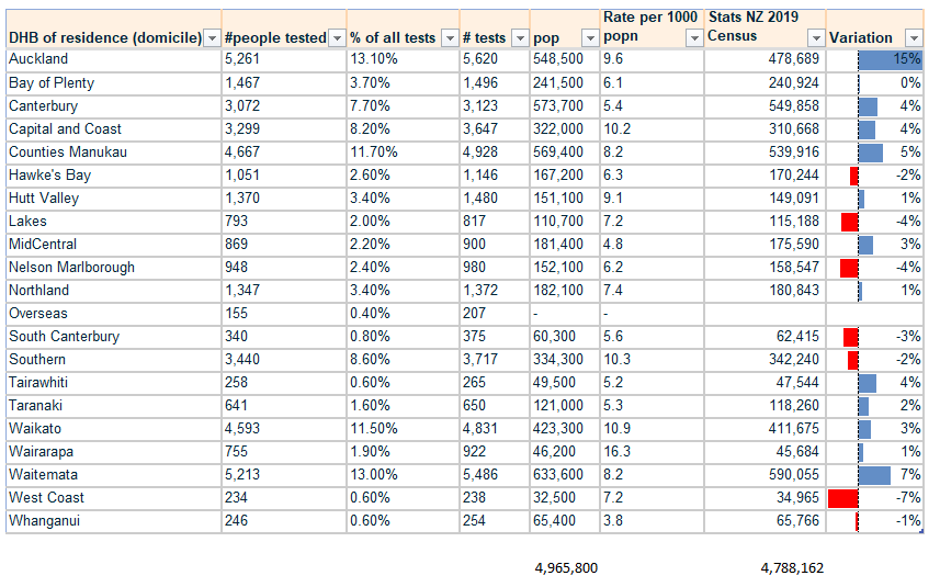
18. Hmm. The table on the MOH site here has NZ population at 4.9 Million. I thought we were 4.6 million.
I& #39;ve added in NZ Census figures on the right that show 15% variation for Auckland. This affects per capital testing figures. What am I missing?
https://www.health.govt.nz/our-work/diseases-and-conditions/covid-19-novel-coronavirus/covid-19-current-situation/covid-19-current-cases/covid-19-testing-region">https://www.health.govt.nz/our-work/...

 Read on Twitter