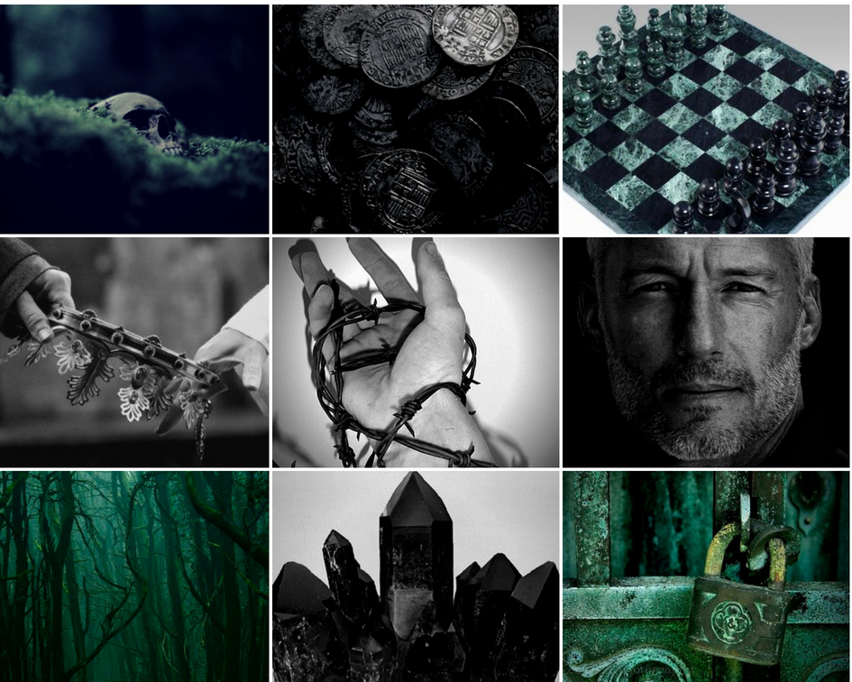
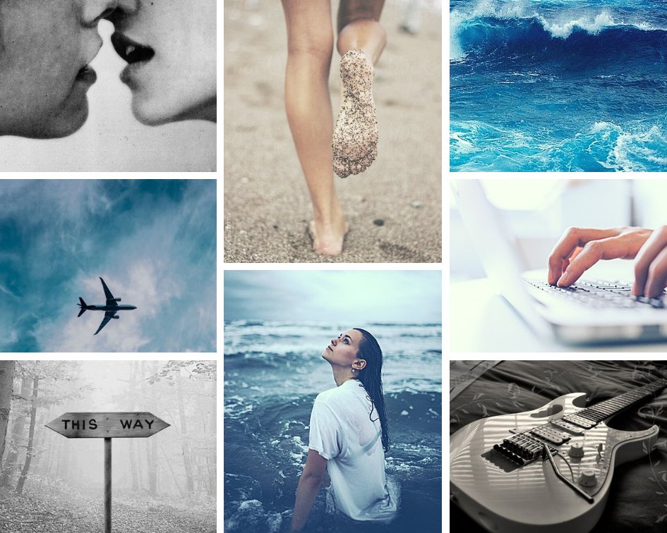
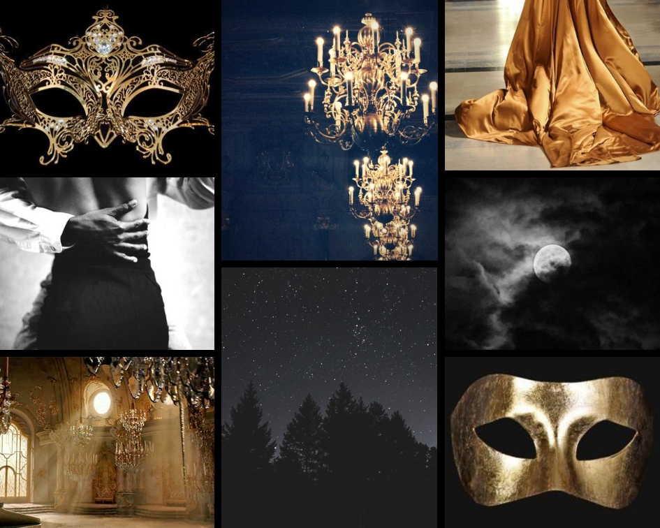
WIP Aesthetics are a creative way to visualize your story, a fun activity, inspiring for new book ideas, and a way to get people excited about your story. Did I mention they& #39;re pretty??
Have you ever wanted to make an aesthetic for your WIP? Here’s how I make mine. THREAD
Have you ever wanted to make an aesthetic for your WIP? Here’s how I make mine. THREAD
Items to note before you start.
You can’t have an aesthetic without images. There are differing opinions on collecting pictures. If you want to make sure they’re free to use, use unsplash or filtered google searches.
You can’t have an aesthetic without images. There are differing opinions on collecting pictures. If you want to make sure they’re free to use, use unsplash or filtered google searches.
I use http://Pinterest.com"> http://Pinterest.com and http://unsplash.com"> http://unsplash.com because I just make aesthetics for fun, not to sell my book. Or to sell, period. I know it& #39;s controversial, so make your own decision and do research on it if you& #39;d like. Now onto the HOW TO
Here& #39;s a basic format to use (just fill in the blanks for your own book)
2-3 colors representing your WIP
4-7 items that correspond (e.g. swords, ocean, fur, forest, guitar, gravestone, garden, plane, cassette)
1-2 emotions (fear, vengeance, love, etc)
any extras (quotes, etc)
2-3 colors representing your WIP
4-7 items that correspond (e.g. swords, ocean, fur, forest, guitar, gravestone, garden, plane, cassette)
1-2 emotions (fear, vengeance, love, etc)
any extras (quotes, etc)
Now for STEP ONE
Pick your color scheme. Colors convey emotion & atmosphere, so pick carefully. E.g. Dark colors, dark feel. You can choose specific colors for a unified feel, too. E.g. Black & Gold. With this one, don& #39;t choose more than 3 colors or things gets complicated.
Pick your color scheme. Colors convey emotion & atmosphere, so pick carefully. E.g. Dark colors, dark feel. You can choose specific colors for a unified feel, too. E.g. Black & Gold. With this one, don& #39;t choose more than 3 colors or things gets complicated.
For a quick application exercise, pick out the color schemes in the following aesthetics. How do those colors make you feel? What do they say about the book? Think hard on what you want to convey in yours.
STEP TWO
Create a folder on your desktop where you’ll save 12+ images for the aesthetic. Here& #39;s an example of a compiled image folder for an aesthetic
Create a folder on your desktop where you’ll save 12+ images for the aesthetic. Here& #39;s an example of a compiled image folder for an aesthetic
STEP THREE: gather images
Search for items in your book or scene followed by & #39;aesthetic& #39; and/or the color you want. The more specific you can be, the easier it is. Enchanted forest, haunted forest, and sunny forest are all going to get different results.
Search for items in your book or scene followed by & #39;aesthetic& #39; and/or the color you want. The more specific you can be, the easier it is. Enchanted forest, haunted forest, and sunny forest are all going to get different results.
You want plenty of images in all your colors. If you chose black & gold, make sure you get a mixture of images from each one. Periodically check what you have to see which colors might be lacking. You can even try finding images from both colors. A gold crown and a red crown!
A note about grids: If you want to play it safe, go with the 9 square one. It’s easy to create color designs with this one. When you’re more confident, you can expand to others. Don& #39;t get crazy because the whole thing is supposed to look unified. My top three favorites:
STEP FIVE
Go to the uploads button on the left side of your canva screen and bring in your images from your desktop folder. BTW, the reason you gather so many images is so you have plenty of options to play around with.
Go to the uploads button on the left side of your canva screen and bring in your images from your desktop folder. BTW, the reason you gather so many images is so you have plenty of options to play around with.
STEP SIX: Start placing!
Take a deep breath. This part is where you get to be creative, so there are a lot of ways to do this step. I& #39;m not a graphic designer or a professional fyi. I& #39;ll try to give my top tips, but I can& #39;t cover everything. Keep the following things in mind...
Take a deep breath. This part is where you get to be creative, so there are a lot of ways to do this step. I& #39;m not a graphic designer or a professional fyi. I& #39;ll try to give my top tips, but I can& #39;t cover everything. Keep the following things in mind...
Tip 1: Place colors carefully. There are many ways to do this. Here are a few examples.
See where I put the pop of red in this aesthetic? It’s in an X shape. The remaining squares are black and grey.
See where I put the pop of red in this aesthetic? It’s in an X shape. The remaining squares are black and grey.
In this one, I put the darker images in the small squares. This allows the larger rectangle images with color to pop but it gives the aesthetic an overall darker tone, which I wanted to convey.
In this one, I picked images that all had black, grey, and white in them. I placed the images based on what direction the focus of the image was and what I wanted to draw attention to. Be careful that one side doesn& #39;t have more dark or light space than the other. BALANCE is key.
Tip 2: Sometimes it doesn’t even matter *gasp*. You can do aesthetics with images you feel like go together, like these ones. Maybe some are a specific color but others aren& #39;t. You can even have the focus be on a quote in the middle.
This aesthetic doesn’t even have a ‘color scheme’ per se. All images have browns and greens in them, but it& #39;s not the focus. All these images work together despite them not being color focused. I used movement and the images to tell a story, instead of focusing on color.
Same with this one. The images work together to create a gritty feel with fear, secrets, and emptiness as the main focus. Aesthetics can be more about a feeling. These are trickier, but they’re fun when you nail them.
Creating a theme/feeling from an aesthetic IS harder. At least for me. It takes time to go through images to find ones that create a mood. Sometimes I search & #39;(emotion) aesthetic& #39; and scroll for ages to find the right fit for my WIP. These were emotion-driven creations for me
Here& #39;s one last color arrangement example. I had the focus be on a quote in the middle, then I did the black squares in an X with green in the rest.
STEP SEVEN: Play with filters.
Sometimes an aesthetic calls for making each image under the same filter. Sometimes I don’t need to use it. Try them out! There are a few features in canva to play with.
Sometimes an aesthetic calls for making each image under the same filter. Sometimes I don’t need to use it. Try them out! There are a few features in canva to play with.

 Read on Twitter


