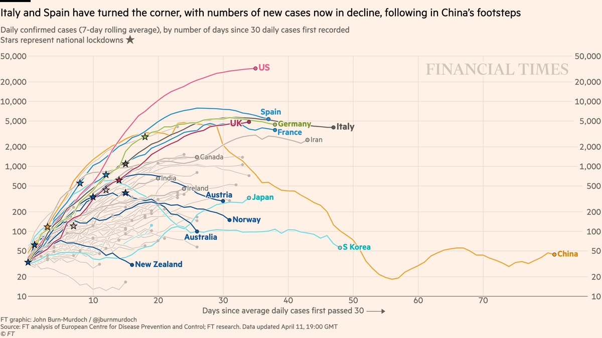
Now daily new cases:
• Early signs that new infections in US *may* be peaking
• New cases falling in four countries that acted early and decisively: New Zealand https://abs.twimg.com/emoji/v2/... draggable="false" alt="🇳🇿" title="Flag of New Zealand" aria-label="Emoji: Flag of New Zealand">, Australia
  https://abs.twimg.com/emoji/v2/... draggable="false" alt="🇦🇺" title="Flag of Australia" aria-label="Emoji: Flag of Australia">, Norway
  https://abs.twimg.com/emoji/v2/... draggable="false" alt="🇳🇴" title="Flag of Norway" aria-label="Emoji: Flag of Norway">, Austria
  https://abs.twimg.com/emoji/v2/... draggable="false" alt="🇦🇹" title="Flag of Austria" aria-label="Emoji: Flag of Austria">
All charts: http://ft.com/coronavirus-latest">https://ft.com/coronavir...
• Early signs that new infections in US *may* be peaking
• New cases falling in four countries that acted early and decisively: New Zealand
All charts: http://ft.com/coronavirus-latest">https://ft.com/coronavir...
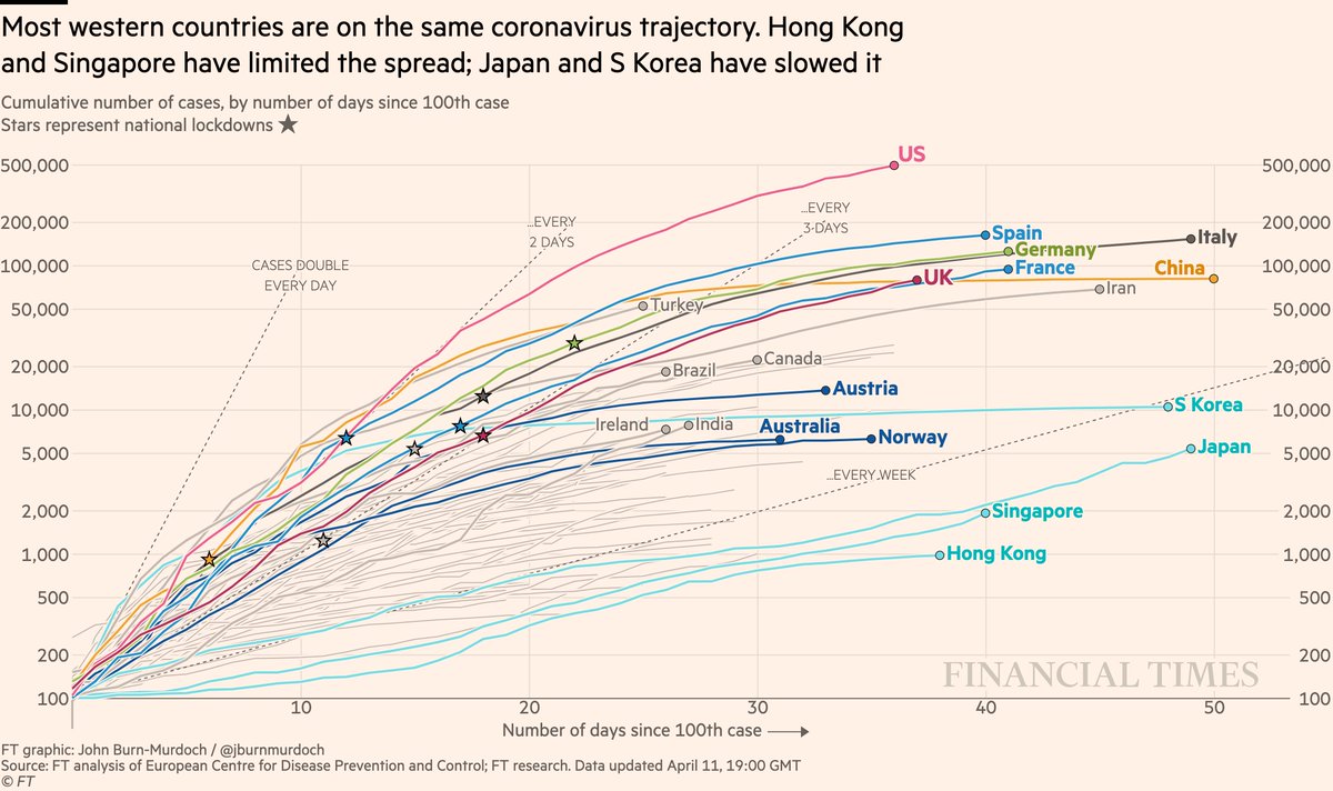
Cases in cumulative form:
• US has passed 500k confirmed cases
• Turkey still battling one of the world’s most severe outbreaks
• Curves flattened early in Austria, Australia, Norway
All charts: http://ft.com/coronavirus-latest">https://ft.com/coronavir...
• US has passed 500k confirmed cases
• Turkey still battling one of the world’s most severe outbreaks
• Curves flattened early in Austria, Australia, Norway
All charts: http://ft.com/coronavirus-latest">https://ft.com/coronavir...
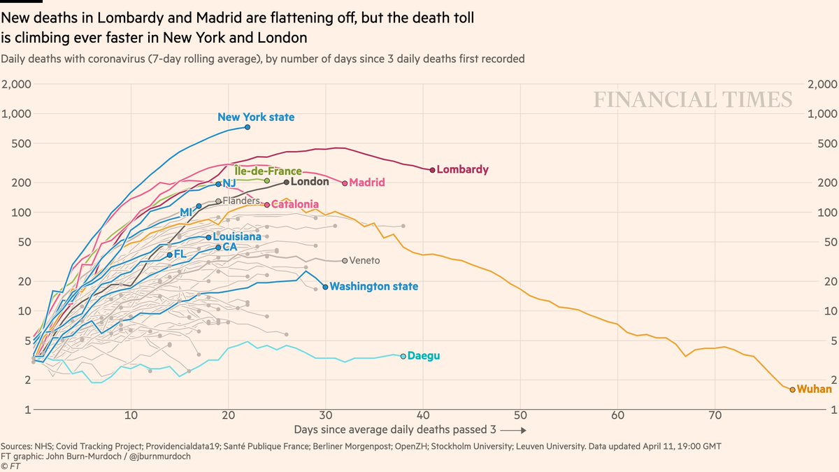
Now subnational region daily deaths:
• Daily deaths still trending upwards in NY & London
• London’s curve still steeper than any region other than NY at this stage of its outbreak
• Signs that the curve in Paris may be flattening
All charts: http://ft.com/coronavirus-latest">https://ft.com/coronavir...
• Daily deaths still trending upwards in NY & London
• London’s curve still steeper than any region other than NY at this stage of its outbreak
• Signs that the curve in Paris may be flattening
All charts: http://ft.com/coronavirus-latest">https://ft.com/coronavir...
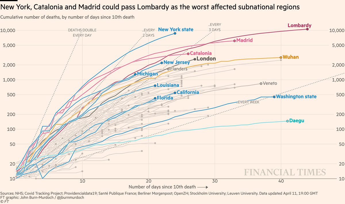
Subnational death tolls cumulatively:
• NY likely to have world’s highest subnational death toll within days, and still rising faster than any other region at this stage of its outbreak
All charts: http://ft.com/coronavirus-latest">https://ft.com/coronavir...
• NY likely to have world’s highest subnational death toll within days, and still rising faster than any other region at this stage of its outbreak
All charts: http://ft.com/coronavirus-latest">https://ft.com/coronavir...
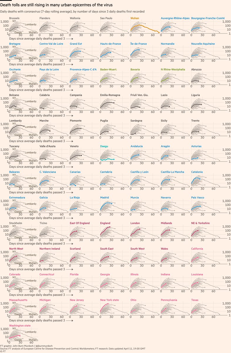
Small multiples of daily deaths in 85 subnational regions, grouped by country:
• Bavaria German epicentre
• 16 US states: NY, NJ, MI, MA steepest; PA, IL also concerning
• Sicily, Sardinia, Balearics all low curves: do islands fare better?
All charts: http://ft.com/coronavirus-latest">https://ft.com/coronavir...
• Bavaria German epicentre
• 16 US states: NY, NJ, MI, MA steepest; PA, IL also concerning
• Sicily, Sardinia, Balearics all low curves: do islands fare better?
All charts: http://ft.com/coronavirus-latest">https://ft.com/coronavir...
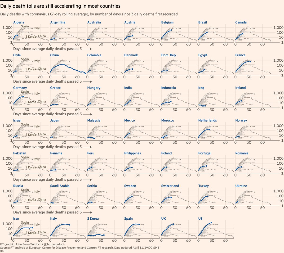
Small multiples for daily new deaths in 48 countries:
• Norway locked down while Sweden didn’t; Norway’s daily death toll rising much more slowly than Sweden’s
• Australia flat-ish so far...
• In Europe, Austria & Denmark faring well
All charts: http://ft.com/coronavirus-latest">https://ft.com/coronavir...
• Norway locked down while Sweden didn’t; Norway’s daily death toll rising much more slowly than Sweden’s
• Australia flat-ish so far...
• In Europe, Austria & Denmark faring well
All charts: http://ft.com/coronavirus-latest">https://ft.com/coronavir...
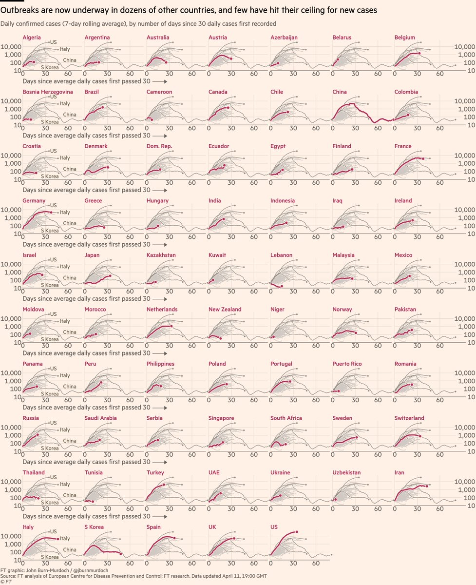
Small multiples for daily cases in 68 countries:
• Early action in Australia & NZ; they may have turned corner early https://abs.twimg.com/emoji/v2/... draggable="false" alt="📉" title="Chart with downwards trend" aria-label="Emoji: Chart with downwards trend">
• Austria & Norway also acted early & new cases falling
• I’m skeptical of the South African data
Live versions of all charts here: http://ft.com/coronavirus-latest">https://ft.com/coronavir...
• Early action in Australia & NZ; they may have turned corner early
• Austria & Norway also acted early & new cases falling
• I’m skeptical of the South African data
Live versions of all charts here: http://ft.com/coronavirus-latest">https://ft.com/coronavir...
Things to note:
• Daily covid data is extremely noisy and implies false precision
• This is why we use a rolling average. Watch for general trends. Focus on slopes, not specific daily numbers
• Read Tuesday’s thread for more on this https://twitter.com/jburnmurdoch/status/1247666977566490626">https://twitter.com/jburnmurd...
We’ve also changed our data sourcing recently.
I’m no longer happy using Worldometers, so now sourcing all data directly from official country sources (health ministries etc).
This takes longer, but given my concerns over data quality on covid, I think this is important.
I’m no longer happy using Worldometers, so now sourcing all data directly from official country sources (health ministries etc).
This takes longer, but given my concerns over data quality on covid, I think this is important.
Here’s a video where I explain why we’re using log scales, showing absolute numbers instead of per capita, and much more: https://twitter.com/janinegibson/status/1244519429825802240">https://twitter.com/janinegib...
And a chart showing why we& #39;re using absolute numbers rather than population-adjusted rates: https://twitter.com/jburnmurdoch/status/1244380095164420101">https://twitter.com/jburnmurd...
Please email coronavirus-data@ft.com with feedback, requests & subnational data.
All of these are invaluable, and we incorporate your suggestions and data every day.
We’ll keep getting back to as many people as possible.
Happy Easter weekend, folks :-)
All of these are invaluable, and we incorporate your suggestions and data every day.
We’ll keep getting back to as many people as possible.
Happy Easter weekend, folks :-)

 Read on Twitter
 , Australia https://abs.twimg.com/emoji/v2/... draggable="false" alt="🇦🇺" title="Flag of Australia" aria-label="Emoji: Flag of Australia">, Norway https://abs.twimg.com/emoji/v2/... draggable="false" alt="🇳🇴" title="Flag of Norway" aria-label="Emoji: Flag of Norway">, Austria https://abs.twimg.com/emoji/v2/... draggable="false" alt="🇦🇹" title="Flag of Austria" aria-label="Emoji: Flag of Austria">All charts: https://ft.com/coronavir..." title="Now daily new cases:• Early signs that new infections in US *may* be peaking• New cases falling in four countries that acted early and decisively: New Zealand https://abs.twimg.com/emoji/v2/... draggable="false" alt="🇳🇿" title="Flag of New Zealand" aria-label="Emoji: Flag of New Zealand">, Australia https://abs.twimg.com/emoji/v2/... draggable="false" alt="🇦🇺" title="Flag of Australia" aria-label="Emoji: Flag of Australia">, Norway https://abs.twimg.com/emoji/v2/... draggable="false" alt="🇳🇴" title="Flag of Norway" aria-label="Emoji: Flag of Norway">, Austria https://abs.twimg.com/emoji/v2/... draggable="false" alt="🇦🇹" title="Flag of Austria" aria-label="Emoji: Flag of Austria">All charts: https://ft.com/coronavir..." class="img-responsive" style="max-width:100%;"/>
 • Austria & Norway also acted early & new cases falling• I’m skeptical of the South African dataLive versions of all charts here: https://ft.com/coronavir..." title="Small multiples for daily cases in 68 countries:• Early action in Australia & NZ; they may have turned corner early https://abs.twimg.com/emoji/v2/... draggable="false" alt="📉" title="Chart with downwards trend" aria-label="Emoji: Chart with downwards trend">• Austria & Norway also acted early & new cases falling• I’m skeptical of the South African dataLive versions of all charts here: https://ft.com/coronavir..." class="img-responsive" style="max-width:100%;"/>


