I& #39;ve seen this #covid19 #dataviz several times as an example of great work, but I have some questions and feedback:
(THREAD) https://twitter.com/DaveDaversa/status/1249029848015736833">https://twitter.com/DaveDaver...
(THREAD) https://twitter.com/DaveDaversa/status/1249029848015736833">https://twitter.com/DaveDaver...
1. #covid19 deaths appear to be sum of deaths from that day, but other causes are an average from some unknown time period. this isn& #39;t most useful comparison - consider an updating "avg daily deaths from covid", or daily sum of deaths from other causes, for more meaningful comp
2. my impression as reader viewing this is, "in early march #covid19 was not a serious threat, but now it& #39;s a bigger threat than heart disease, cancer, alzheimers" etc. is that the goal?
3. i think the goal is probably to show "daily #covid19 deaths ramped up quickly in a short period of time, and daily deaths now comparable to daily deaths from other major causes", but the animated "climbing the leaderboard" effect distracts from the point
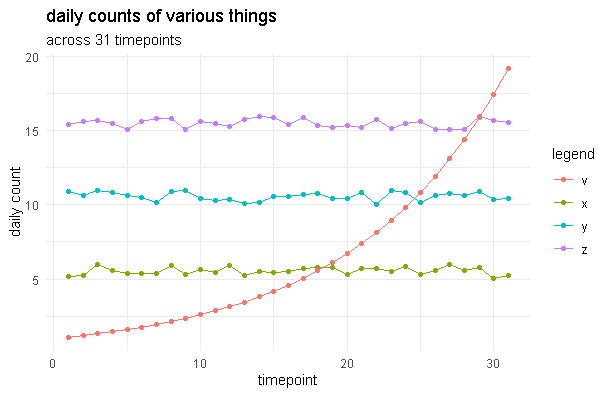
4. if that& #39;s the case, then i think something like this might work better
(THESE ARE FAKE DATA FOR ILLUSTRATIVE PURPOSES)
(THESE ARE FAKE DATA FOR ILLUSTRATIVE PURPOSES)
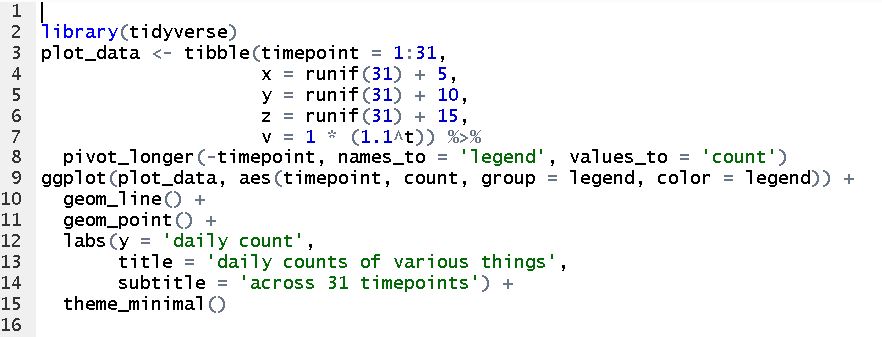
5. #rstats code to generate that (nb, if you know a better way to share snippets in twitter w/o killing character limit, let me know!):
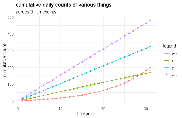
6. personally, i think looking at cumulative counts of those things across same time window is also important, something like this (in which case, the purple line is wayyyy scarier than the red one!):
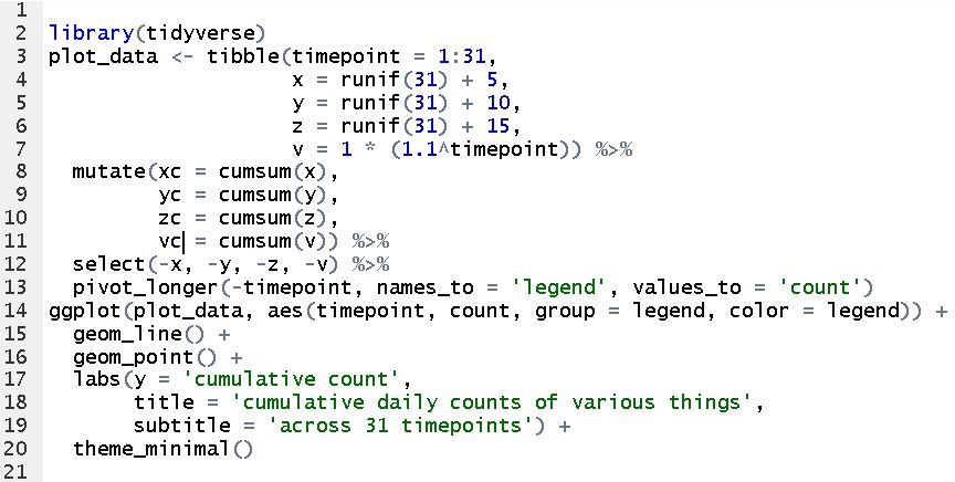
7. #rstats snippet for that graph (with apologies to . @JennyBryan for not re-ordering the legend, which i should do but have to tend to a salty toddler):
8. Animated #dataviz is eye-catching and can be very useful (see shifting distributions in fantasy draft adp from . @Josh_ADHD last couple of years!), but "draws attention" and "clearly articulates a useful story with appropriate context" are not always the same thing.
/end rant
/end rant

 Read on Twitter


