(Changed my mind, posting the figures but no comments)
Use of care and mortality due to corona in Finland, Sweden, Norway, Denmark, Iceland and Estonia; data from yesterday 10.4. Read the whole thread. (English version)
Fig 1. Number of persons in intensive care per day. 1/x
Use of care and mortality due to corona in Finland, Sweden, Norway, Denmark, Iceland and Estonia; data from yesterday 10.4. Read the whole thread. (English version)
Fig 1. Number of persons in intensive care per day. 1/x
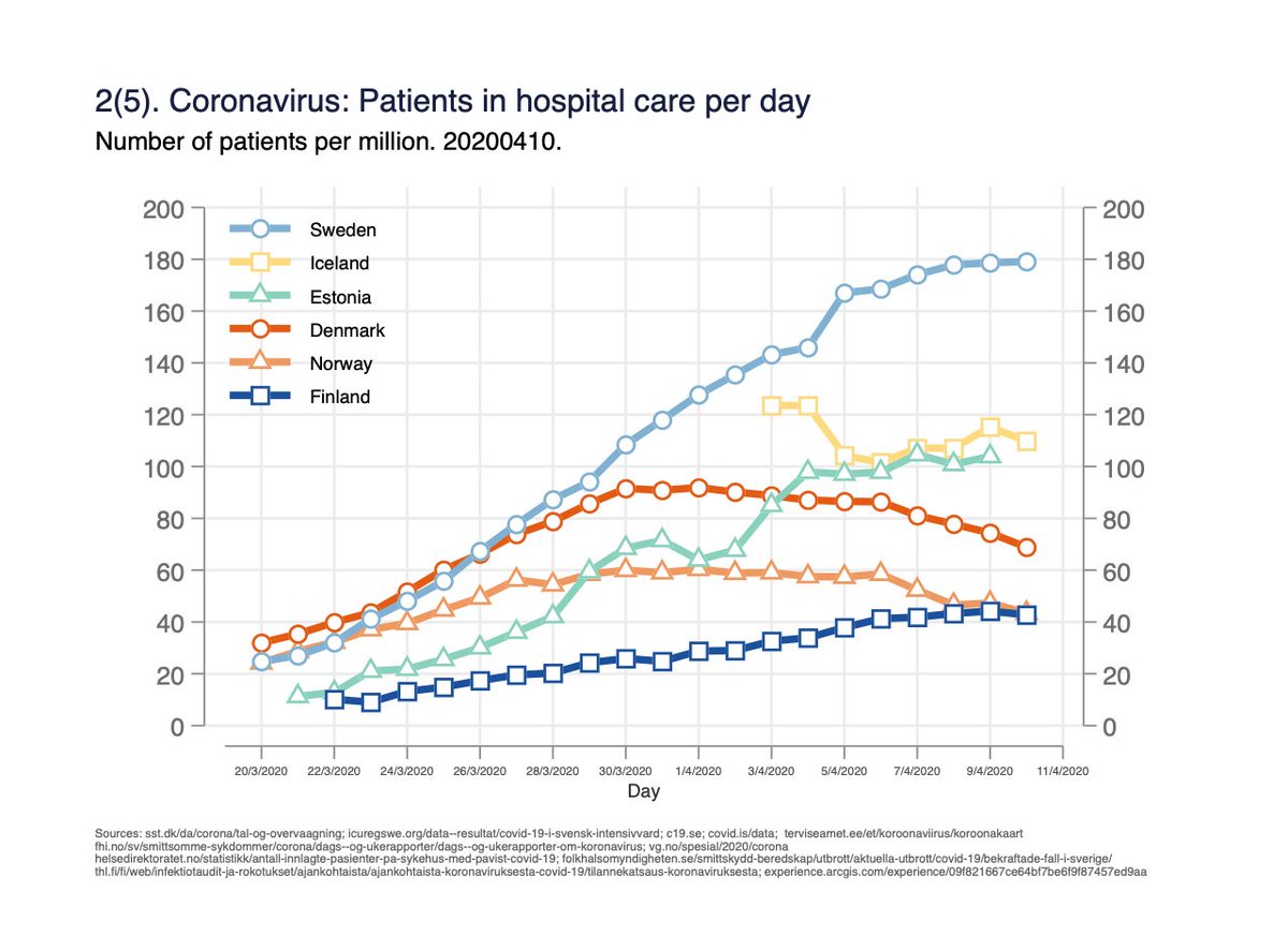
Fig 2. Number of persons in hospital care per day. One person can be counted for several days. Measures the burden on hospital capacity. 2/x
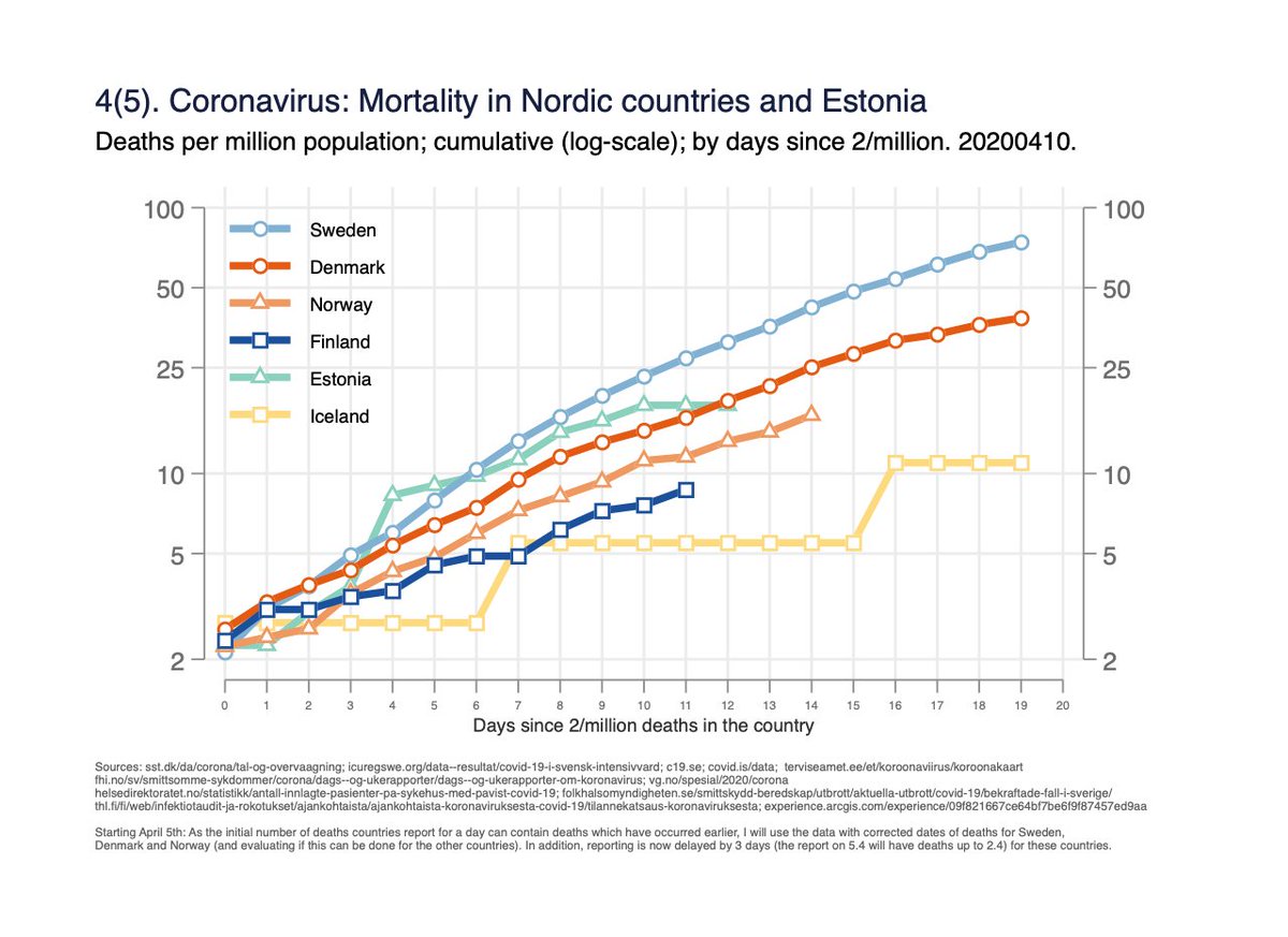
Fig 4. Mortality per million population on log-scale, by days since 2/million deaths in the country. Same data as fig 3, but y-axis helps to understand rate of change, and time-scale unified. 4/x

 Read on Twitter


