Today I have a thread on latest trends for #covid19 deaths in the UK at the request of @BristOliver
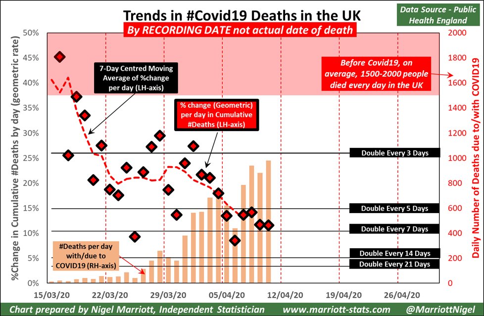
I will start with the usual chart I& #39;ve been showing for @PHE_uk data. This is by date of recording of the death where #coronavirus is present, not the actual date of death.
/1
I will start with the usual chart I& #39;ve been showing for @PHE_uk data. This is by date of recording of the death where #coronavirus is present, not the actual date of death.
/1
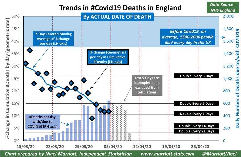
@NHSEngland are taking this data and allocating the deaths to actual date of death. Because of time lags, they state the last 5 days of data is incomplete.
Consequently my chart (same format as PHE chart) does not compute trends for the last 5 days.
/2
Consequently my chart (same format as PHE chart) does not compute trends for the last 5 days.
/2
So far I can verify the truth of the last 5 days& #39; caveat. If I start to include the most recent data, the underlying trend will be understated and revised upwards once new recorded deaths come in and are allocated to the actual date of deaths.
/3
/3
Approx 90% of future reallocations go to the last 5 days. The remaining 10% are too small in numbers to materially affect the underlying trend.
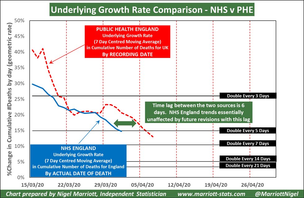
I can now plot the underlying trends from my 2 previous charts onto the same chart.
/4
I can now plot the underlying trends from my 2 previous charts onto the same chart.
/4
It should be obvious that both data sets are showing the same underlying trends, just 6 days apart.
There is a larger difference at the beginning but that is to be expected. First numbers were small back then and a simple simulation where the time lag between ...
/5
There is a larger difference at the beginning but that is to be expected. First numbers were small back then and a simple simulation where the time lag between ...
/5
… actual day of death and recording date is assumed to follow a Poisson distribution with mean 5 days demonstrates that the underlying trend for recorded deaths will be higher than actual deaths for the first week or so. This is what we see here.
I have undertaken some ...
/6
I have undertaken some ...
/6
… extrapolations of the underlying growth shown in the chart but I& #39;m not yet ready to publish details. Currently they point to the peak for number of daily deaths to be in the week of 19-26 April averaging 1250 deaths per day for the PHE dataset. This may be revised.
/end
/end

 Read on Twitter


