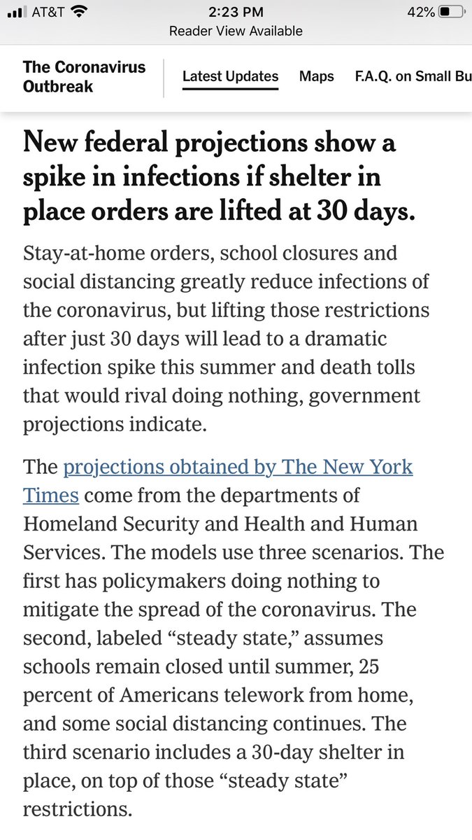
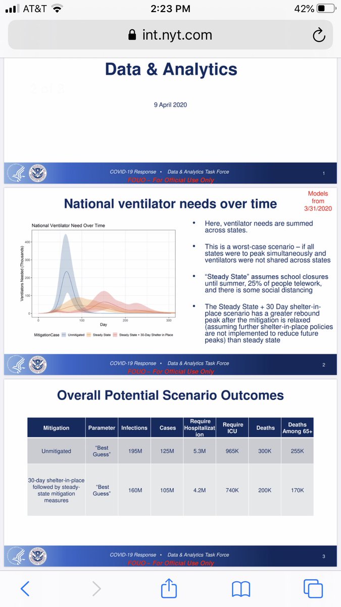
So @nytimes has a big story right now about a @fema model showing up to 300,000 deaths. The documents are “dated April 9,” the story says. So they must account for everything we’ve learned this week - which would be bad news. But what the chart actually says: “Models from 3/31.”
You may understand why this matters - but if not - the @IHME_UW projections have been changed THREE times since March 31 (resulting in sharp cuts in hospitalization/ICU projections). If this were actually made yesterday, it would be frightening. Instead it’s just out of date.
Link to story, before they fix it (if they fix it): https://www.nytimes.com/2020/04/10/us/coronavirus-updates-usa.html?action=click&module=Spotlight&pgtype=Homepage">https://www.nytimes.com/2020/04/1...

 Read on Twitter


