While there are all sorts of doubts about how China is covering up the true scale of its #covid19 pandemic, there is a giveaway in the data, I think.
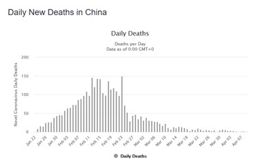
China fatality statistics are skewed, but the asymmetry is entirely opposite to what we are seeing in other countries.
1/
China fatality statistics are skewed, but the asymmetry is entirely opposite to what we are seeing in other countries.
1/
The left tail, i.e. the increasing fatality rate before the peak is "thicker" than the right peak. After fatalities peak in February, they then rapidly dissipate. That makes little sense. People don& #39;t die instantly. The waning of the wave should be stickier than the onset.
2/
2/
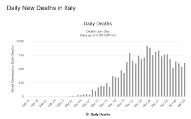
And curves emerging from other countries that are beyond peak show exactly that skewness to the right. See Italy and Spain. As steep a rise towards the peak as in China but plateauing much longer.
Would have to come a very rapid descent in both countries now to match China.
3/
Would have to come a very rapid descent in both countries now to match China.
3/
In China the ascent was followed by a plateau of about ten days, after which daily fatalities dropped from 150 to about 40 and then slowly declining further.
Italy has been plateauing for three weeks now, Spain almost as long, with very slow decline recently.
4/
Italy has been plateauing for three weeks now, Spain almost as long, with very slow decline recently.
4/
Perhaps I am reading too much into this and we will see how distributions move on in Italy and Spain, but Chinese data look very odd, particularly the sharp drop in fatalities after Feb 23.
5/
5/
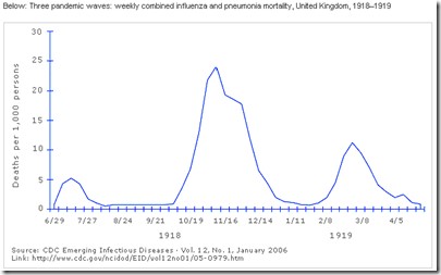
The Chinese data also don& #39;t fit with the shape of waves during the 1918 Spanish flu. Onset of the waves is always steeper than their waning.
6/6
6/6

 Read on Twitter


