Sunrise, sunset, the umpteenth day, more data.
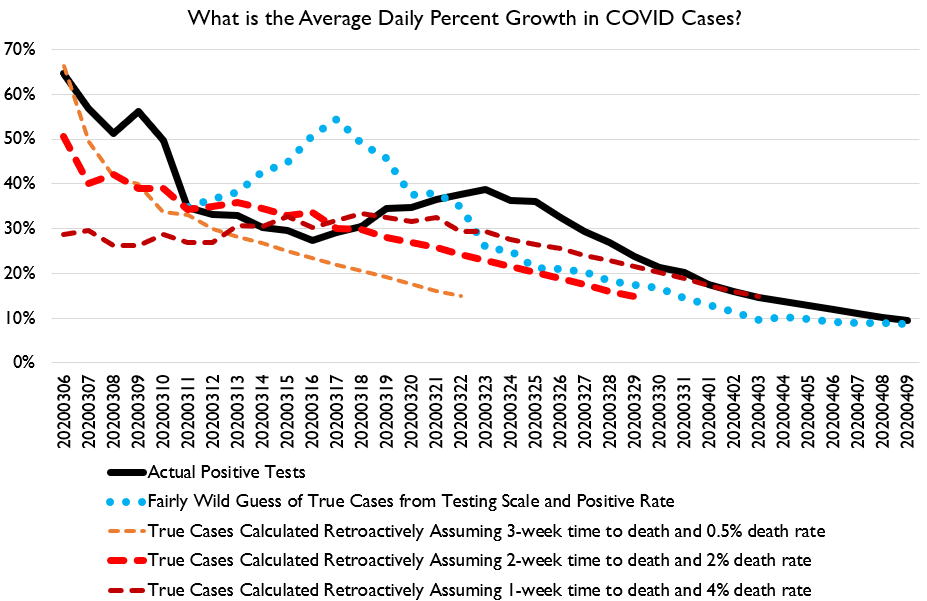
The curve in America continues to be flattened. COVID tracker extended their time series backwards a bit, which is nice, as it lets us see what spread was like earlier on.
The curve in America continues to be flattened. COVID tracker extended their time series backwards a bit, which is nice, as it lets us see what spread was like earlier on.
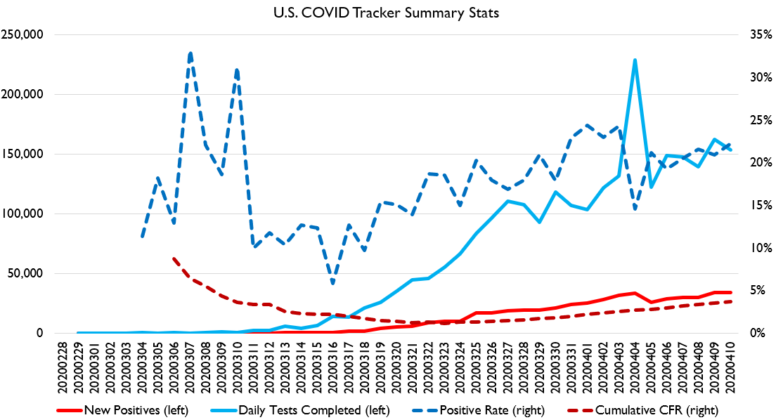
Today was also a nice day for the fundamentals: testing rose a bit while the positive % fell. CFR continues to rise.
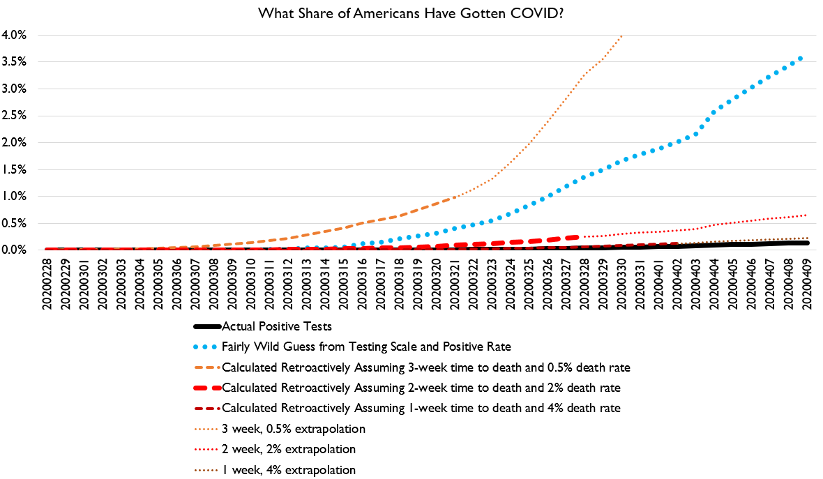
And here& #39;s estimates of the infected share. I still think estimates over 4% are pretty unlikely.
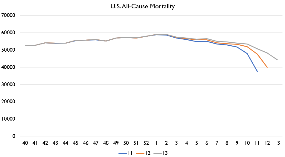
I will update my New York chart and some other charts in about 9 hours from now. US FluView should provide first estimates of Week 13 deaths and revised estimates of prior weeks of deaths this morning Eastern time.
At that time I will post:
1. Revision history for US deaths
2. Revision history for US P&I deaths
3. Revision history for NY deaths
4. Revision history for NY P&I deaths
5. My NY death chart
6. Maybe death charts for a few other states, if I get time
1. Revision history for US deaths
2. Revision history for US P&I deaths
3. Revision history for NY deaths
4. Revision history for NY P&I deaths
5. My NY death chart
6. Maybe death charts for a few other states, if I get time
The big things I& #39;ll be watching for in this will be the scale of upward revisions for all cases, but ESPECIALLY the scale of upward revisions for NY Week 12, as that should give us a better sense of the total death spike.
Week 13 national data is going to be 100% useless given massive reporting delays. NY data may or may not be useful. If Week 12 revisions are normal-sized, then Week 13 may be useful data. If Week 12 revisions are unusually large, that suggests a reporting backlog.
If there& #39;s a reporting backlog on week 12 which had lower NY reported COVID deaths than week 13, then that suggests that initially-reported week 13 deaths are probably even more underreported than normal.
I am laying this all out BEFORE the data is released because we have some serious Grade A Idiots on this website who are always looking for reasons to challenge the good faith of any analysis that challenges their conclusions.
So I& #39;m pre-registering the kinds of analysis I intend to do, so that I can& #39;t be accused of cherry-picking.
I don& #39;t know what& #39;s gonna happen. I don& #39;t know if the week 12 revisions will be big or small. And I don& #39;t know if the week 13 number will match my projections or not.
I don& #39;t know what& #39;s gonna happen. I don& #39;t know if the week 12 revisions will be big or small. And I don& #39;t know if the week 13 number will match my projections or not.
If revisions in week 12 for NY are normal-ish and deaths in week 13 come in way below my expectations, especially P&I deaths, that would suggest that COVID is considerably less lethal on than I and others have suggested. I& #39;m open to being wrong!
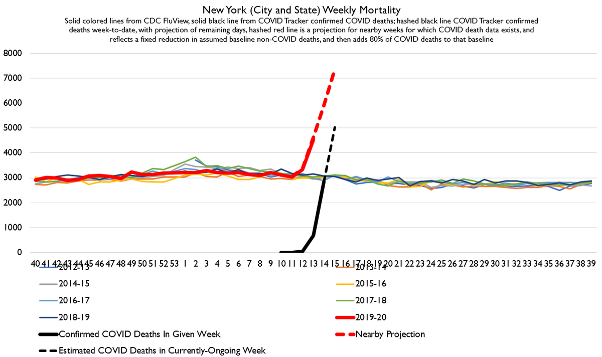
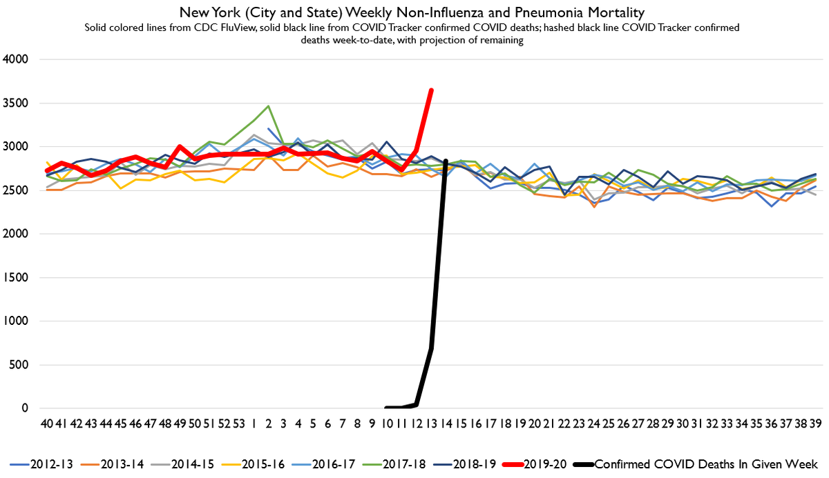
That red dotted line is what I thought was going to happen.
The solid red line is what actually happened. The revisions to Week 12 were near expectations, and upwards. Week 13 came in way above expected.
Folks, COVID deaths are being under-counted.
The solid red line is what actually happened. The revisions to Week 12 were near expectations, and upwards. Week 13 came in way above expected.
Folks, COVID deaths are being under-counted.
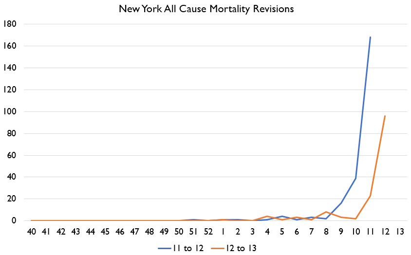
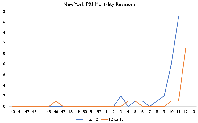
Here& #39;s revisions to New York. They were up, but not unusually so. This suggests there is *not* a backlog in the death reporting system. This is good news, as it suggests that this data will be useful going forward.
But, to emphasize:
Week 13 had 680 confirmed COVID deaths in New York.
But deaths rose 1,500 above baseline. About 3 times as much.
Week 12 had 41 confirmed COVID deaths. Yet was 270 above baseline.
Week 13 had 680 confirmed COVID deaths in New York.
But deaths rose 1,500 above baseline. About 3 times as much.
Week 12 had 41 confirmed COVID deaths. Yet was 270 above baseline.
For two weeks in a row, we have seen that the true death spike is MUCH larger than confirmed COVID deaths.
All your optimistic models are wrong.
All your optimistic models are wrong.
Hospitals may not be overwhelmed simply because many people are dying alone in their homes without any medical care at all.
And it was evening, and it was morning, the second day.
Gonna break my habit of doing a new thread each day and continue this thread a second day, because I didn& #39;t finish the promised graphs from yesterday!
Gonna break my habit of doing a new thread each day and continue this thread a second day, because I didn& #39;t finish the promised graphs from yesterday!
Also, to all the Christians celebrating Holy Week in unusual circumstances, and the Jews who had their Seders over Zoom: these are strange times. But our peoples have lived and worshiped and thriven in even stranger ones before. This will pass, and God will be praised.
Okay before we dive into mortality data let& #39;s do our usual COVID chart roundup.
Officially reported COVID numbers continue to show signs of curve-flattening by almost all metrics.
Officially reported COVID numbers continue to show signs of curve-flattening by almost all metrics.
Whether you calculate retrospectively from deaths or use reported cases, the curve is flattening.
The only metric which suggests curve-flattening has stopped is my "fairly wild guess" estimate. So let& #39;s talk about that one a bit more to understand it.
The only metric which suggests curve-flattening has stopped is my "fairly wild guess" estimate. So let& #39;s talk about that one a bit more to understand it.
This figure tries to exploit changes in reported cases alongside the intensity of testing to guess at a "true" attack rate.
So, I take the cumulative number of completed tests divided by population (i.e. testing per capita), and then I divide that by the share of completed tests which have been positive.
Intuitively, this means that if the positive % of tests is stable and the amount of testing is rising, my estimate of the attack rate rises too.
I don& #39;t fully understand the calculation myself. It was suggested to me by an expert in the field who preferred not to be named. But what& #39;s strange about it is that it actually tracks pretty well with retrospectively estimated cases from deaths.
Anyways, I& #39;m not sure you should take it as super reliable. That it has flattened seems to have a lot to do with California& #39;s clearing of case backlogs. Once that& #39;s out of the 7 day window it may decline again.
And on our basic stats, we can see that testing fell a bit while the positive % rose. CFR continues to rise.
By the by, if you believe my 0.7% to 4% infection rates, that implies that we have only successfully tested somewhere between 2% and 18% of actual cases.
Which means we need a testing scale of like.... 5-50x bigger for test and trace to work.
Which means we need a testing scale of like.... 5-50x bigger for test and trace to work.
Okay. So, now for the main event, the thing you& #39;ve all been waiting for.
Here& #39;s my latest estimate of New York mortality. The red solid line is **actual reported deaths**. The red hashed line is my *best estimate* of what deaths *are eventually going to come in at*.
Here& #39;s my latest estimate of New York mortality. The red solid line is **actual reported deaths**. The red hashed line is my *best estimate* of what deaths *are eventually going to come in at*.
You can choose to ignore this of course. But for the last two weeks I& #39;ve been basically correct in my modeling of New York, albeit I was a bit too *low* vs. actual numbers.
But at this point, in the only US jurisdiction for which we have reliable data for all-cause mortality for a period in which COVID deaths have been appreciable, the jump in all-cause deaths was very, very large.
But, what caused this?
Was it heart attacks? Suicide? COVID? There& #39;s debate over how to count a COVID death, so can we get a 2nd approach?
Yes, we can! We can use the CDC& #39;s long-standing and basically uncontested definition of influenza and pneumonia deaths.
Was it heart attacks? Suicide? COVID? There& #39;s debate over how to count a COVID death, so can we get a 2nd approach?
Yes, we can! We can use the CDC& #39;s long-standing and basically uncontested definition of influenza and pneumonia deaths.
And LOOKEE THERE! Influenza and pneumonia deaths in New York did indeed rise by about the right amount in week 12 and 13! We don& #39;t have week 14 P&I deaths deaths in yet, but this suggests they& #39;ll come growing by about the COVID death amount.
Now, non-P&I deaths rose too! That could reflect deaths due to lockdown: people not able to get care or something like that. Or, it could reflect deaths that were misclassified, which is easy in cases of non-medicalized deaths (i.e. finding dead bodies at home or street).
But what I really want to point out is that confirmed COVID deaths alone amount to about 100% of non-P&I deaths in New York in the latest week.
Here& #39;s revision patterns. NY revisions look normal.
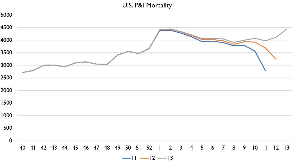
The US revision pattern looks frickin& #39; terrifying.
The US revision pattern looks frickin& #39; terrifying.
Why?
Well, look at the 3 P&I estimate vintages shown. NORMALLY, latest weeks of data are LOW because numerous jurisdictions haven& #39;t reported. But right now, even with probably 20-40% of death-reporting jurisdictions not reporting, P&I deaths are UP.
Well, look at the 3 P&I estimate vintages shown. NORMALLY, latest weeks of data are LOW because numerous jurisdictions haven& #39;t reported. But right now, even with probably 20-40% of death-reporting jurisdictions not reporting, P&I deaths are UP.
US all cause mortality revisions are still down in latest weeks, consistent with delayed reporting.... but by less and less. Controlling for vintage age, US deaths were up by quite a bit in week 13.
I was hoping to do some looks at other states too, however, I& #39;m gonna have to leave this off here. Got other stuff to do today.
Just for the signal boost I& #39;ll cc the above mortality thread to.... @Noahpinion @mattyglesias @swinshi @JDVance1 @JonahDispatch @RAVerBruggen
Just for the signal boost I& #39;ll cc the above mortality thread to.... @Noahpinion @mattyglesias @swinshi @JDVance1 @JonahDispatch @RAVerBruggen
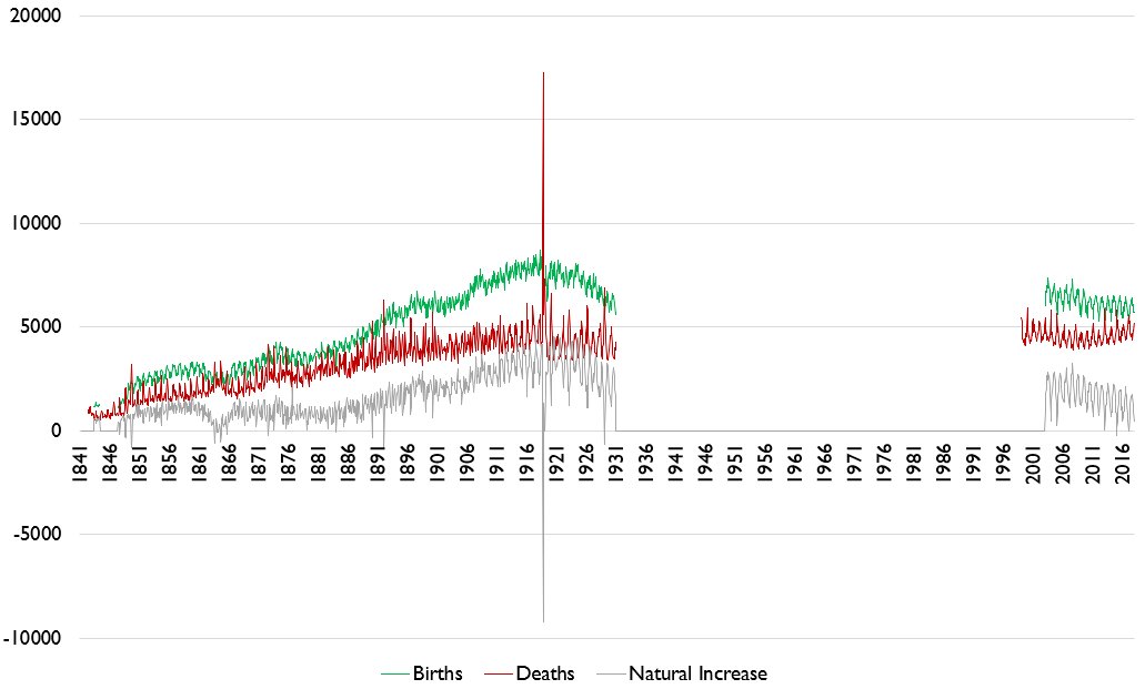
And as a sneak peak to what other thing I& #39;m working on....
WOOOOOOOO SUPER LONG VITAL STATISTICS SERIES WOOO WOOO GET HYYYYYPE
WOOOOOOOO SUPER LONG VITAL STATISTICS SERIES WOOO WOOO GET HYYYYYPE

 Read on Twitter


