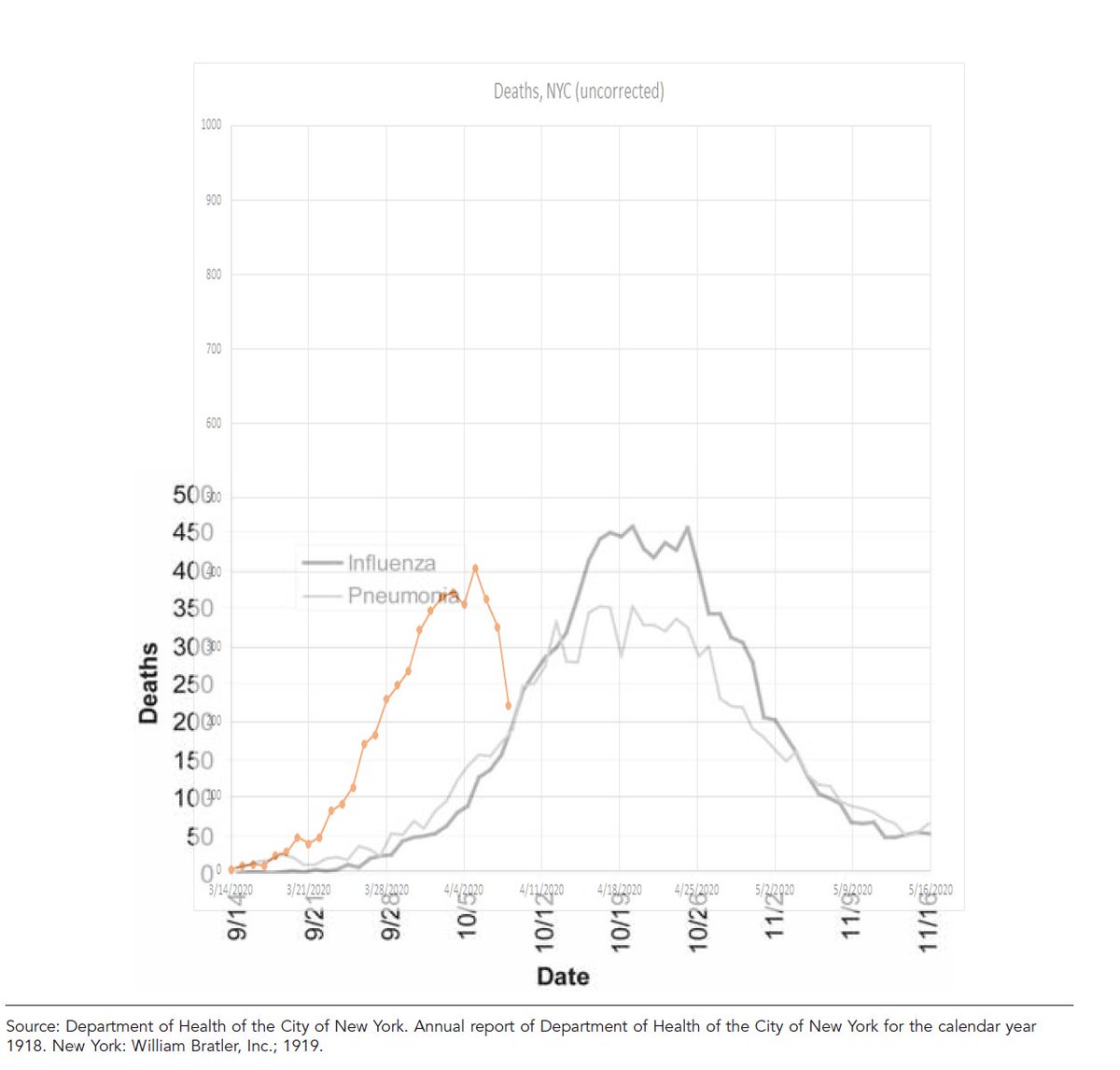
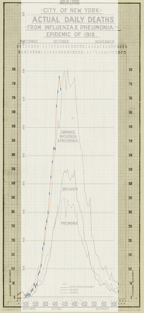
I& #39;ve just plotted the number deaths in NYC due to the COVID-19 epidemic versus those due to the 1918 influenza epidemic. The results are... striking.
A bit of background first, though.
This is a follow-on to two previous graphs, found here:
https://twitter.com/cgseife/status/1247308761968107520">https://twitter.com/cgseife/s...
1/
A bit of background first, though.
This is a follow-on to two previous graphs, found here:
https://twitter.com/cgseife/status/1247308761968107520">https://twitter.com/cgseife/s...
1/
The updated graph, using the same methodology looks like this... the curve to the left is NYC/COVID-related deaths; the curves on the right are NYC/Influenza pandemic-related deaths. Data current as of 5 PM today (4/9/20.) However, there& #39;s a problem that needs correcting....
2/
2/
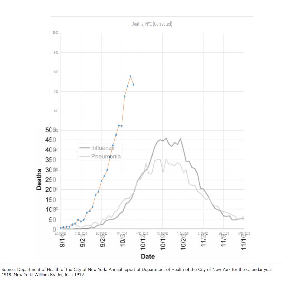
NYC death rates are distorted by delays in reporting, & those delays are particularly grave for most recent 4-5 days of data. In previous threads, I described this problem and described a method for adjusting for the distortion. 3/
https://twitter.com/cgseife/status/1247752842137358337">https://twitter.com/cgseife/s... https://twitter.com/cgseife/status/1247882103636676611">https://twitter.com/cgseife/s...
https://twitter.com/cgseife/status/1247752842137358337">https://twitter.com/cgseife/s... https://twitter.com/cgseife/status/1247882103636676611">https://twitter.com/cgseife/s...
In this graph, I plot the *adjusted* COVID-19 data against the 1918 flu data. (Reminder: take with a grain of salt, b/c data depends on the validity of the correction.) We& #39;re gonna need a bigger graph. 4/
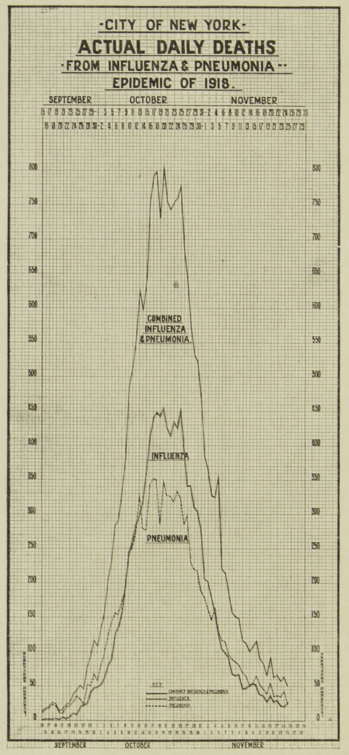
The 1918 data has two separate curves: one for "influenza deaths" and one for "pneumonia deaths." For an apples-to-apples comparison, it& #39;s better to look at the combined death rate. A search through the archives yielded this graph. (source: https://www.archives.nyc/blog/2018/3/1/the-flu-epidemic-of-1918">https://www.archives.nyc/blog/2018... ) 5/
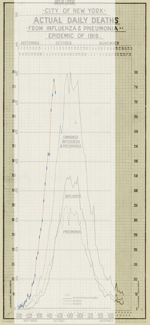
Apologies for the unsightliness -- I& #39;ll replace with a more modern graph when I have the chance to digitize the data -- but here& #39;s an apples-to-apples overlay of the present (adjusted) COVID-19 data with the 1918 flu data. Curve to the left is COVID. 6/
Now... here& #39;s the kicker. The x-axis is somewhat arbitrary; I& #39;ve been matching 3/14/2020 to 9/14/1918, just for simplicity& #39;s sake. But if you advance the COVID graph by 5 days, matching 3/14/2020 to 9/21/1918, this is what you get. 7/
We don& #39;t yet know quite how high the peak will be, or how broad the curve will be--and, remember, this is based on *adjusted* numbers--but at least in NYC, the severity of this pandemic appears to be directly comparable to that of the 1918 flu, in which ~30,000 NYers died. 8/

 Read on Twitter