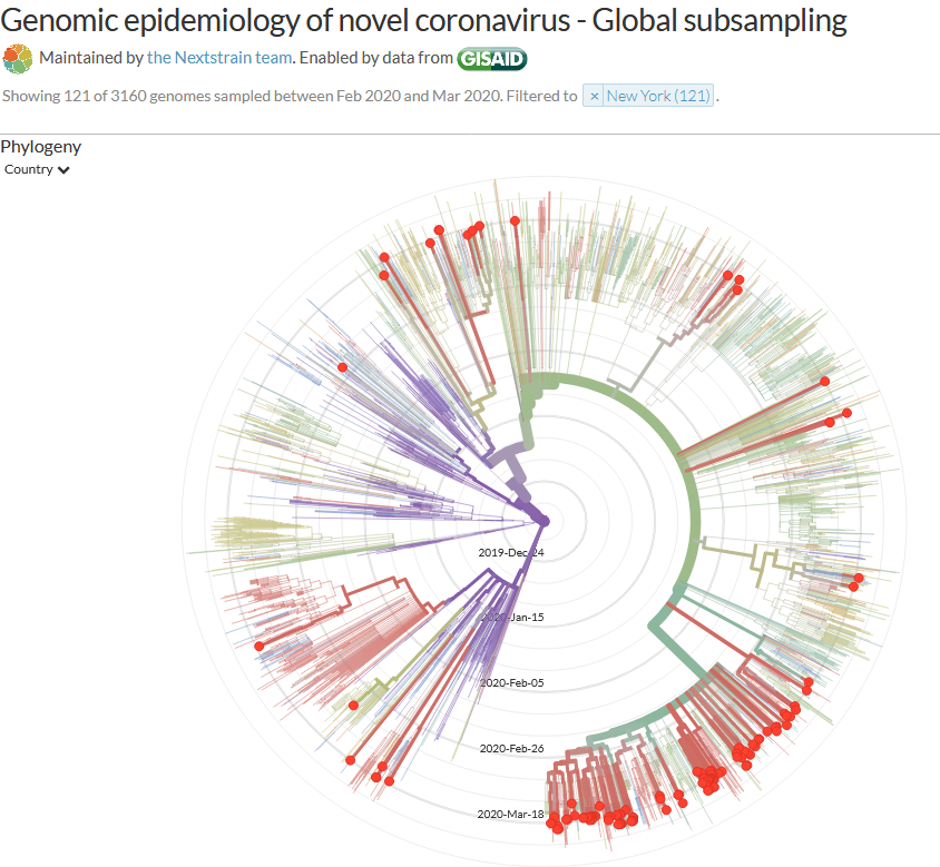
Great story in @nytimes about how #COVID19 spread to NY, based on genomes posted by @AdrianaHeguy @VivianaSimonLab & others to @GISAID. @nextstrain maintains fabulous visualizations of these data. Thought I& #39;d post a few to illustrate the story. https://www.nytimes.com/2020/04/08/science/new-york-coronavirus-cases-europe-genomes.html?action=click&module=Spotlight&pgtype=Homepage">https://www.nytimes.com/2020/04/0...
Viruses mutate a little bit all the time, not in a clinically meaningful way, but enough so that researchers can build a "family tree" of parent strains and their children. If you know where each one was isolated, you can estimate how the virus has traveled in space over time.
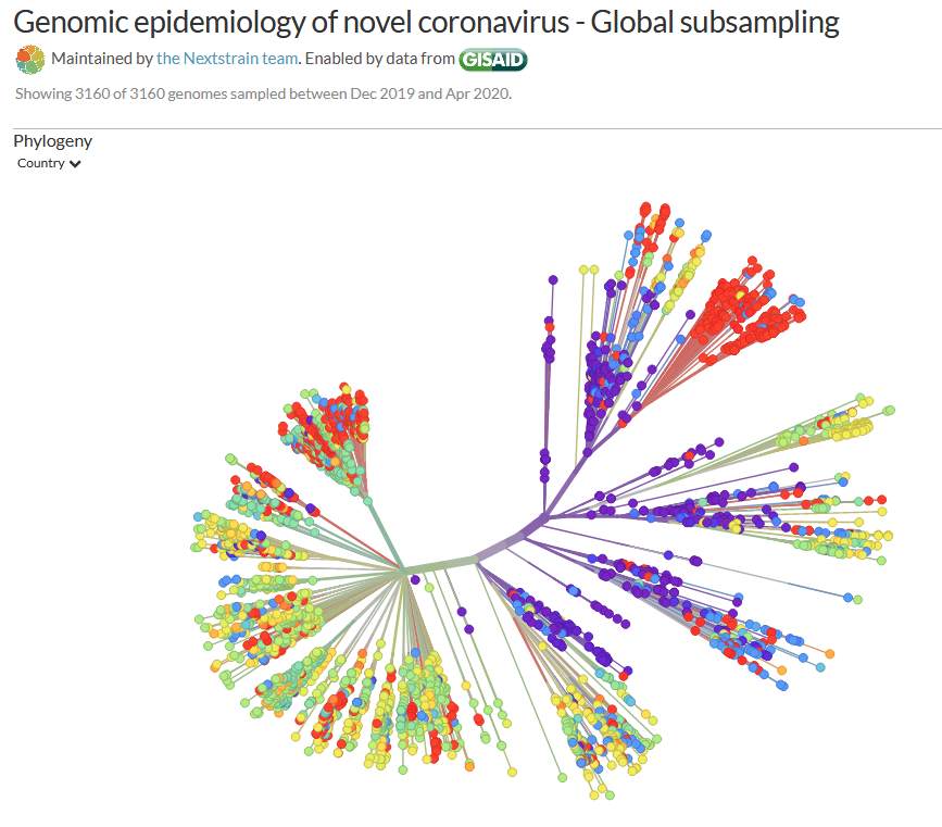
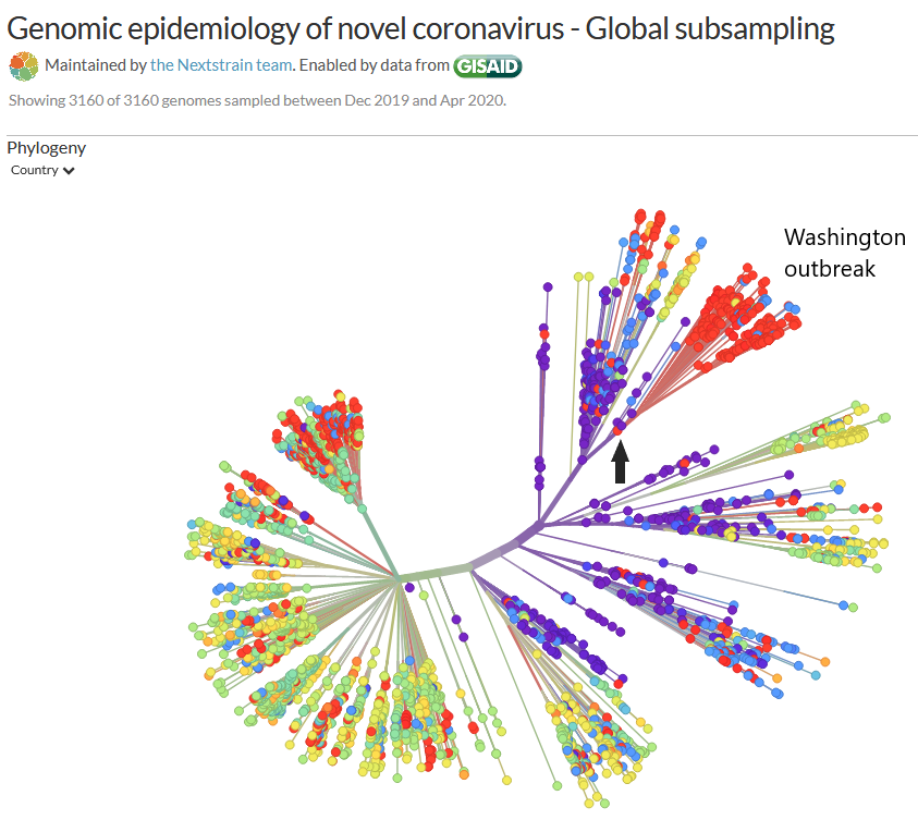
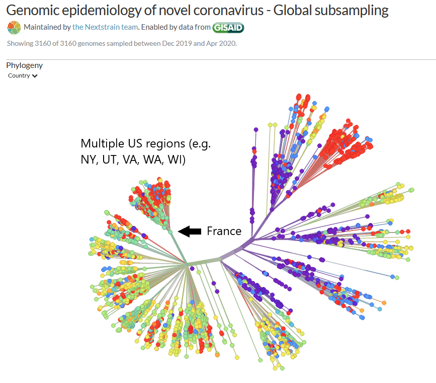
Here& #39;s a view that I find particularly easy to see the US pattern in. The color of the dot represents where the sample was isolated. Purple is mostly China, red is North America (mostly US), aqua/yellow are countries in Europe. Dots further to the edge are newer descendents.
The big cluster of red dots at the top right are the Washington state outbreak, descended from the first Washington case (black arrow), who in turn came from China.
But look at that cluster of red on the left. They came from an aqua line, which originated in France. And those patients? They are all over the US.
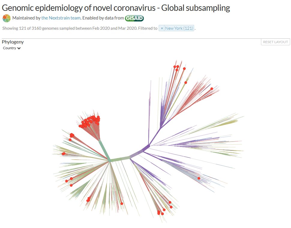
More fun with data: here are the samples sent from New York. They originate from all over! But most of those red dots are on the Europe side of the graphic.
Here is a radial view of NY cases that is organized by time. That purple dot in the center is the virus in Wuhan. Each concentric circle outward is another week. You can see by when the related viruses start to diverge from each other that it was likely spreading in NY in Feb.
You can have fun with your own data visualizations here: https://nextstrain.org/ncov/global ">https://nextstrain.org/ncov/glob... Thanks, @nextstrain! (And apologies to the real scientists if I have misstated anything.) Also, I can& #39;t find the preprints online but if anyone has them, please add.

 Read on Twitter