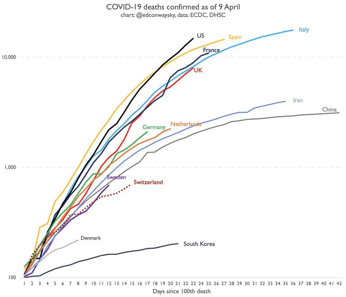
Following @DominicRaab& #39;s announcement that UK #COVID19 death toll has reached 7,978, here’s today’s update on trajectories
- UK line now within a whisker of overtaking Italy
- Eg at this stage in their outbreak Italian deaths were rising less quickly than in UK
- UK line now within a whisker of overtaking Italy
- Eg at this stage in their outbreak Italian deaths were rising less quickly than in UK
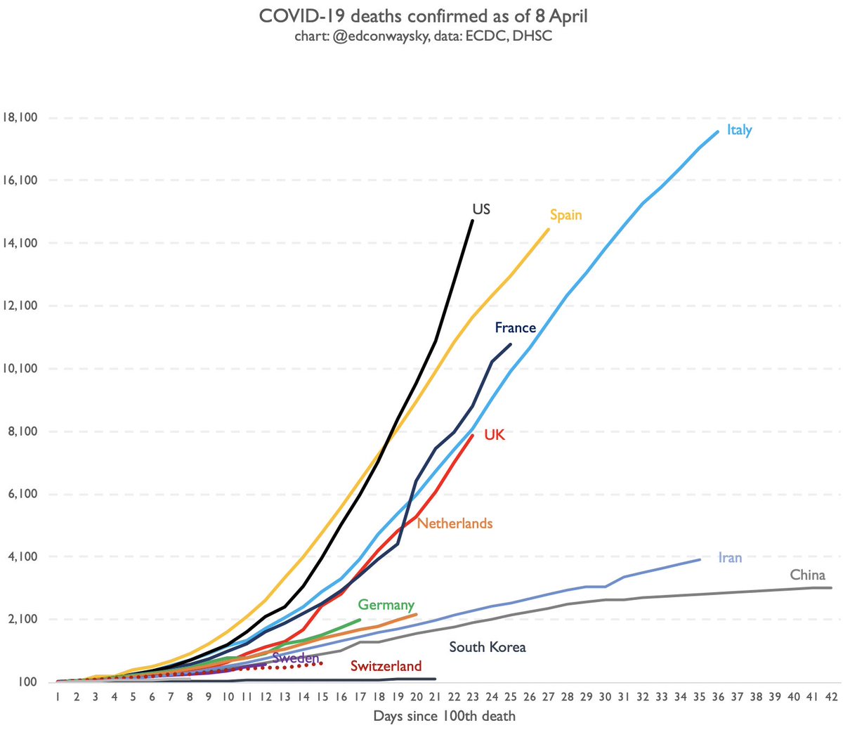
The axis in my charts is logarithmic. Why? Because this disease, and sadly its deaths, tend to spread exponentially. That means small differences in growth rates mean big differences in eventual impact. Explainer: ">https://youtu.be/GEzVVXjTP... And here& #39;s the same chart w/ normal axis:
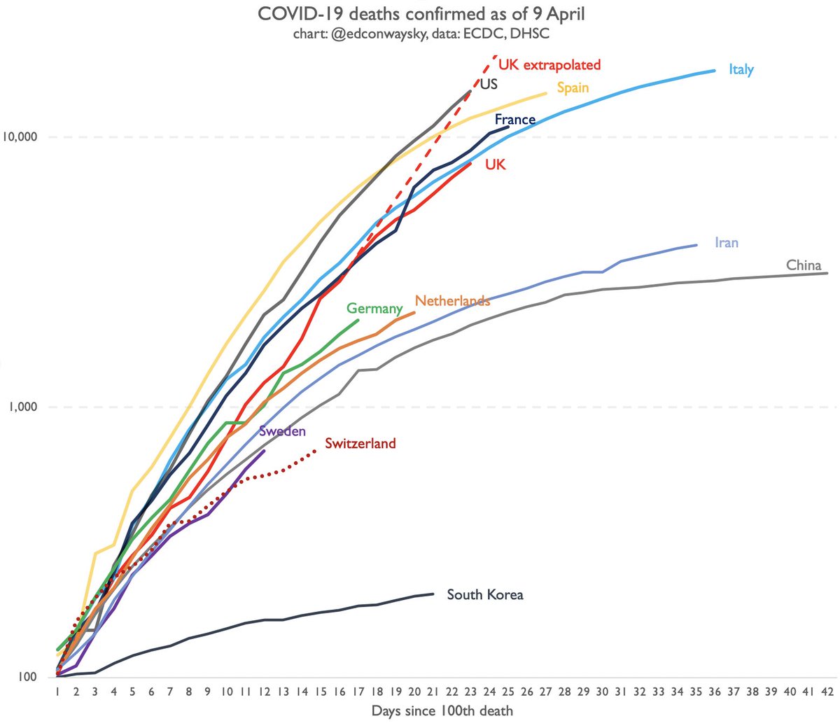
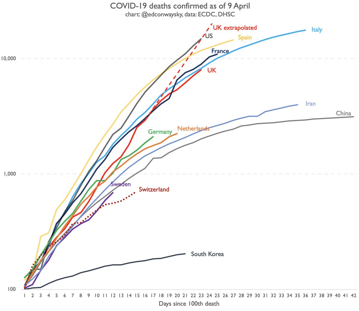
For anyone sceptical that the line is flattening, please look at this chart. A week ago 7 day avg growth in UK #COVID19 deaths was running at 26%. Today the 7 day avg is 16%.
This chart extrapolates what would& #39;ve happened to UK deaths had last week& #39;s growth rate continued
This chart extrapolates what would& #39;ve happened to UK deaths had last week& #39;s growth rate continued
Flattening:
It does NOT mean UK outbreak has peaked. It hasn’t.
It does NOT mean deaths aren’t still rising. They are & the numbers are horrible.
But it DOES mean the speed at which the deaths are increasing has slowed.
That& #39;s important: suggests lockdown measures MAY be working.
It does NOT mean UK outbreak has peaked. It hasn’t.
It does NOT mean deaths aren’t still rising. They are & the numbers are horrible.
But it DOES mean the speed at which the deaths are increasing has slowed.
That& #39;s important: suggests lockdown measures MAY be working.

 Read on Twitter


