hola amigos, professor gato here
today& #39;s topic: have the unprecedented quarantines, lockdowns, and closures across the globe shown efficacy in stopping COV?
the short answer seems to be "no".
it& #39;s a great story, but it seems to fall apart when approached with actual data.
today& #39;s topic: have the unprecedented quarantines, lockdowns, and closures across the globe shown efficacy in stopping COV?
the short answer seems to be "no".
it& #39;s a great story, but it seems to fall apart when approached with actual data.
basic concept: correlation is not causality.
just because two things are correlated implies no causal link. it could be random. they could also both be caused by a third factor.
shredded couches and red eyes may correlate.
but neither causes the other. cats cause both.
just because two things are correlated implies no causal link. it could be random. they could also both be caused by a third factor.
shredded couches and red eyes may correlate.
but neither causes the other. cats cause both.
BUT: we can flip this around.
if we see no correlation, we can cast quite a lot of doubt on causality, even if it is swamped by another factor.
you may not be able to stop a car rolling down a hill by pushing. but you might slow it down.
this would show up in data.
if we see no correlation, we can cast quite a lot of doubt on causality, even if it is swamped by another factor.
you may not be able to stop a car rolling down a hill by pushing. but you might slow it down.
this would show up in data.
alternately, it might not slow down at all. this would be a sign you got run over for nothing. the crash at the bottom of the hill was just as bad
but what if you pushing the car actually made the crash worse?
that would cast serious doubt on what you did
let& #39;s explore:
but what if you pushing the car actually made the crash worse?
that would cast serious doubt on what you did
let& #39;s explore:
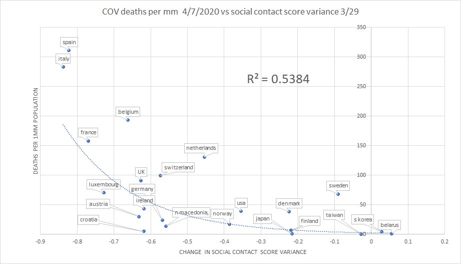
i took these countries and calculated the variance in their social contact score.
this is an estimated value that i created by averaging the change in time at work, retail and recreation (inc bars, rests etc), in grocery, on public transit, and in parks.
i wanted one value.
this is an estimated value that i created by averaging the change in time at work, retail and recreation (inc bars, rests etc), in grocery, on public transit, and in parks.
i wanted one value.
the data is from google who tracked user cell phone locations. this seems like the best truth standard available and avoids having to argue about whether the policies in X are more or less restrictive than in Y and whether people followed them.
this is what they actually did.
this is what they actually did.
so what does it show us? it shows a negative correlation.
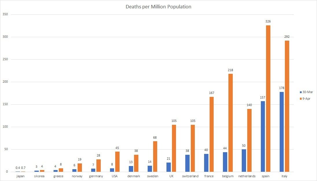
in general, those countries that reacted in the most restrictive fashion on 3/29 saw the worst car crashes on 4/7.
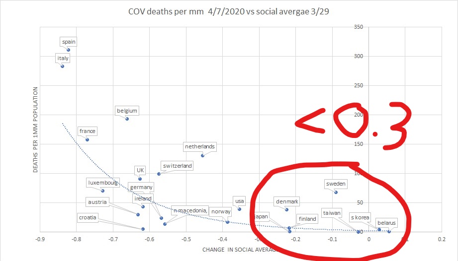
the least restrictive group fared far better than avg and that the most restrictive group.
in general, those countries that reacted in the most restrictive fashion on 3/29 saw the worst car crashes on 4/7.
the least restrictive group fared far better than avg and that the most restrictive group.
we see lots of signs of non correlation as well
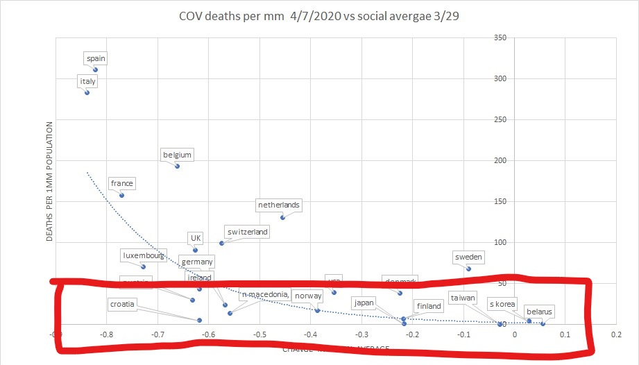
look at the low deaths box. it spans a wide range of lockdown
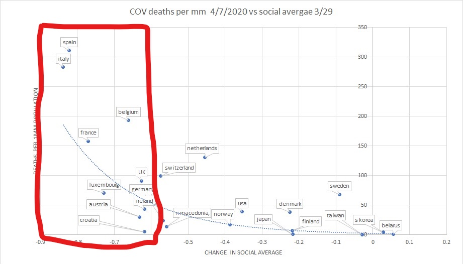
looks at the high lockdown box, it spans a massive range of deaths
this is how you can eyeball crummy correlation.
this data does not have a ton of signal. r2=0.53.
look at the low deaths box. it spans a wide range of lockdown
looks at the high lockdown box, it spans a massive range of deaths
this is how you can eyeball crummy correlation.
this data does not have a ton of signal. r2=0.53.
we can pull out all sorts of provocative comparisons.
most notable is how well many asian nations performed despite not closing their economies/social spheres
this may bolster the "masks work" thesis and recommend their use instead of shutdowns but it could show lots of things
most notable is how well many asian nations performed despite not closing their economies/social spheres
this may bolster the "masks work" thesis and recommend their use instead of shutdowns but it could show lots of things
we can compare sweden and norway and say it proves quarantine works
but then we can compare netherlands and belguim and argue the opposite
we could then look at deaths by day and see the swedish and dutch curves flattening the same way
this bowl of cherries is ripe for picking
but then we can compare netherlands and belguim and argue the opposite
we could then look at deaths by day and see the swedish and dutch curves flattening the same way
this bowl of cherries is ripe for picking
which is why i& #39;m trying to stick to overall impressions vs contrived comparisons
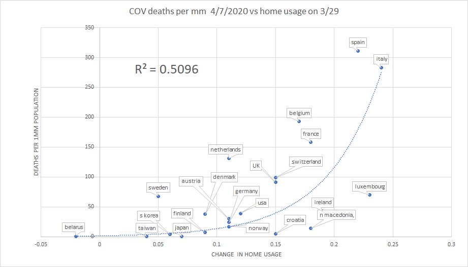
there is another provocative value here: time spent at home.
i did not include it in the social score because home hours are large so % changes are smaller and i did not want it swamped by grocery
there is another provocative value here: time spent at home.
i did not include it in the social score because home hours are large so % changes are smaller and i did not want it swamped by grocery
it looks A LOT like the social score. even the R2 is very similar. and we see the same relationship emerge: more time at home correlated (loosely) to greater deaths per million but we see lots of signs that it is not the dominant factor.
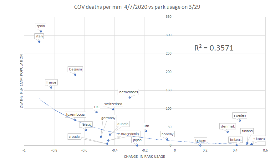
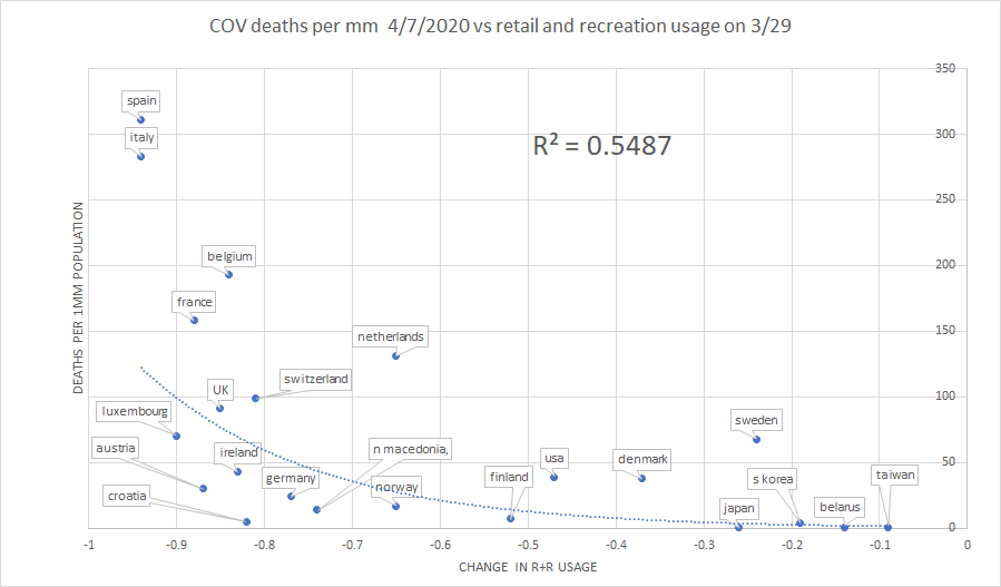
we see this same trend in the individual series as well.
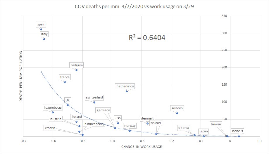
the strongest inverse relationship seems to be "going to work" at r2=0.64. this is actually getting into a range where it starts to warrant being taken more seriously.
the strongest inverse relationship seems to be "going to work" at r2=0.64. this is actually getting into a range where it starts to warrant being taken more seriously.
it& #39;s also deeply problematic for the idea that offices need to be closed to stop COV deaths. the evidence seems to show the opposite.
this is a damning indictment of the policies of most of the west. they just are not working. they may be counterproductive.
costs are vast.
this is a damning indictment of the policies of most of the west. they just are not working. they may be counterproductive.
costs are vast.
to go back to the earlier analogy: not only are we getting run over by the car trying to stop it from rolling down the hill, but it looks like we& #39;ve made the crash worse by doing so
did we just adopt the most expensive policy in human history to find that it& #39;s counterproductive?
did we just adopt the most expensive policy in human history to find that it& #39;s counterproductive?
it certainly starts to look that way.
it looks like instead of buying a very expensive bilge pump, we blew our entire savings paying a guy to , at best, do nothing, and quite possibly to drill holes in the bottom of the boat.
not good. not good at all.
it looks like instead of buying a very expensive bilge pump, we blew our entire savings paying a guy to , at best, do nothing, and quite possibly to drill holes in the bottom of the boat.
not good. not good at all.
some comments on the choices and limitations here:
1. i used the most objective behavior data i could find (google). i used 3/29 because that& #39;s what was posted and it sets a past baseline for behavior.
2. i used current deaths per mm from woldometer
1. i used the most objective behavior data i could find (google). i used 3/29 because that& #39;s what was posted and it sets a past baseline for behavior.
2. i used current deaths per mm from woldometer
3. i chose deaths vs cases because cases seem far too dependent on the number of tests per million and that number varies widely while testing of deaths is pretty universal.
4. yes, deaths may lag and this may change. but, provocatively, curves are flattening all over.
4. yes, deaths may lag and this may change. but, provocatively, curves are flattening all over.
and they seem to be doing so without regard to social score variance. i suspect this result will hold, but only time will tell for sure.
5. there seem to be some interesting outliers. sweden seems to have a higher death rate due to very high death rates among somali refugees.
5. there seem to be some interesting outliers. sweden seems to have a higher death rate due to very high death rates among somali refugees.
the netherlands, while still high, really outperformed neighboring belgium and over the last 10 days, while everyone has seen a rise, relative position has changed little.
6. this does not prove causality. 100 things could be driving this relationship and we& #39;re not even clear on direction. does work help deaths or do mild cases increase work?

 Read on Twitter

