1/ I’m more of a consumer than a producer on Twitter. On occasion I’ll chime in when I (rarely) have something funny to add or when I’m frustrated (common) at the narrative of the day. The following thread is neither. This time, I& #39;m here to help identify flawed data analysis...
2/ Unavoidable Limitations of the #COVID-19 data...
A month ago, I shared an Oct 2018 BBC article on the history of the Spanish Flu. One of the key findings was that death rates varied widely around the globe. For example, Asians were 30x more likely to die than Europeans.
A month ago, I shared an Oct 2018 BBC article on the history of the Spanish Flu. One of the key findings was that death rates varied widely around the globe. For example, Asians were 30x more likely to die than Europeans.
3/ Here’s the the BBC article “The Flu that Transformed the 20th Century: https://www.bbc.com/future/article/20181016-the-flu-that-transformed-the-20th-century">https://www.bbc.com/future/ar...
4/ For a couple weeks, people were declaring that the US was following Italy’s path. There was a monumental flaw in that data analysis which I will get to in a minute. But setting aside the analysis, there was no reason to believe we would follow any other country’s path.
5/ The Italy-Path theory was based on raw data counts and the growth rate of that data. Here’s why that was flawed. Assume a fixed amount of 10% of the population was infected and you test daily at an increasing rate. The raw counts will also accelerate.
6/ I’m not suggesting the US infection rate was fixed. I’m simply illustrating that we don’t know anything about the true infection rate by simply looking at the raw data counts. Because that is what was happening.
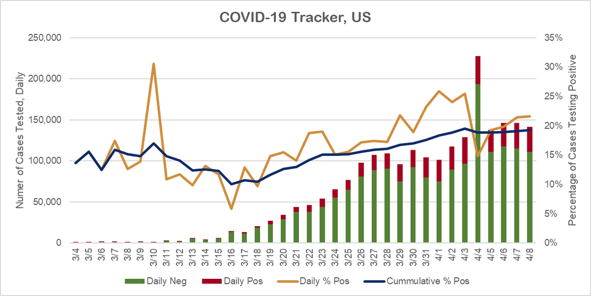
7/ Below is one of the charts we watch internally. Notice the bars show an acceleration in testing in the US from 3/15-3/27. Green = negative results, red = positive, unresolved or pending excluded.
8/ Using a very simple transformation, we track the percentage of cases testing positive each day and over time. These are shown in the blue and gold lines.
This transformation adjusts for the acceleration in tests… but it is still flawed.
This transformation adjusts for the acceleration in tests… but it is still flawed.
9/ It is flawed because the US is only testing symptomatic cases. An acceleration in daily positives could indicate the virus is spreading. But it could also indicate we are getting better at pre-screening candidates for testing.
10/ This is the point – we are guessing. According to the NY Post, these are the actual words of Dr. Fauci. And according to Nobel Prize winning Economist Danny Kahneman, even experts do a poor job of guessing. https://nypost.com/2020/04/08/how-us-bureaucrats-deepened-the-coronavirus-crisis-to-deadly-effect/">https://nypost.com/2020/04/0...
11/ As long as we don’t know the true extent of the virus, leaders are going to remain paralyzed by fear. It is, after all, an election year and the opposition is surely waiting to pounce on any/every misstep.
12/ Broad scale, randomized testing is the only way out of this mess – or a government with a war-time mentality that is willing to risk a life in order to protect a way of life.
End thread.
End thread.

 Read on Twitter


