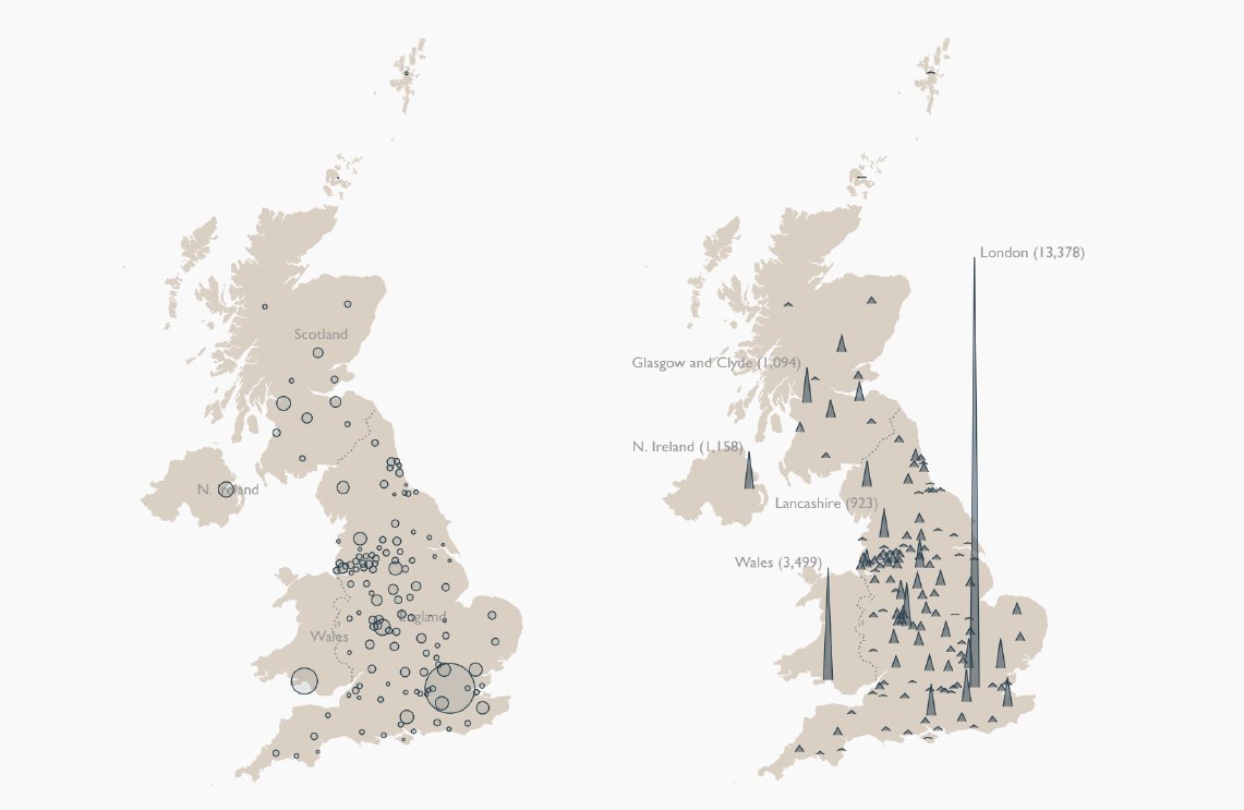
Yesterday we switched our symbol map of coronavirus cases in the UK to a ridge map. This was for two key reasons:
1) the number of cases meant the circles were beginning to overlap making areas – and crucially peaks – difficult to see
2) it allowed us to label noteworthy areas
1) the number of cases meant the circles were beginning to overlap making areas – and crucially peaks – difficult to see
2) it allowed us to label noteworthy areas
We toyed with the idea of plotting cases per capita. This would have helped broaden the focus from London to other areas of concern, but part part of the story is the crowded nature of cities. It comes down to whether you want to show the spread (total) or the effect (per capita)
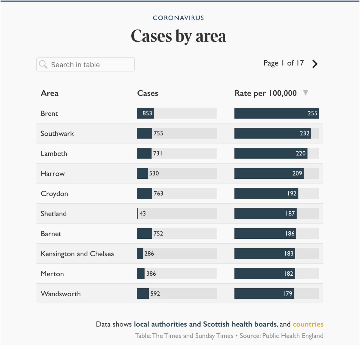
Our solution? Run both. We now have the ridge map showing actual numbers and a searchable table with totals + cases per 100k. As well as the overall picture, this allows readers to see the strain on local services in areas they care about and unexpected hotspots like Shetland
When the map is animated, you can now clearly see how London& #39;s case count dwarfs the rest of the country.
The shape of the UK means the data-off-the-chart issues @LazaroGamio had with with the NYT& #39;s brilliant US version are hopefully a while away yet... https://twitter.com/LazaroGamio/status/1247511346201198593">https://twitter.com/LazaroGam...
The shape of the UK means the data-off-the-chart issues @LazaroGamio had with with the NYT& #39;s brilliant US version are hopefully a while away yet... https://twitter.com/LazaroGamio/status/1247511346201198593">https://twitter.com/LazaroGam...
You can see live versions of all these charts in our UK tracker which is updated daily by @ryanleewatts @Dan_Clark5 & @TomCalver2. This thread is just one example of the thought, discussion and time that goes into improving the dataviz in it every day  https://abs.twimg.com/emoji/v2/... draggable="false" alt="📈" title="Chart with upwards trend" aria-label="Emoji: Chart with upwards trend"> https://www.thetimes.co.uk/article/tracking-coronavirus-in-the-uk-maps-show-how-the-disease-has-spread-2w05d0rwl">https://www.thetimes.co.uk/article/t...

 Read on Twitter


