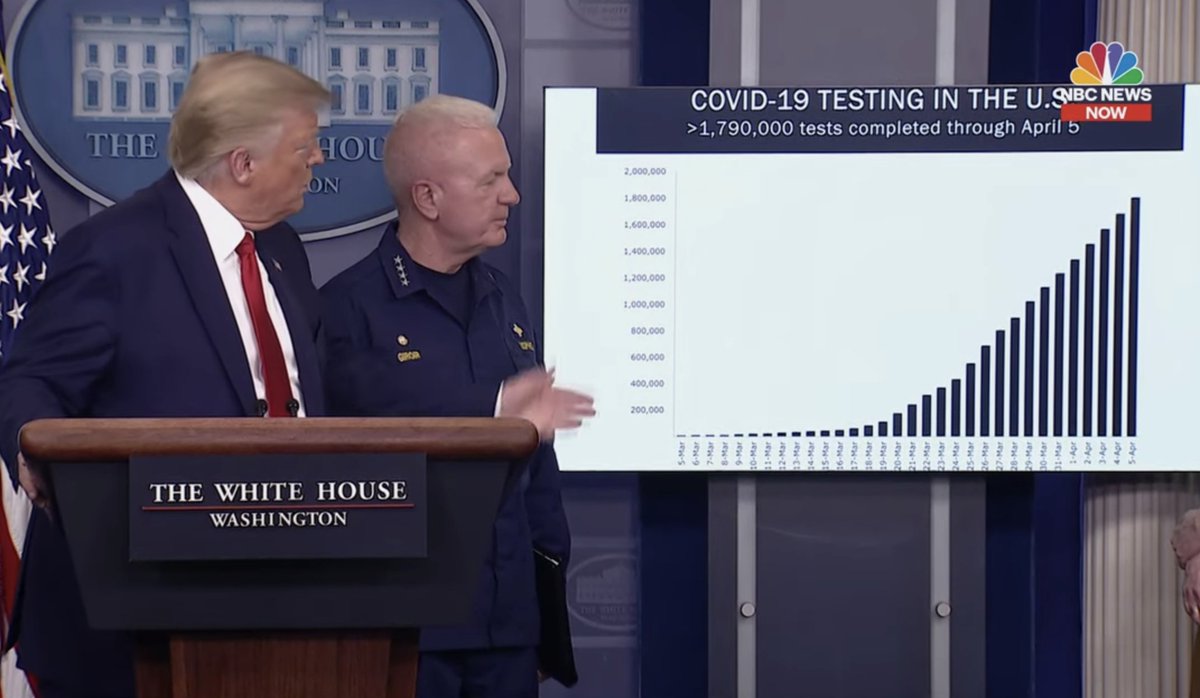
Here& #39;s a remarkable example of a misleading visualization from the 4/6 White House press conference.
They are using a bar chart to show *cumulative* tests run.
Looks impressive, but that linear increase means capacity is not improving!
https://www.youtube.com/watch?time_continue=338&v=nlJo_9LQ9Lg&feature=emb_logo
h/t">https://www.youtube.com/watch... @markjaggers
They are using a bar chart to show *cumulative* tests run.
Looks impressive, but that linear increase means capacity is not improving!
https://www.youtube.com/watch?time_continue=338&v=nlJo_9LQ9Lg&feature=emb_logo
h/t">https://www.youtube.com/watch... @markjaggers
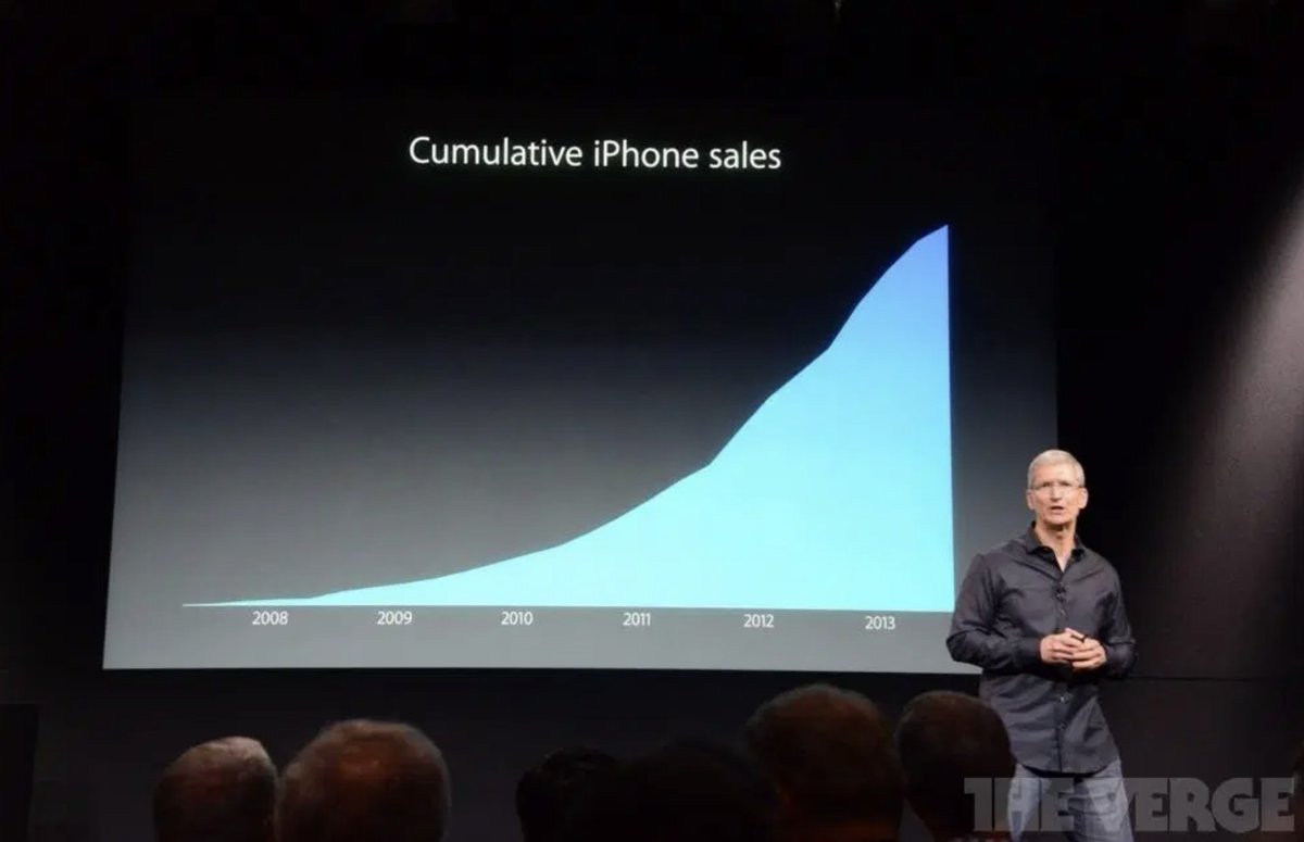
It& #39;s the same trick that Apple CEO Tim Cook used in his infamous presentation. ( See also our video https://youtube.com/watch?v=q94VJ3KToK8&feature=youtu.be&list=PLPnZfvKID1Sje5jWxt-4CSZD7bUI4gSPS
)">https://youtube.com/watch...
https://qz.com/122921/the-chart-tim-cook-doesnt-want-you-to-see/">https://qz.com/122921/th... https://youtube.com/watch...
)">https://youtube.com/watch...
https://qz.com/122921/the-chart-tim-cook-doesnt-want-you-to-see/">https://qz.com/122921/th... https://youtube.com/watch...
A question to the #dataviz community. I& #39;d love some help pinning down a precise explanation of why this is so misleading. Basically, in a filled line graph or a bar chart, the shaded region should correspond to something meaningful.
It does that if you show daily tests or quarterly sales. The shaded area corresponds to total tests or total sales
But if you show cumulative tests or cumulative sales, there are only tortured interpretations of the shaded area.
But if you show cumulative tests or cumulative sales, there are only tortured interpretations of the shaded area.
Important point: this graph doesn& #39;t label the data as cumulative nature in the header or with a y axis label. Truly dreadful design, so bad that it& #39;s hard to stick to our maxim "never attribute to malice what can be explained by sufficient incompetence." https://twitter.com/lpachter/status/1248127545104429062">https://twitter.com/lpachter/...

 Read on Twitter


