Use of care and mortality due to corona in Finland, Sweden, Norway, Denmark, Iceland and Estonia; data from yesterday 8.4 reports. Read the whole thread. (English version)
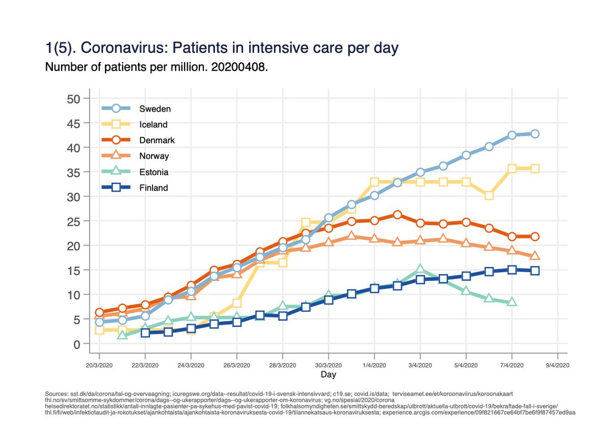
Fig 1. Number of persons in intensive care per day. Measures the burden on intensive care capacity. 1/x
Fig 1. Number of persons in intensive care per day. Measures the burden on intensive care capacity. 1/x
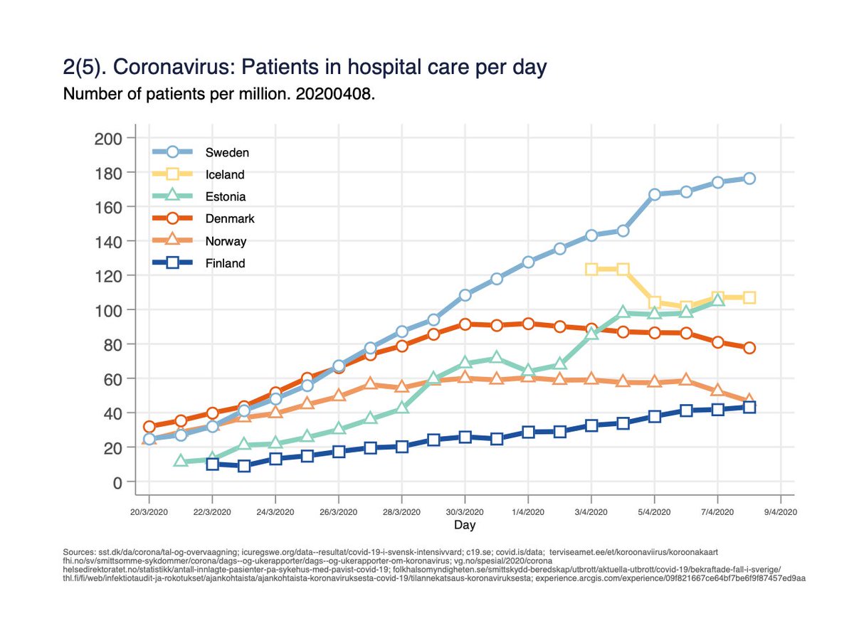
Fig 2. Number of persons in hospital care per day. One person can be counted for several days. Measures the burden on hospital capacity. 2/x
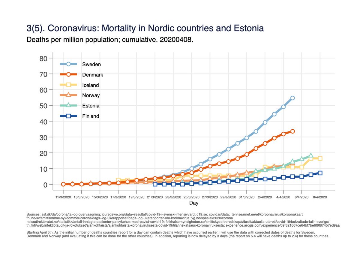
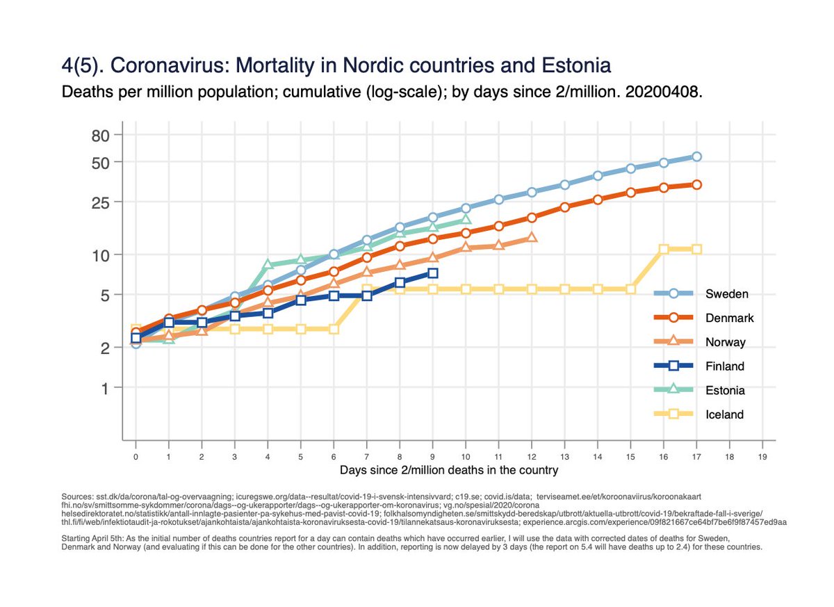
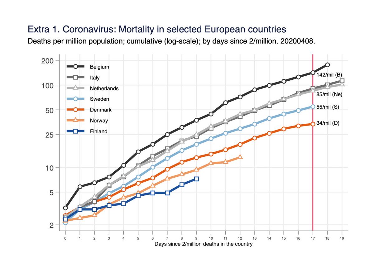
Fig 4. Mortality per million population on log-scale, by days since 2/million deaths in the country. Same data as fig 3, but y-axis helps to understand rate of change, and time-scale unified. 4/x
Fig 5(5). Absolute number of deaths by days since 10th death in the country.
(Attempts to get same starting point/phase of the epidemic for all countries). 5/x
(Attempts to get same starting point/phase of the epidemic for all countries). 5/x
In addition, I wanted to reflect the Nordic countries with selected European; Belgium, Netherlands and Italy (Hopkins data), and illustrate why conclusions on actions countries have taken vs outcomes, are difficult with these data . 6/
Extra figure; mortality per million population (log-scale, by days since 2/million deaths; same as fig 4 except for the new countries). When accounting the time and population, Belgium has highest mortality (even higher than Italy). /7
It is tempting to look at the mortality data from Sweden vs other Nordic cntries and draw conclusions from this. But if one tries to use the same arguments to explain diffs. btw Belgium/Netherlands, Belgium/Swe, and Swe/Netherlands, it does not make any sense at all. Why? /8
This is due to a cognitive bias; confirmation bias: “Tendency to search for, interpret, favor, and recall information in a way that confirms or strengthens one& #39;s prior personal beliefs”. /9
(check wiki, or if fluent in Finnish, read @POhukainen’s :
http://www.tervettaskeptisyytta.net/skeptisen-mielipiteen-muodostaminen-osa-iii-omien-vinoumien-minimointi).">https://www.tervettaskeptisyytta.net/skeptisen...
(check wiki, or if fluent in Finnish, read @POhukainen’s :
http://www.tervettaskeptisyytta.net/skeptisen-mielipiteen-muodostaminen-osa-iii-omien-vinoumien-minimointi).">https://www.tervettaskeptisyytta.net/skeptisen...
To summarise, one can’t read too much into the graphs about diffs in actions the countries have taken vs effects; would be more complicated analysis to do, and will require long follow-up. Just simple monitoring of a complex situation, and hopefully giving some new ideas. 10/10

 Read on Twitter