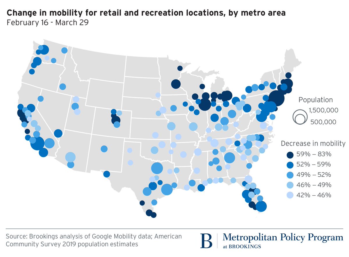
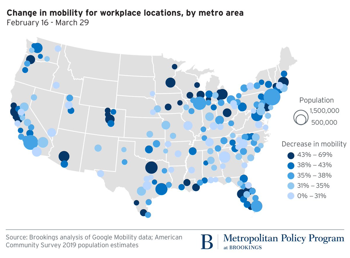
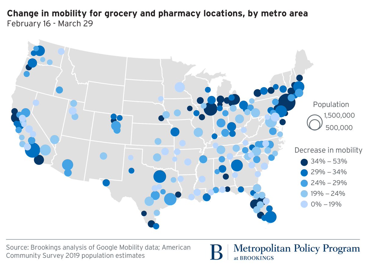
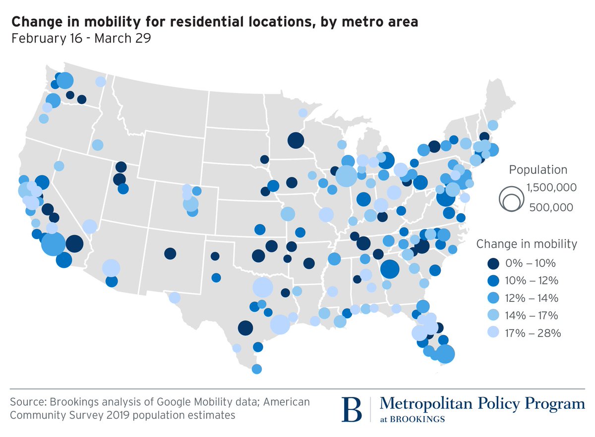
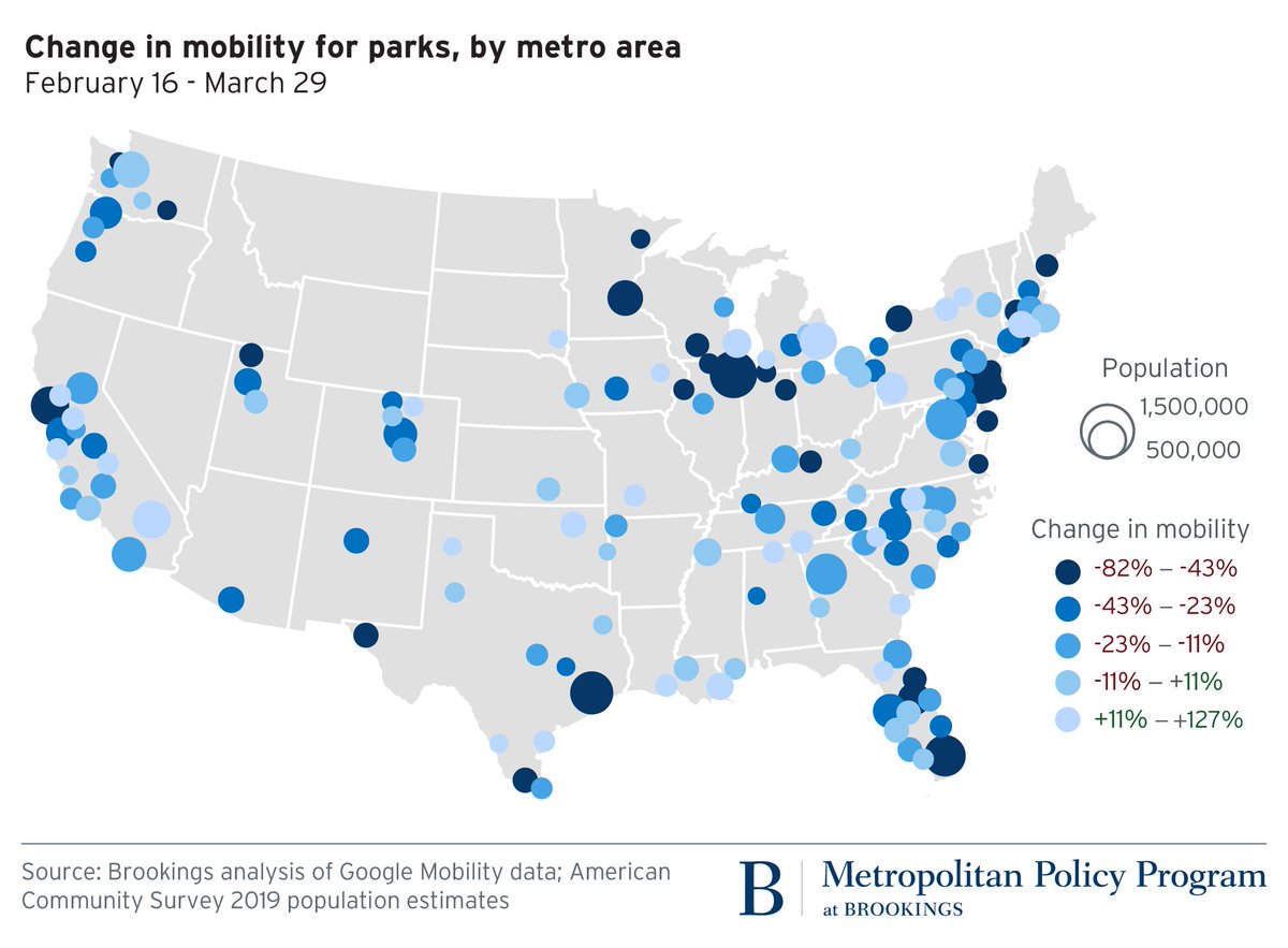
MAP THREAD: A major #COVID19 story is less physical travel in U.S. metro areas. So @larafishbane + I looked at @Google “Community Mobility Reports” to understand what might be happening. TL;DR: Much fewer trips, but patterns are mixed @BrookingsMetro (1/)
Quick technical notes. Google took median trip levels over the Jan3-Feb6 period. The percent’s are trip changes through Mar29. This relies on Location Services data and may not be calibrated to metro areas or U.S. pop. We just don’t know (more at the end) (2/)
Retail/recreation trips -47% across US, which is center of #COVID19 story. Huge drops in Northeast, Great Lakes, Bay Area, Front Range, Parts of FLA. NYC metro had biggest drop (-83%), but every metro dropped at least -40%, showing the retail hit is national (3/)
Workplace trips dropped 38% across US, so we can see more folks are still heading to work. Akron had smallest drop (21%), home of @Purell! Same regions (NorCAL, Great Lakes, FLA) seeing biggest drops, but also major impacts in New Orleans, Phoenix. (4/)
National grocery/pharma trips down 22%, which might seem weird. But we’re still staying away, likely buying more in bulk. Same general map, some anomalies. Minneapolis, Baltimore little drop in trips. But if there was some way to get goods to our houses … (5/)
Trips to US residences UP 12%. Woah. So here’s all our deliveries plus those looping walks through our neighborhoods. (No house parties, right?!) Almost every metro is up, biggest large metro gains in Dallas, Grand Rapids, Phoenix. (6/)
Parks are the most fascinating map since some places are handling it different. Park trips up over 100% in Riverside, Tulsa; down 70% in Chicago and 60% in Philly. The deal? Likely different state and local distancing rules. (7/)
What’s all this mean? Overall, we’re def traveling less. We also modeled income, race, age, and education. They& #39;re significant, but explain little of the difference (AKA, low r^2). Why? Likely all those local industrial conditions and distancing rules we can’t account for. (8/)
But it also tells us something about spatial movement analysis in #COVID19 era: we need neighborhood data. Variation in places like Chicago, for example, show wide variety by race and income. Different lived experiences. County is just too aggregated. (9/)
We’ll paste all this data @BrookingsInst, look out for that link (I’ll add another Tweet to this thread once ready). For now, please spread so other folks can play and explain! @Richard_Florida @JedKolko @emilymbadger @mslaurabliss @Joe_Cortright (10/)
Quick soapbox @Google please don’t release data like this as PDF. We all know it’s tabular/flat on your side. All it does is force people like @vitorbaptista to scape, then researchers can analyze. It’s generous to publish, so might as well make it easier to work with! Thx! (11/)

 Read on Twitter