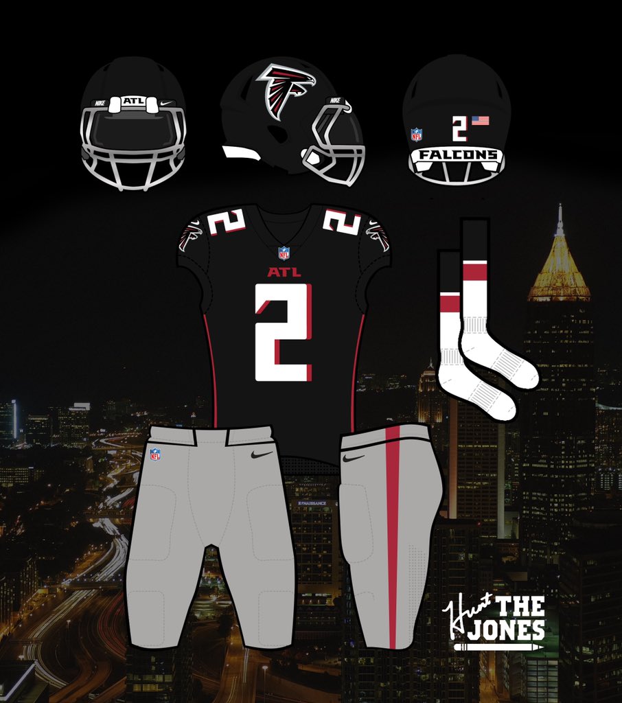
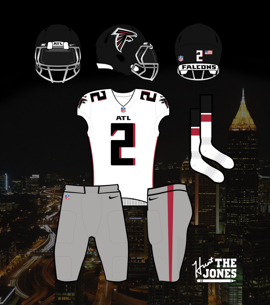
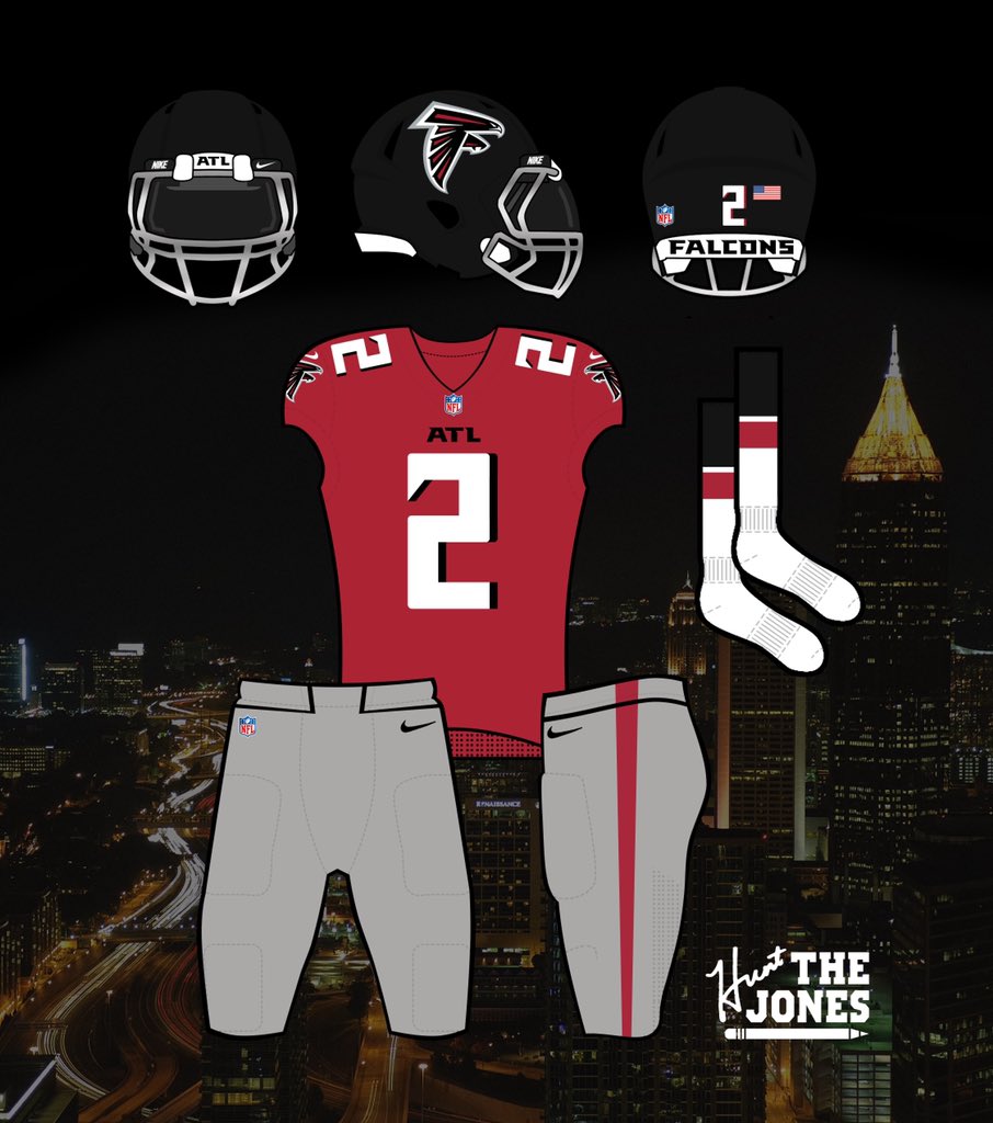
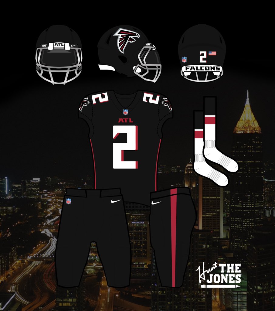
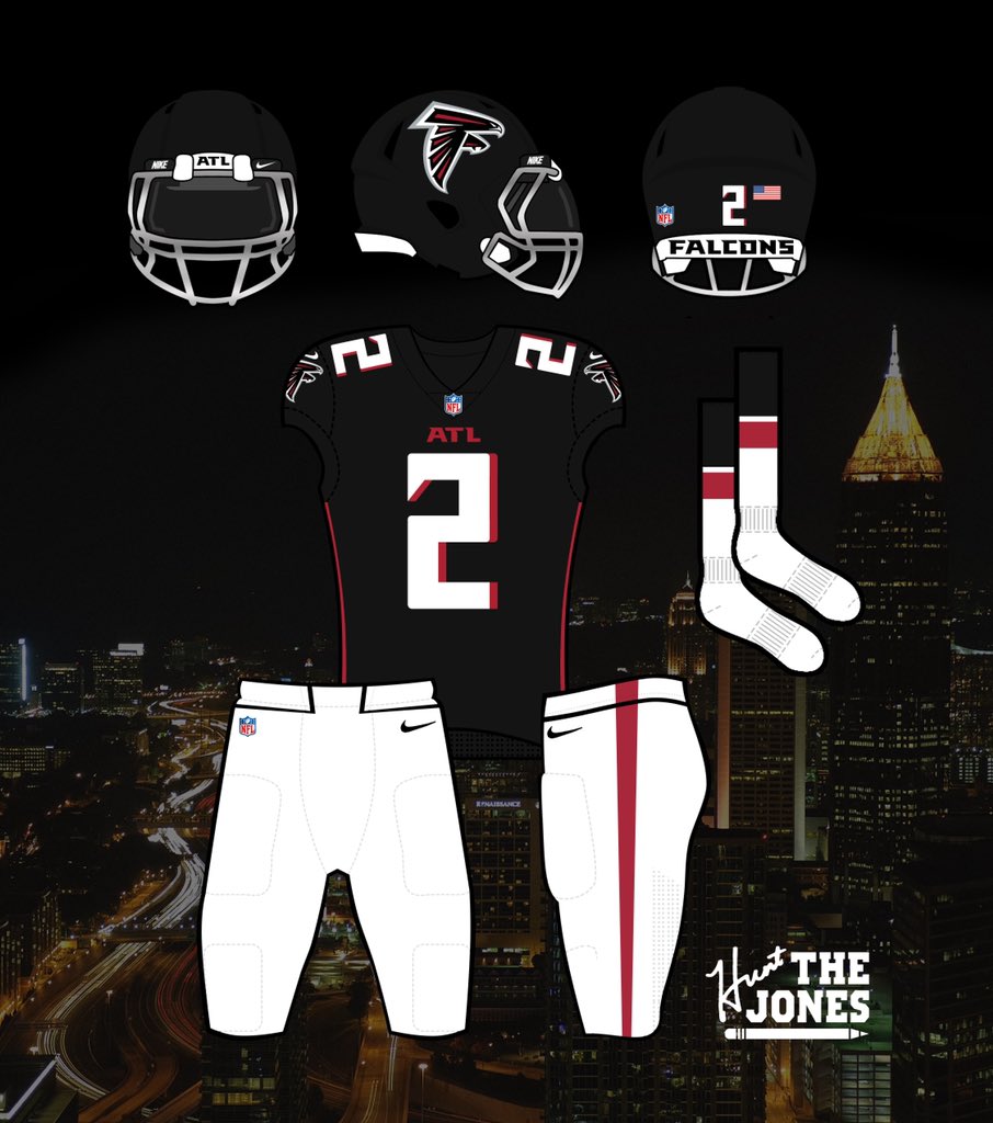
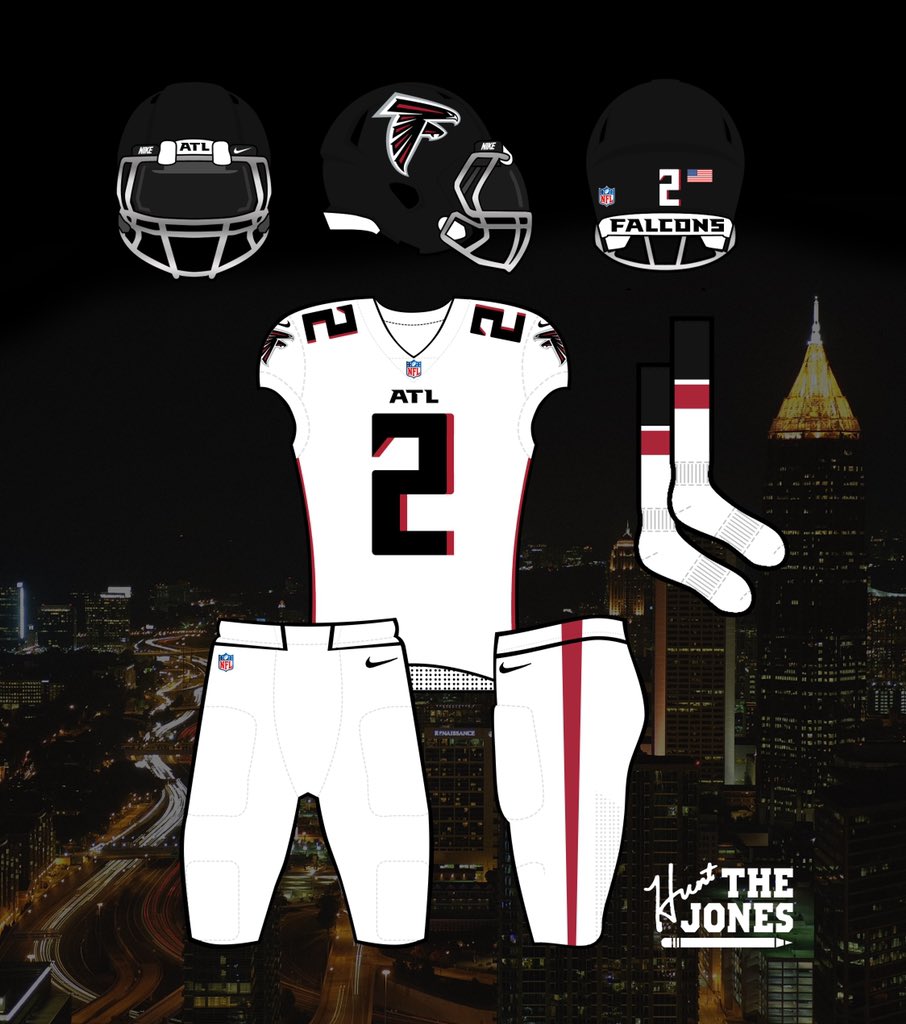
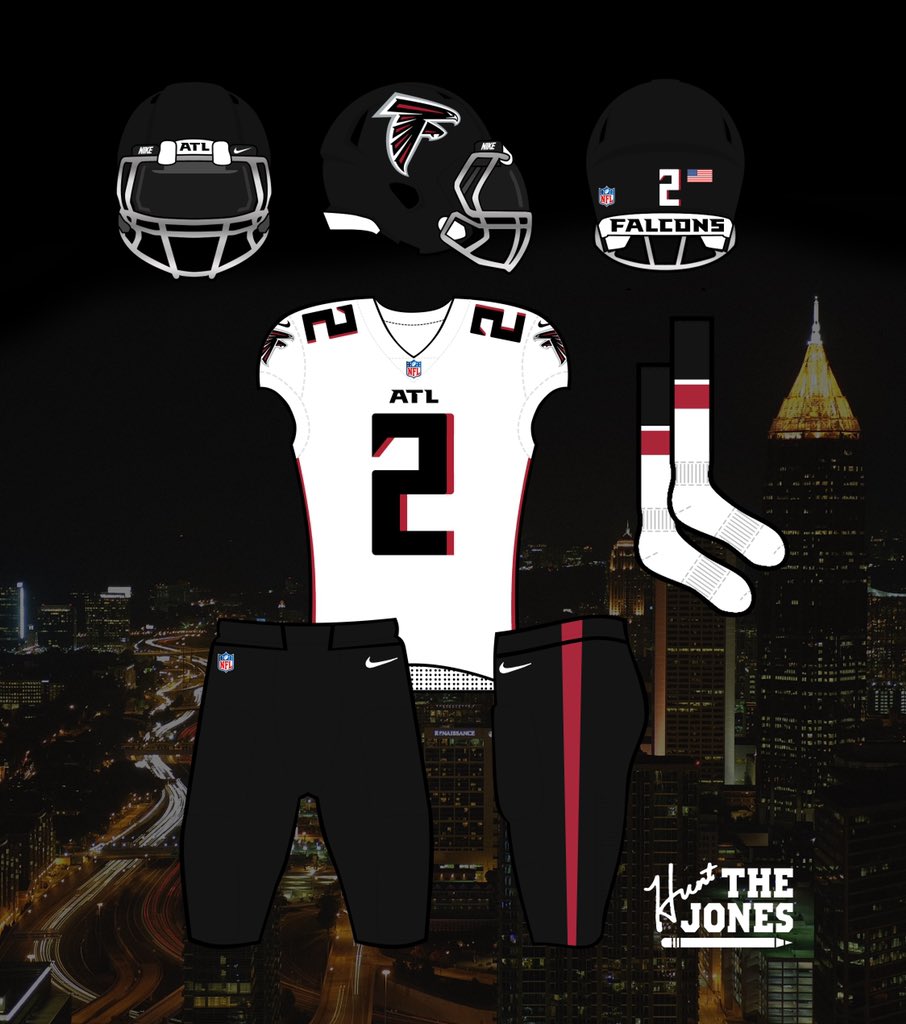
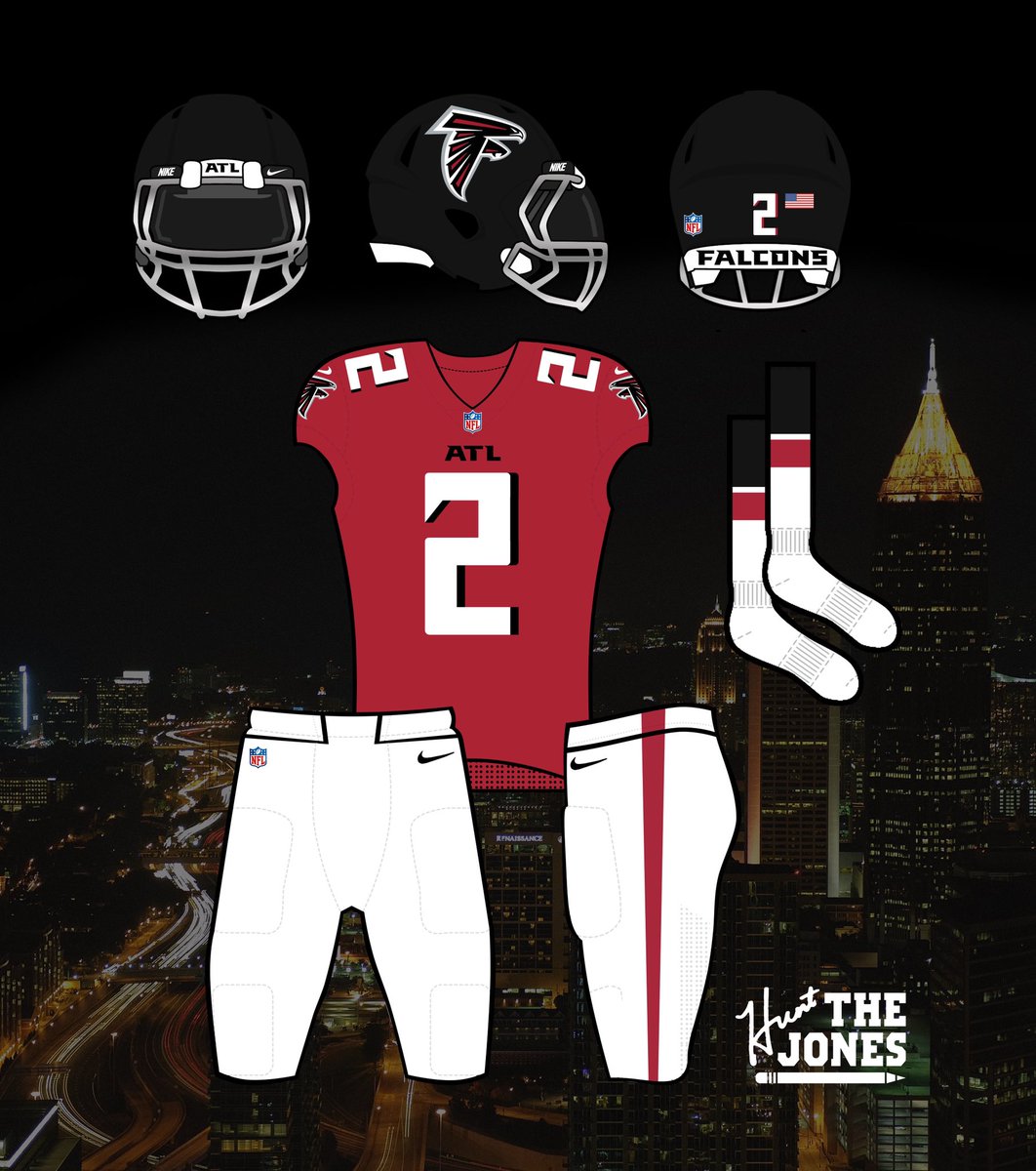
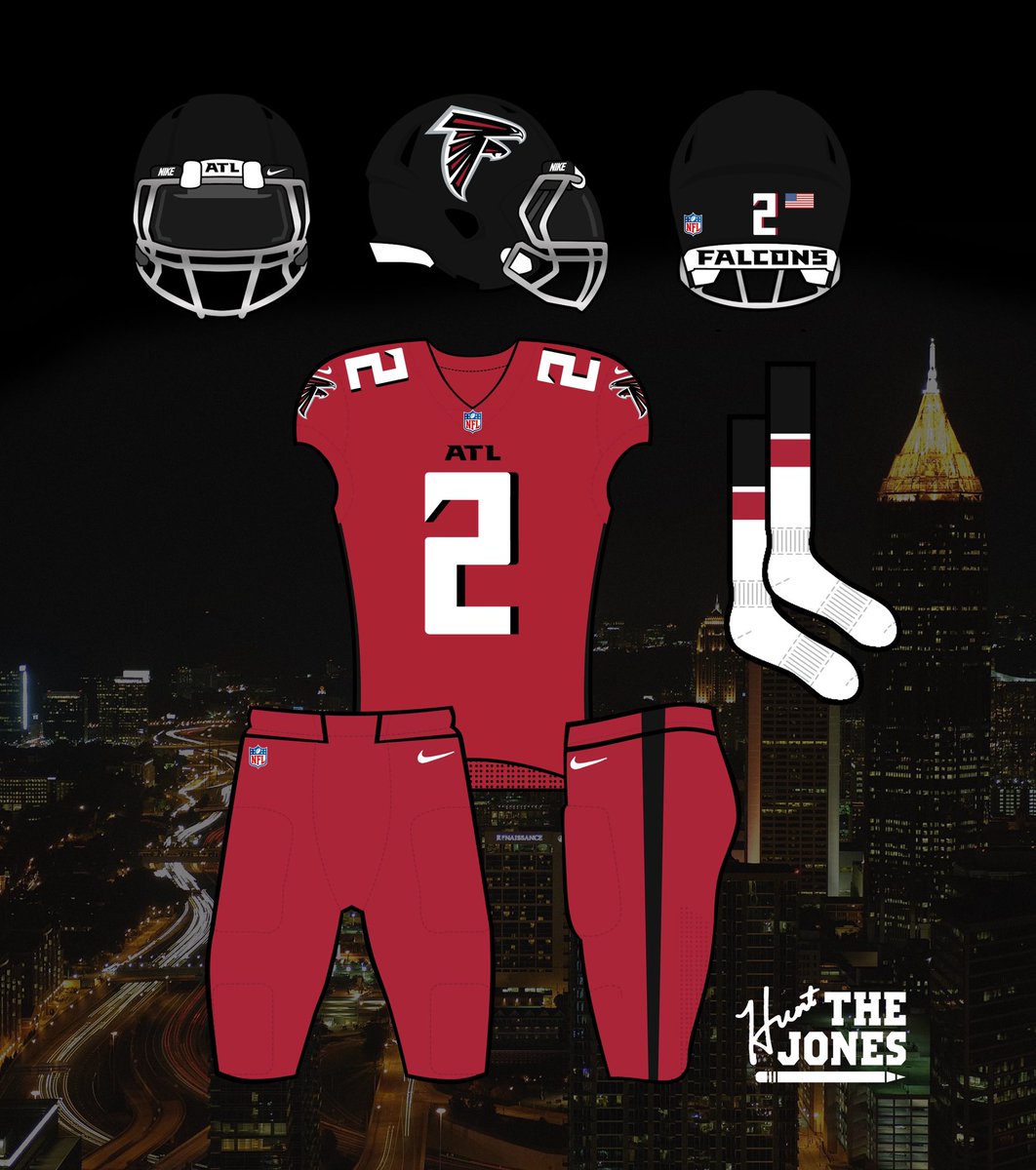
So, @AtlantaFalcons you were only two oversized logos, a really bad gradient, and another set of pants away from nailing it.
I’ll let the chrome mask grow on me, so you need grey somewhere else in the uni. How about the pants.
#Falcons #RiseUp
A thread of combos coming:
I’ll let the chrome mask grow on me, so you need grey somewhere else in the uni. How about the pants.
#Falcons #RiseUp
A thread of combos coming:
The Black Jersey.
It’s actually really good, and a well done modernization of the throwback. Just make the “ATL” smaller on the chest and it’s perfect.
All black looks great, as does black on white. Not much to change with this one.
#Falcons #RiseUp
It’s actually really good, and a well done modernization of the throwback. Just make the “ATL” smaller on the chest and it’s perfect.
All black looks great, as does black on white. Not much to change with this one.
#Falcons #RiseUp

 Read on Twitter