The CMI (continuous mortality investigation) has published its quarterly “Mortality Monitor” report.
By calculating age-standardised mortality rates, this allows us to properly consider how 2020 mortality rates compare to recent years. 1/5
https://www.actuaries.org.uk/system/files/field/document/Mortality%20monitor%20Q1%202020%20v01%202020-04-08.pdf">https://www.actuaries.org.uk/system/fi...
By calculating age-standardised mortality rates, this allows us to properly consider how 2020 mortality rates compare to recent years. 1/5
https://www.actuaries.org.uk/system/files/field/document/Mortality%20monitor%20Q1%202020%20v01%202020-04-08.pdf">https://www.actuaries.org.uk/system/fi...
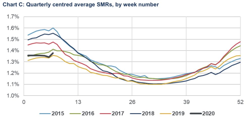
Death rates in the first three months of the year were low, similar to the corresponding period in 2019.
The lines below are rolling averages, which is why the black 2020 line appears to stop early. It does include the most recent ONS data from yesterday. 2/5
The lines below are rolling averages, which is why the black 2020 line appears to stop early. It does include the most recent ONS data from yesterday. 2/5
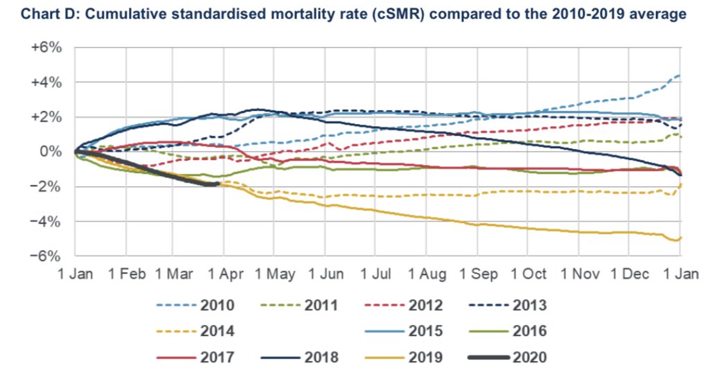
This chart shows the cumulative effect of the light mortality to end March. Death rates are down by around 2% compared to the average of the last decade. 3/5
Clearly this is all before COVID-19 starts to really show up in the data. Even the uptick in the black line in Chart C isn’t entirely due to COVID-19 deaths (it’s partly due to Christmas bank holiday week dropping out of the average). 4/5
This report will be essential to properly understand COVID-19 impacts on death rates.
Hence CMI have committed to publish a version of this every week for the foreseeable future. They are not on Twitter but I will share it. 5/5
Hence CMI have committed to publish a version of this every week for the foreseeable future. They are not on Twitter but I will share it. 5/5

 Read on Twitter


