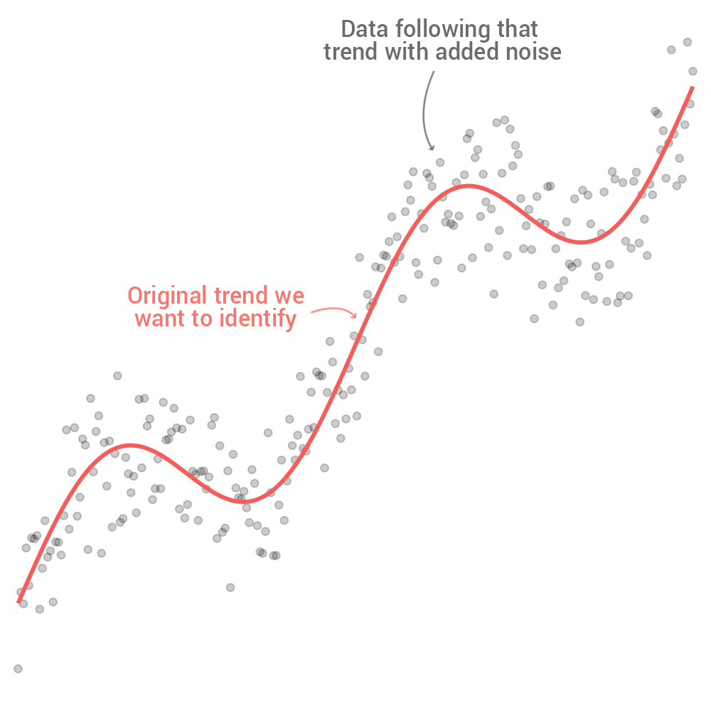
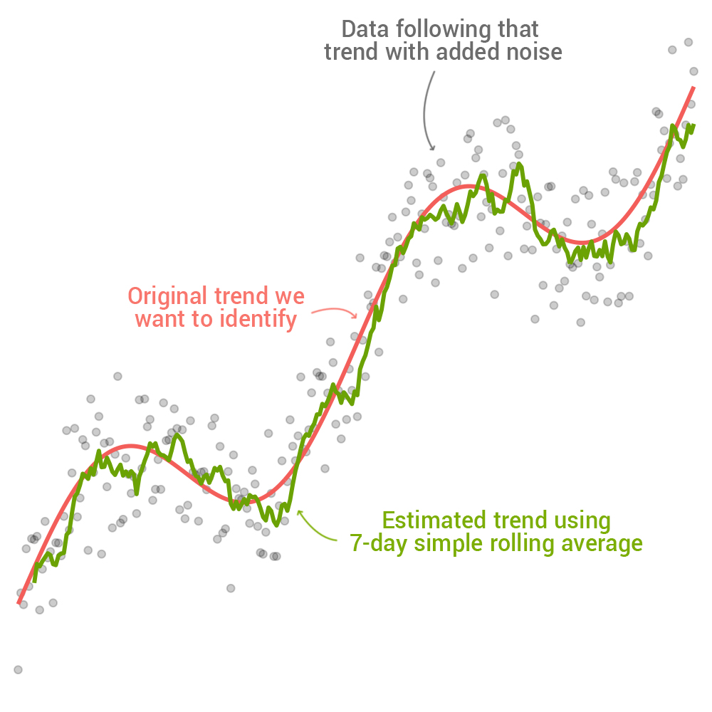
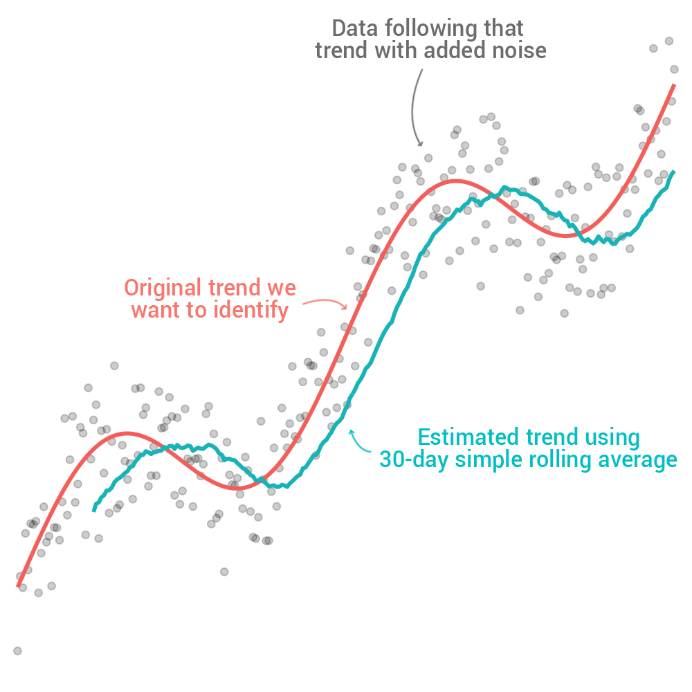
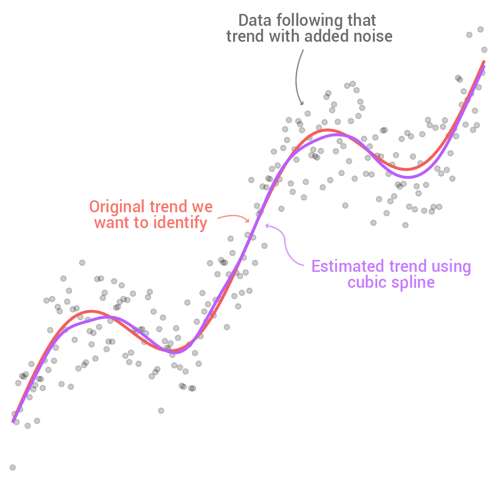
A very interesting thread on how subtle changes can have pretty substantial effects on charts, interpretations, etc.
Great stuff from @jburnmurdoch and @ftdata https://twitter.com/jburnmurdoch/status/1247666977566490626">https://twitter.com/jburnmurd...
Great stuff from @jburnmurdoch and @ftdata https://twitter.com/jburnmurdoch/status/1247666977566490626">https://twitter.com/jburnmurd...

 Read on Twitter


