I love that Stephanie loves my book’s cover bc I LOVE IT SO. And I can answer some (most? All?) of her questions. So: a thread on the cover process for this book. https://twitter.com/grubreport/status/1247725312013553667">https://twitter.com/grubrepor...
Indeed, Elizabeth H. Clark was my designer. And she sent me 4 or 5 rough designs and I got to pick my favorite. There was one of a house, a couple with two kids running hand in hand, and one of a girl standing atop a tortoise shell. All in silhouette, which I just realized.
I loooved the girl standing on the tortoise bc it is such a great metaphor for how Tuck, the tortoise in the book, is really the stepping stone or bridge between Red and the rest of the characters. But in the design I first saw, the sky background was mostly pale blue/orange
To which I said, “that isn’t a Colorado sunset.” Colorado has the most spectacularly colorful sunsets, and I wanted that on the cover. So Elizabeth googled CO sunsets and voila! A cover was born! She worked her magic with stars and wind and general gorgeousness, of course.
Then came lettering. I don’t know why Elizabeth didn’t do the lettering, as I’m sure she could. But I am so so grateful Macmillan hired @Inkymole to do it! Sarah has designed and lettered something like a billion STUNNING covers. Her ink work is  https://abs.twimg.com/emoji/v2/... draggable="false" alt="😍" title="Smiling face with heart-shaped eyes" aria-label="Emoji: Smiling face with heart-shaped eyes">
 https://abs.twimg.com/emoji/v2/... draggable="false" alt="🤩" title="Star-struck" aria-label="Emoji: Star-struck">
 https://abs.twimg.com/emoji/v2/... draggable="false" alt="🤯" title="Exploding head" aria-label="Emoji: Exploding head">
I mean...just peruse her site. So much gorgeous. https://www.inkymole.com"> https://www.inkymole.com
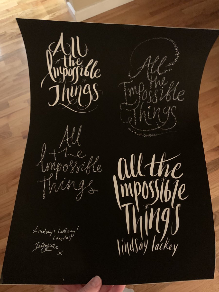
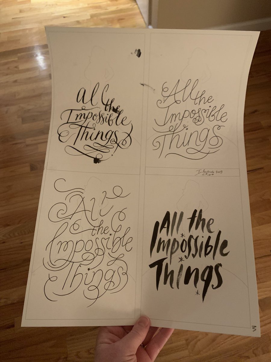
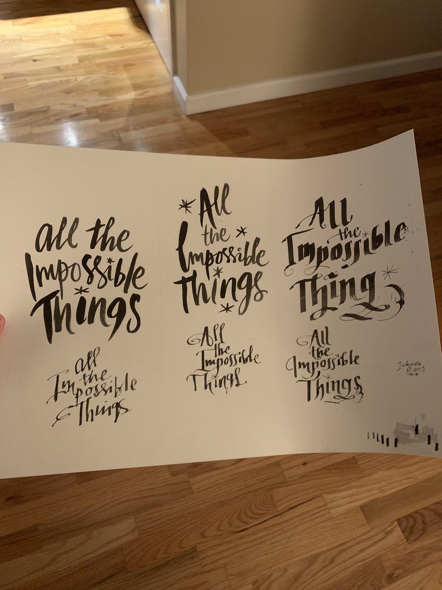
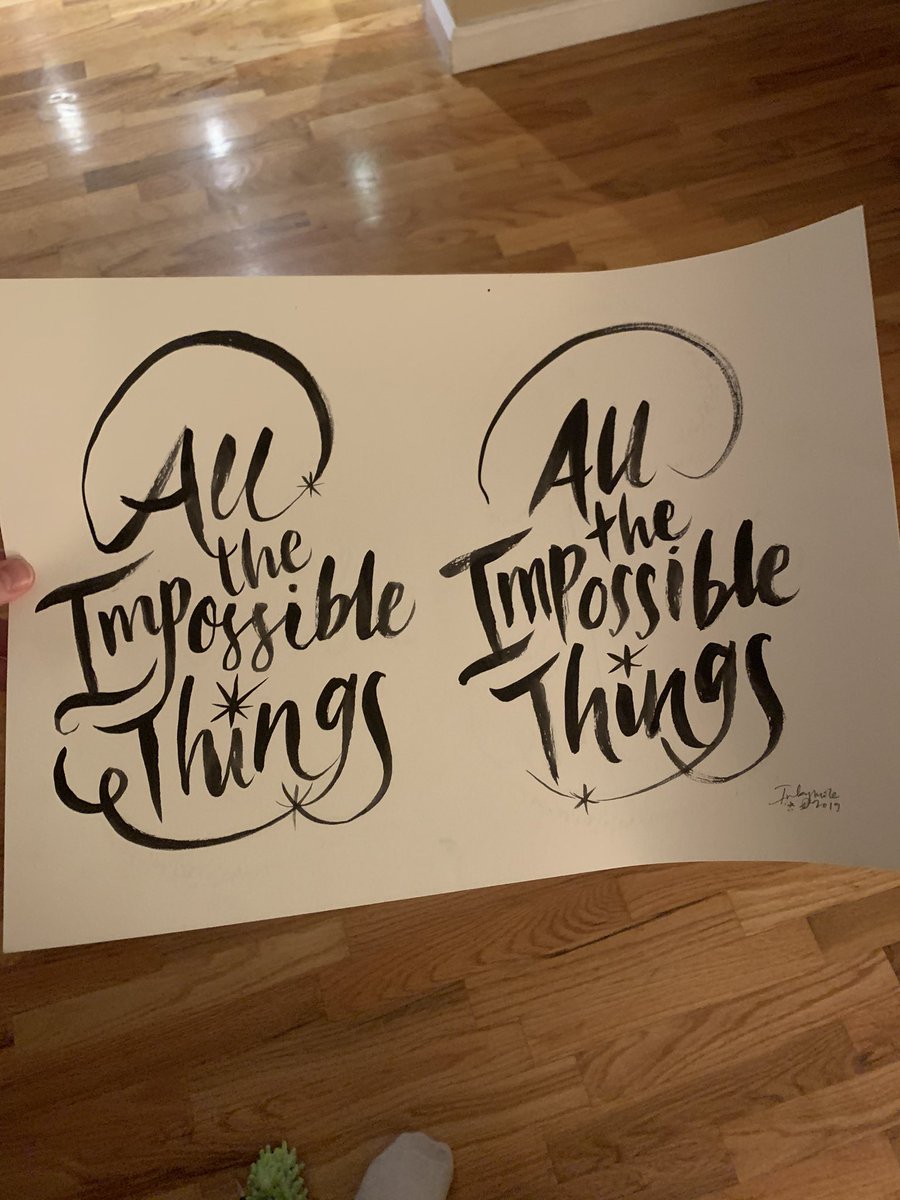
Sarah handlettered the title a bunch of different ways, then digitally sent them to Macmillan. I happened to be visiting NYC and the offices when they arrived, so I got to see each one superimposed on the cover design and pick my favorite! (Not easy, btw. So much  https://abs.twimg.com/emoji/v2/... draggable="false" alt="😍" title="Smiling face with heart-shaped eyes" aria-label="Emoji: Smiling face with heart-shaped eyes">)
Then came the back cover. Fun fact: the back cover and spine are all elements from the other cover designs I saw! I love that the house, tree, and running Red/Marvin all made it onto the cover in some way.
So yeah, it was a bunch of images created by other artists that Elizabeth skillfully wove together you make my cover. She tweaked and colored and magicked everything so beautifully so that the images really matched the story.
And from what I know of publishing (I used to work for PRH in marketing, so often worked with the cover designers) it is very common for a designer to use multiple images and then polish them up in some way to perfectly suit a cover. It’s such a skill!!
Now, another fun fact: I got to meet @Inkymole when I was vacationing in England last year. I adore her and wish we could hang out ALWAYS. And, delightful human that she is, she recently sent me her original ink sketches of the various hand letterings of the title!

 Read on Twitter


