A thread on deaths from COVID-19 in the UK, and drawing different conclusions from different data sources. More information is set out in the appendix to our paper here: https://aon.com/unitedkingdom/retirement-investment/COVID-19/Demographic-Horizons-COVID-19-longevity-impact">https://aon.com/unitedkin...
This thread discusses two different data sources for deaths with COVID-19 in the UK. The total number of deaths recorded by each source are similar, but they show very different numbers of deaths by day. This could impact on some COVID-19 models and projections. 1/
Before I start, I want to be clear that this doesn’t mean either data source is wrong – but the way the data produced by the first source is typically interpreted may not be correct. This is touched on in a recent BBC article https://www.bbc.co.uk/news/health-52167016?intlink_from_url=https://www.bbc.co.uk/news/topics/cp7r8vglnnwt/nhs&link_location=live-reporting-story">https://www.bbc.co.uk/news/heal... 2/
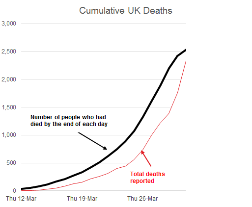
The first data source is the DHSC. Each day, they publish data on the total number of deaths with COVID-19 in the UK (individuals hospitalised in the UK who tested positive) – the red line in the chart shows the figures up to 1 April. 3/
Taking the difference between the deaths reported on one day and the previous day gives an indication of the number of people that died of COVID-19 on that day in the UK. These are the numbers that have typically been quoted – e.g. https://www.bbc.co.uk/news/uk-52056534">https://www.bbc.co.uk/news/uk-5... 4/
This data shows that the number of UK deaths is increasing very rapidly, particularly towards the end of March – this caused much comment, e.g. https://www.bbc.co.uk/news/uk-52077997">https://www.bbc.co.uk/news/uk-5... 5/
The second source of deaths data is NHS England who have published details of all the COVID-19 deaths reported in England up to 31 March, split by the actual day of death https://www.england.nhs.uk/2020/04/total-number-of-covid-19-deaths-in-england-by-date-of-death/">https://www.england.nhs.uk/2020/04/t... 6/
The black line shows the NHS England data, increased to reflect the larger UK population. This is a very different shape to the DHSC line. 7/
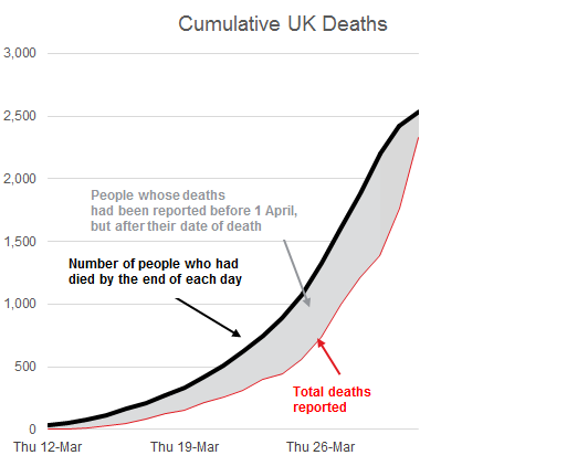
The difference between the two lines (the grey shaded area) represents the number of people whose deaths were reported *before* 1 April, but *after* their date of death. 8/
It seems that the speed of reporting of deaths may have increased - many deaths have been reported in the last few days that actually happened some days earlier. This seems to be in large part what has produced the pattern of faster recent increases. 9/
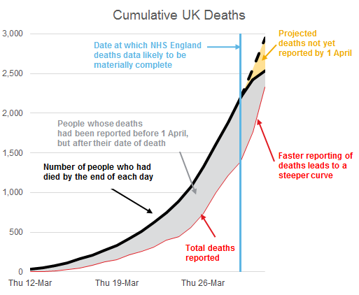
Projecting deaths forward based on the steeper DHSC curve will very quickly give much higher answers than on the NHS England curve. And because it’s based on actual dates of death, the NHS curve should better reflect what’s actually happened. 10/
One point of caution – the apparent slowing of the NHS England deaths data is likely to be mainly due to deaths that happened before 1 April but were not reported by then (the yellow area). This point was noted in a recent article. https://amp.theguardian.com/world/2020/apr/04/why-what-we-think-we-know-about-the-uks-coronavirus-death-toll-is-wrong">https://amp.theguardian.com/world/202... 11/
This “incurred but not reported” (IBNR) issue is seen frequently in actuarial work – if it is consistent over time, it shouldn’t cause too many problems with forecasting. https://en.wikipedia.org/wiki/Incurred_but_not_reported">https://en.wikipedia.org/wiki/Incu... 12/
Other than the IBNR point, the most recent reported deaths (after 1 April) are likely to be closer to the deaths occurring on each day. 13/
To summarise, I think it’s better to use the NHS England deaths data to illustrate progression of UK deaths and as a starting point for projections - taking the difference between the total daily death figures from the DHSC gives a misleading shape. 14/

 Read on Twitter


