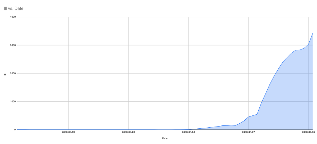
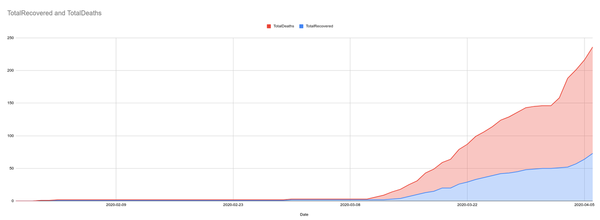
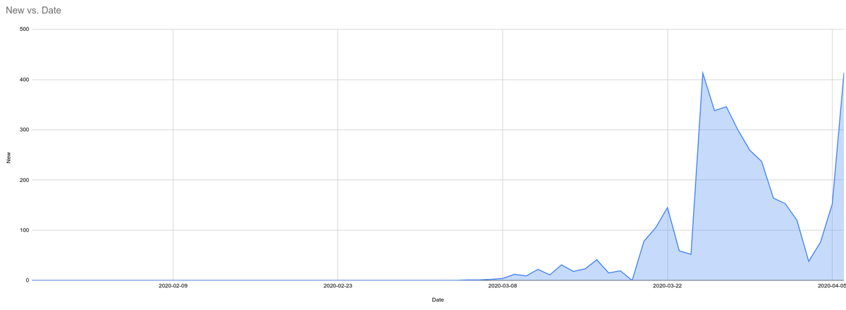
This is why we shouldn& #39;t base our expectations on a curve based on date tested.
If you graph new cases per day reported by DOH, it only reflects testing capability, not an epidemiological curve. I painstakingly copy-pasted from http://endcov.ph"> http://endcov.ph here in this Google Sheet as of April 5, 2020 data: https://bit.ly/3bZ3ook ">https://bit.ly/3bZ3ook&q...
Again, those websites with nice graphics, where do they get their data of date of symptom onset? We& #39;d like to take a look ourselves, as well.

 Read on Twitter


