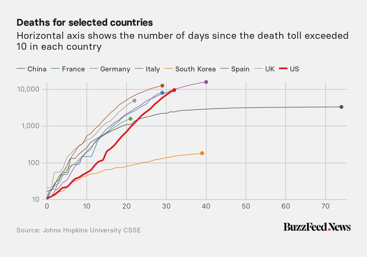
THREAD: As US deaths from #COVID19 surge past 10,000, this chart shows that the nation& #39;s "death curve," plotted on a logarithmic axis, is crossing that for Italy at the same stage.
https://www.buzzfeednews.com/article/peteraldhous/coronavirus-deaths-by-country">https://www.buzzfeednews.com/article/p...
https://www.buzzfeednews.com/article/peteraldhous/coronavirus-deaths-by-country">https://www.buzzfeednews.com/article/p...
2/ Notice how Italy& #39;s curve has started to level off, which suggests that its national lockdown is having the desired effect. (Spain is also making progress after a very steep rise.)
https://www.buzzfeednews.com/article/peteraldhous/coronavirus-deaths-by-country">https://www.buzzfeednews.com/article/p...
https://www.buzzfeednews.com/article/peteraldhous/coronavirus-deaths-by-country">https://www.buzzfeednews.com/article/p...
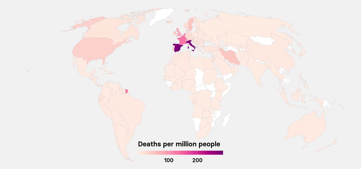
3/ It& #39;s important to realize that the death rates in Italy and Spain, relative the the nations& #39; populations, are still both higher than for the US.
https://www.buzzfeednews.com/article/peteraldhous/coronavirus-updating-charts-maps">https://www.buzzfeednews.com/article/p...
https://www.buzzfeednews.com/article/peteraldhous/coronavirus-updating-charts-maps">https://www.buzzfeednews.com/article/p...
4/ What this chart is about is the trajectory of growth in deaths, and looking for signs that efforts to limit #COVID19 are working.
https://www.buzzfeednews.com/article/peteraldhous/coronavirus-deaths-by-country">https://www.buzzfeednews.com/article/p...
https://www.buzzfeednews.com/article/peteraldhous/coronavirus-deaths-by-country">https://www.buzzfeednews.com/article/p...

 Read on Twitter


