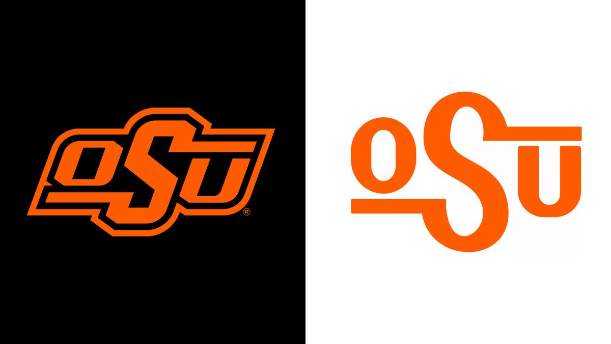
I was just waiting for someone to ask! Keep in mind, I& #39;m coming in with an outside, looking in perspective... #okstate athletics has done a great job with our "rebrand," which is really just a consolidation of the dozens of logos developed through the decades... a thread...(1/5) https://twitter.com/daveabarr/status/1247216658101547008">https://twitter.com/daveabarr...
... Some people will be excited to hear the badge is out. I& #39;m not one of those people. It was an alternate logo to our main brand and helped create some symmetry to an asymmetrical logo. It also looked great on uniforms...(2/5)
...We now have the updated brand and Pistol Pete as our primary and secondary logos, respectively. This was a great move as both are distinctive to #okstate. The cleanup of the brand removing excessive keylines, aligning angles, and simplifying to one-color...(3/5)
...all help to streamline an overall solid and unique design. While I have a lot of love for "tradition" and appreciate the nostalgia of it, the original brand logo is lacking and messy for today& #39;s design standards. It has it& #39;s place as an annual throwback homage...(4/5)
...but for everybody outside Cowboy Country, the new brand has a stronger, bolder impact, and will have a longer lifespan. Fun fact: the opposite helmet has won in our Instagram polls every day, which tells me the younger generations are fonder of the contemporary look. (5/5)

 Read on Twitter


