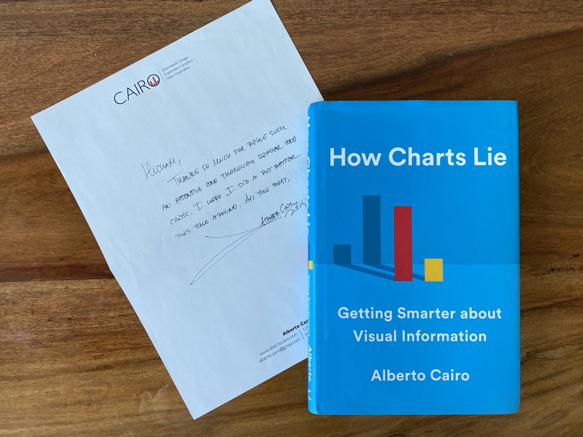
I too got my copy of @AlbertoCairo ‘s “How Charts Lie” and finally had the pleasure of reading it. This is a terrific book. It’s clearly written with wide insights into how not to be fooled by graphs.
Practical examples permeate the book. Although American centric, the examples do not require prior deep knowledge of statistics and dataviz principles and many readers can relate to—irrespective of their discipline.
Although Alberto is skeptical about the ability of people to interpret scatterplots correctly, he made a bold move and used 26 of the 185 or so charts in the book as scatterplots. Also, this is probably the first dataviz book that tackles the ecological correlation fallacy.
The quality of the print is first class. Interestingly, Alberto never referred to graphs as “see Fig. 1” or “as in Fig.2”. Instead, he used words like “this graph” or “the graph below”—hence integrating the graphs with their explanations.
…However, in some instances you have to turn the page back and forth between the explanations and the graph in order to comprehend certain ideas. Bravo and well done Alberto.

 Read on Twitter


