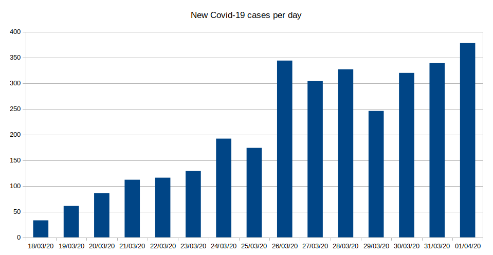
If anyone is wondering, this is what the graph looks like without f***ed up axis. https://twitter.com/MarekGierlinski/status/1246433996612997122">https://twitter.com/MarekGier...
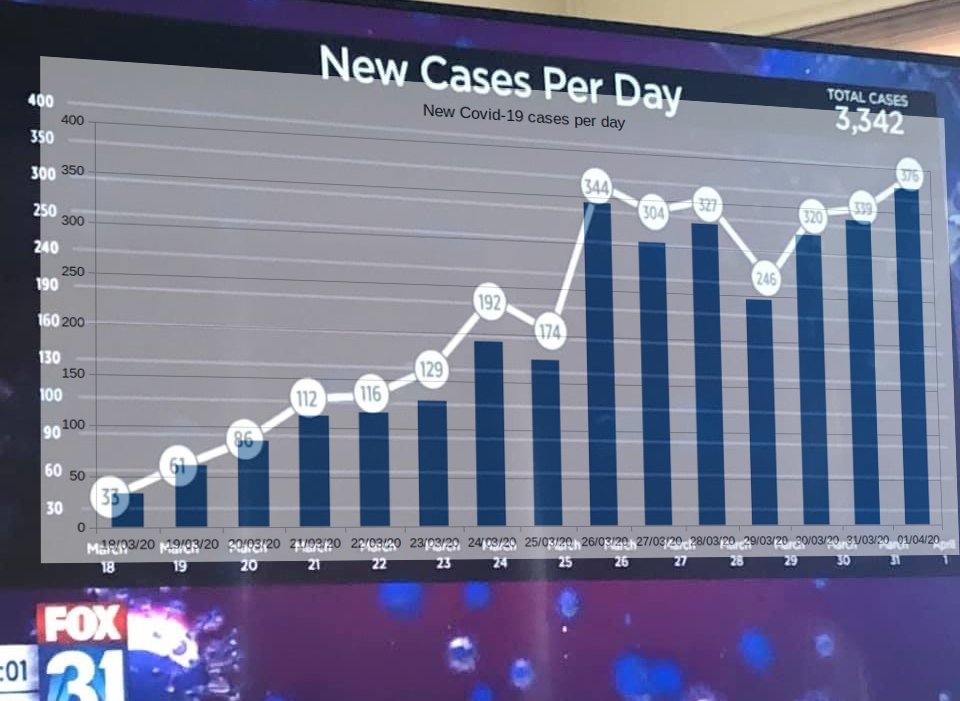
I tried to sheer mine to match the screen and overlaid them and the Fox news graph is almost (but not quite? - depends on image curve) just an error of axis labelling.
Obviously it& #39;s not quite right.
My theory is that someone did the "right"graph in Excel and passed it to some graphics person to make splashy graphics and they mis-transcribed the axis. They probably drew out the line again too which is why it doesn& #39;t match up perfectly.
My theory is that someone did the "right"graph in Excel and passed it to some graphics person to make splashy graphics and they mis-transcribed the axis. They probably drew out the line again too which is why it doesn& #39;t match up perfectly.
This thread brought to you by "I simply don& #39;t believe that there is a plotting tool that would let you create the y axis in the original automatically."

 Read on Twitter


