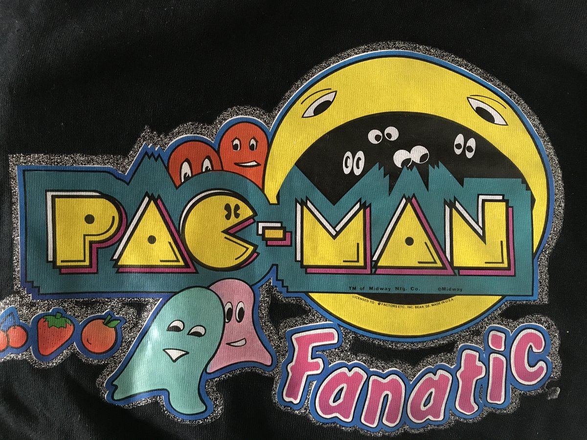
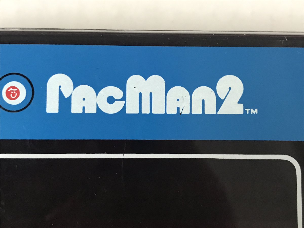
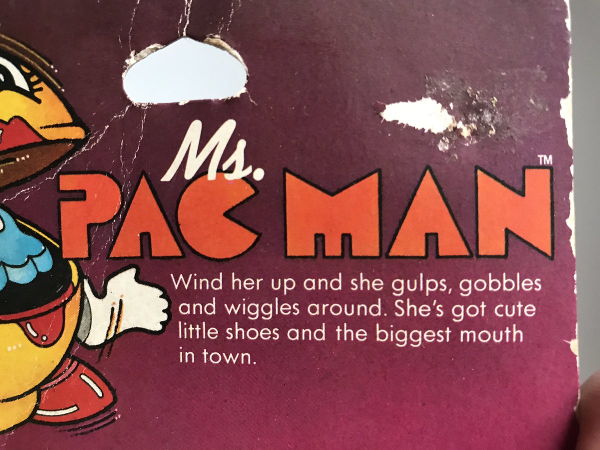
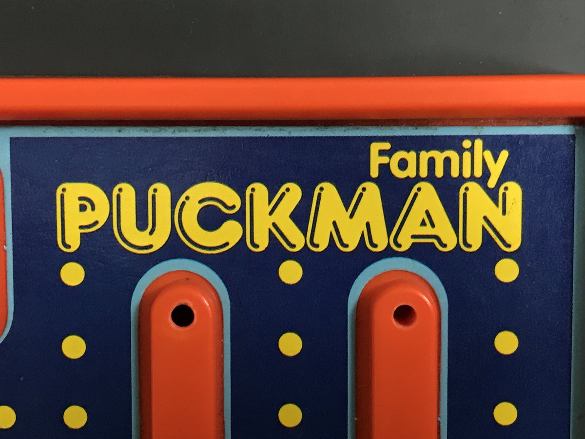
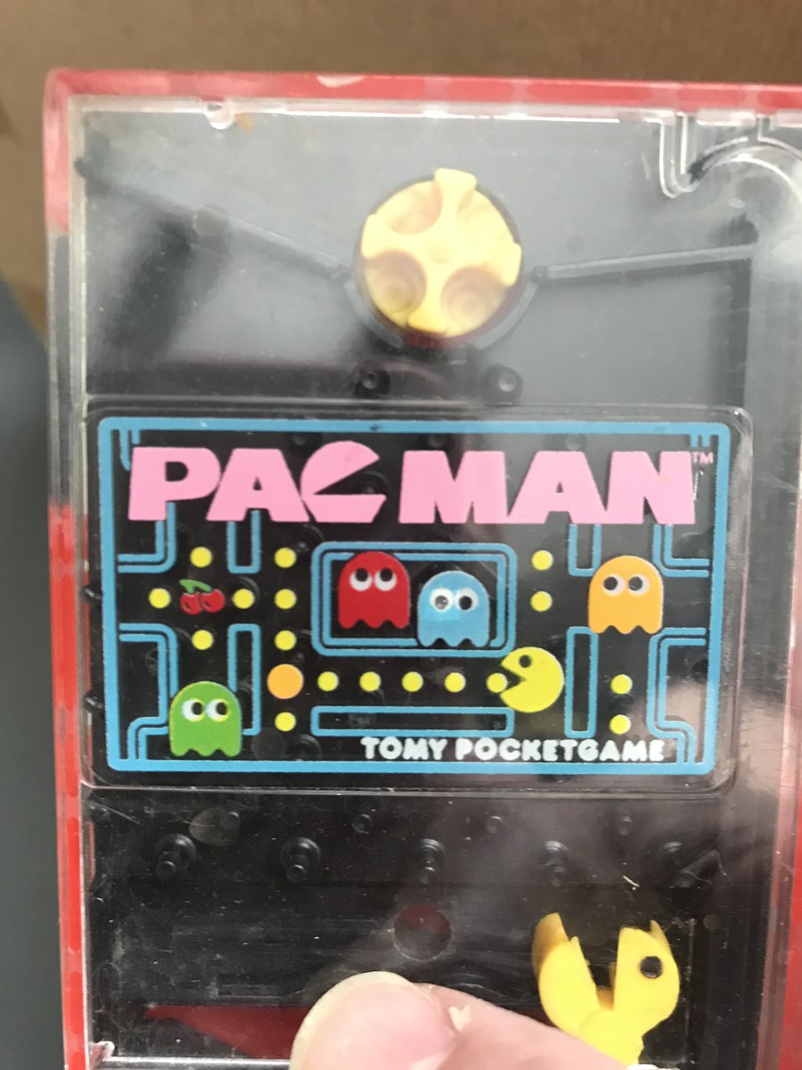
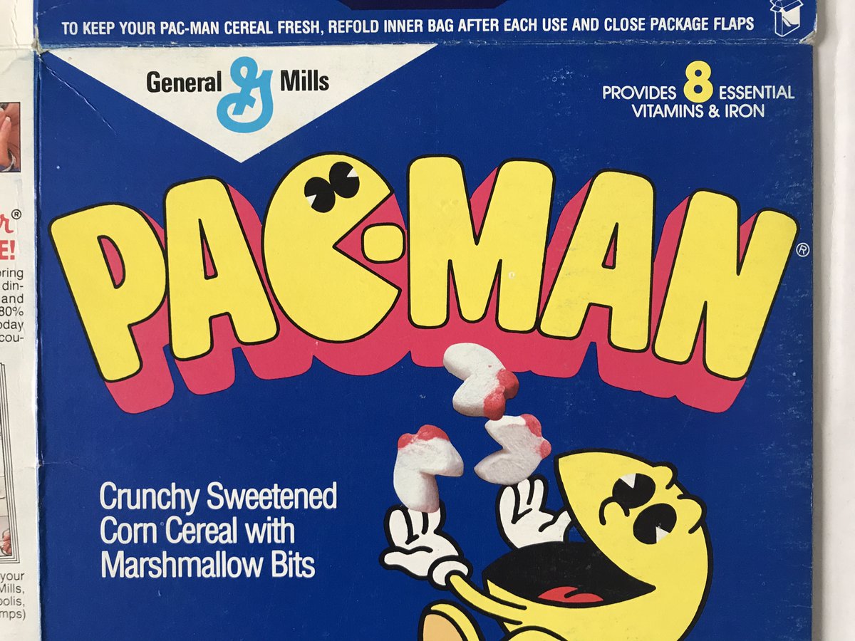
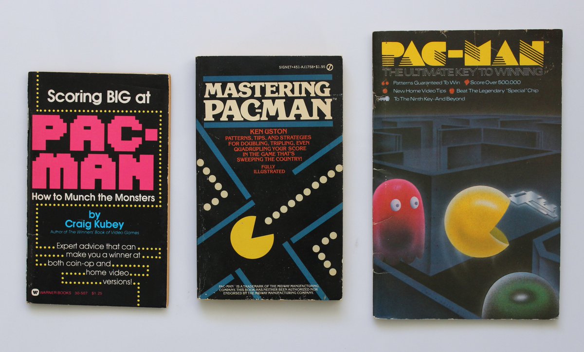
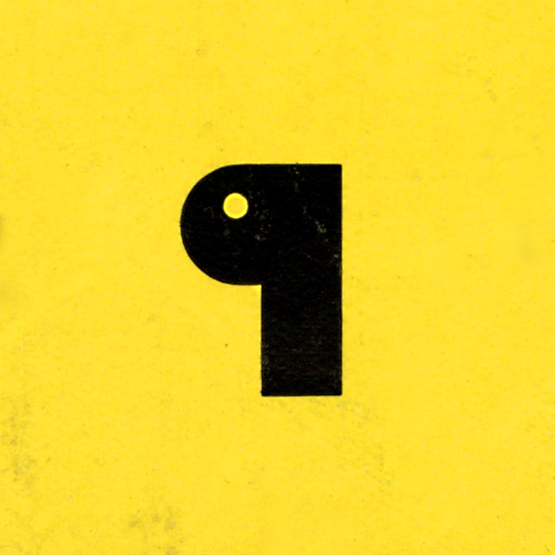
Day 95: Pac-Typography! As a designer, I& #39;m very interested in the origins & evolution of the #PacMan logo, and how much of the brand ethos it contains. The original designer is unknown, but I dig how the logo has changed & morphed over decades, across media and creators.
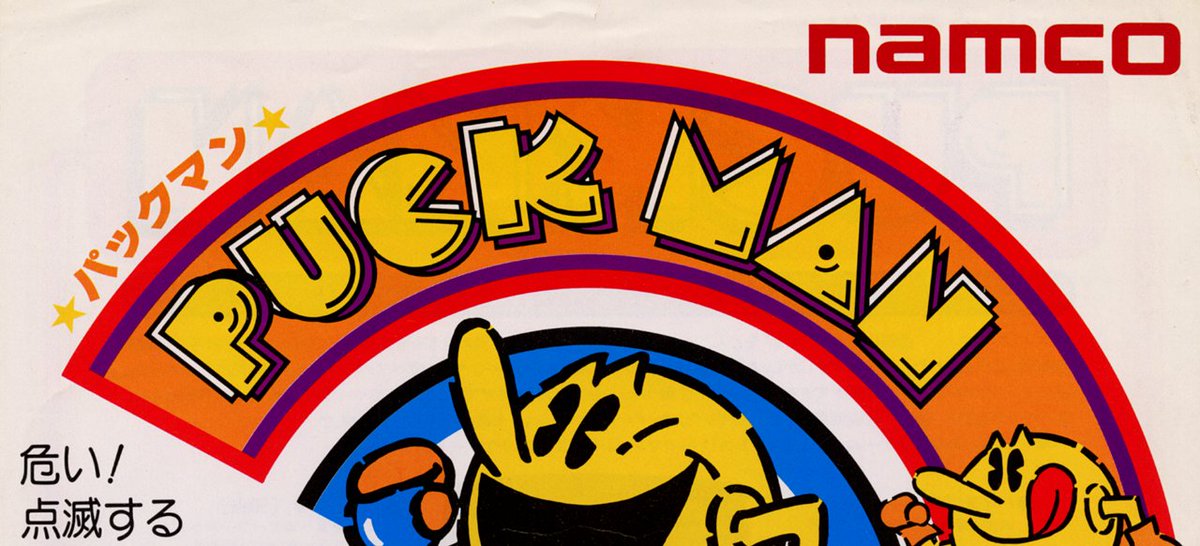
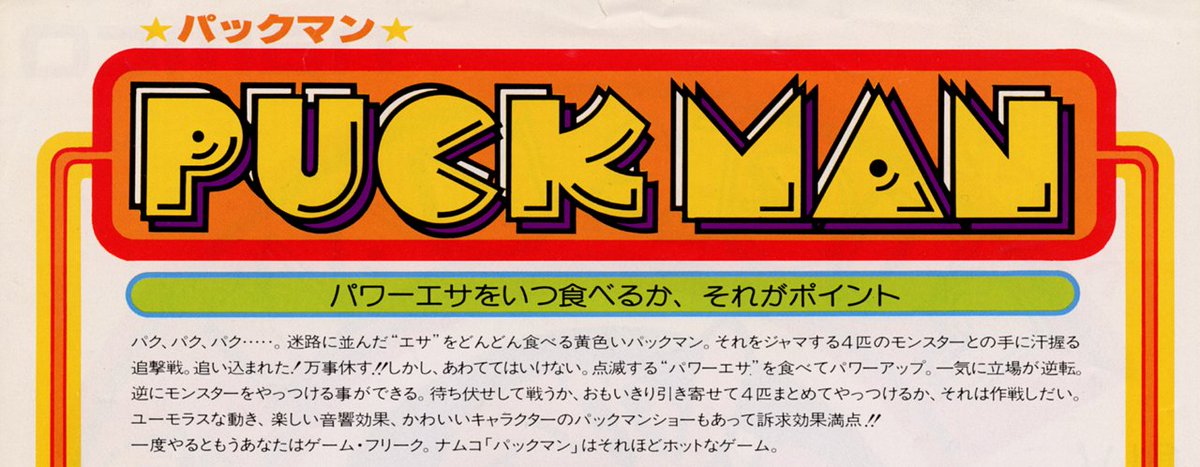
I& #39;ve wanted to dig into this for a while, so buckle up! The original logo is a geometric, Bauhas-inspired design built with custom letterforms. The modern @BandaiNamcoUS used the historical logo as the basis for a proprietary typeface that& #39;s now currently used in licensing.
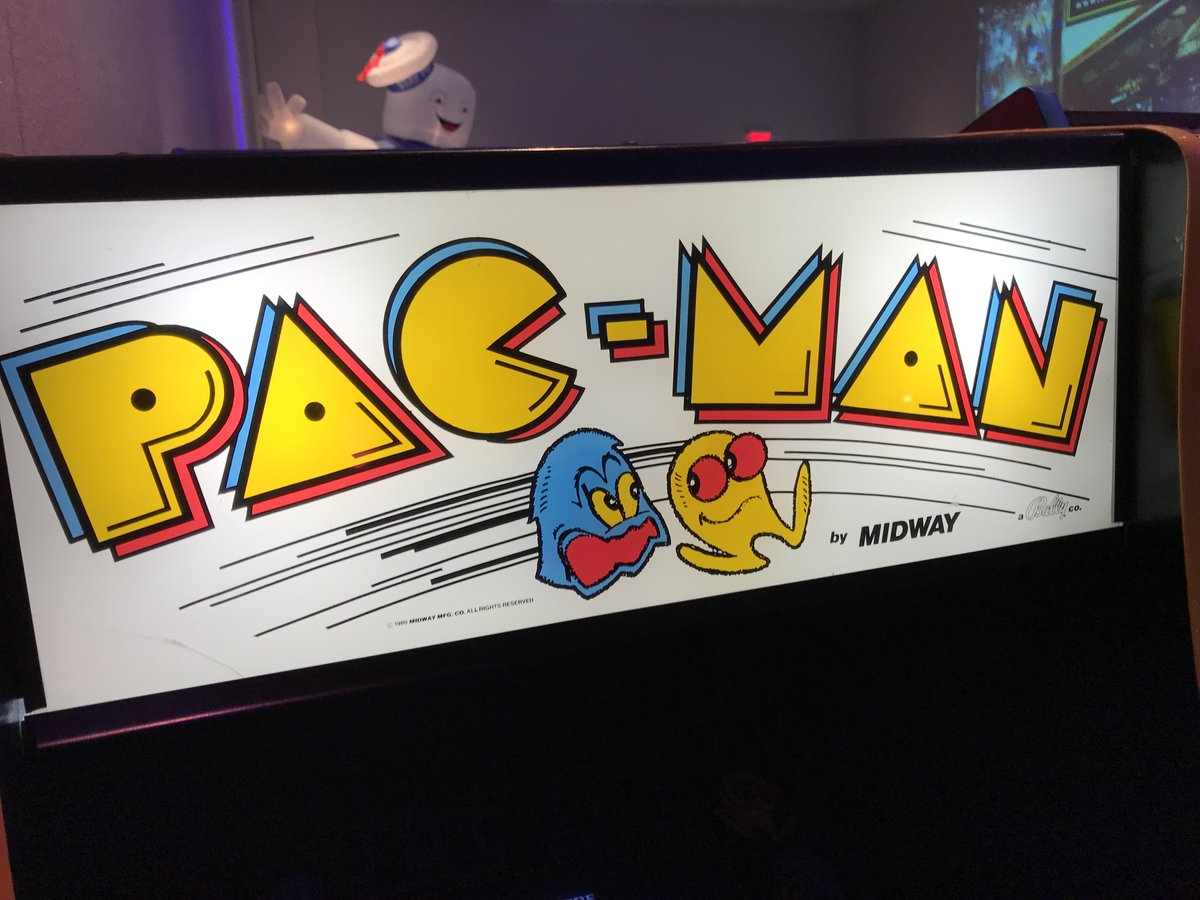
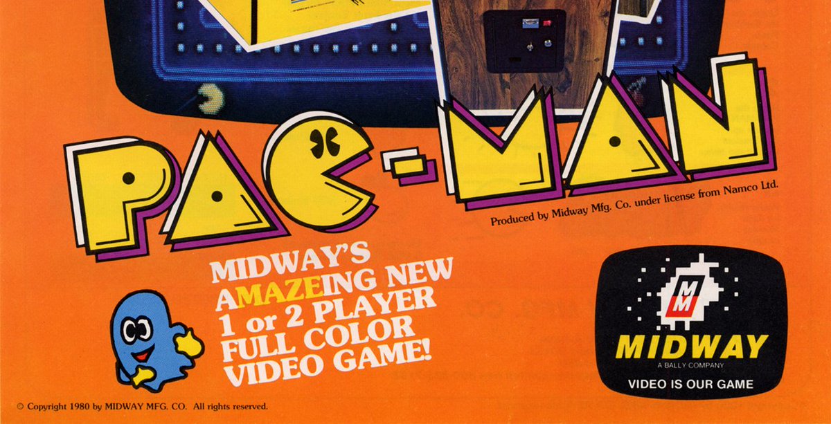
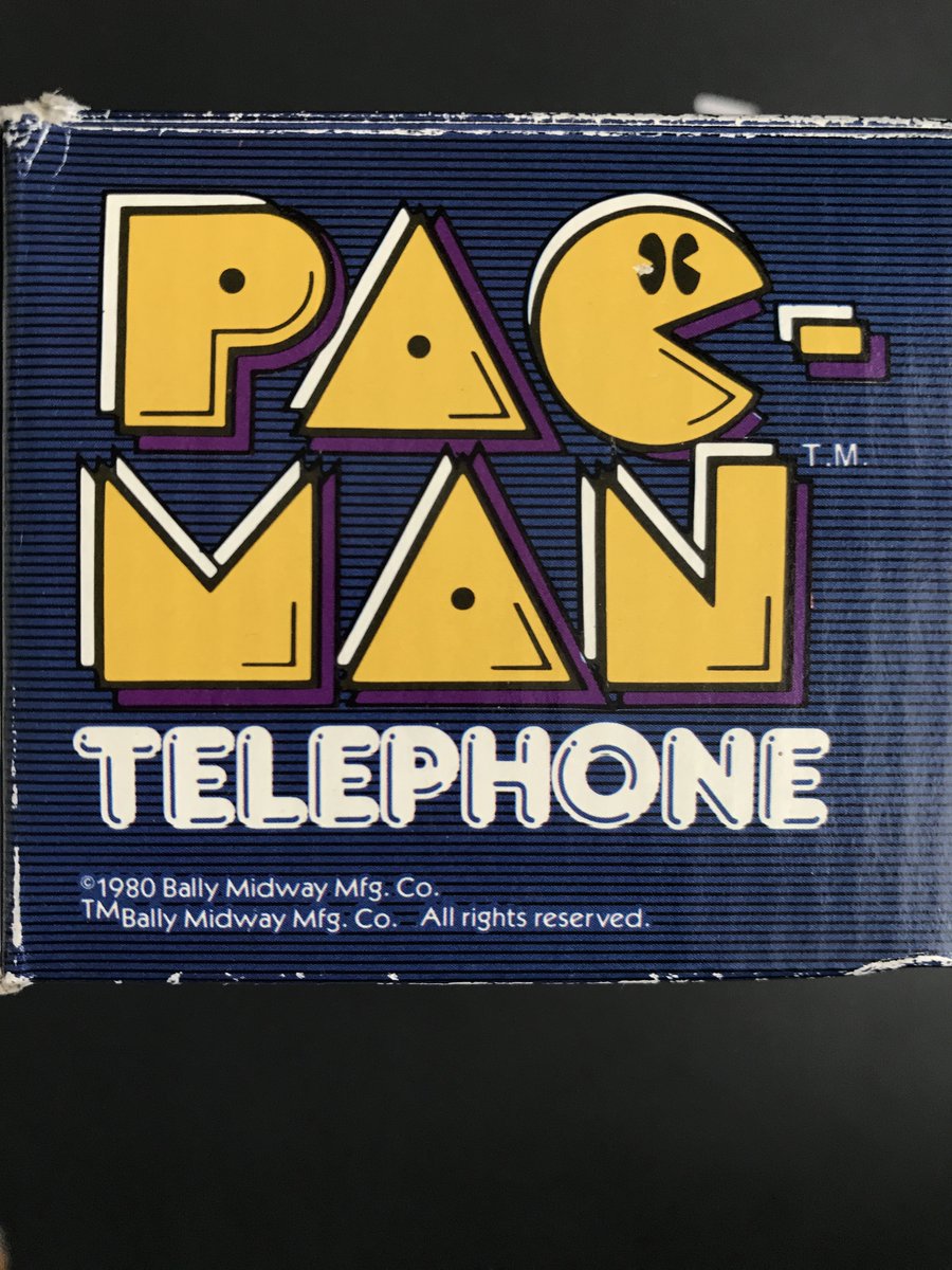
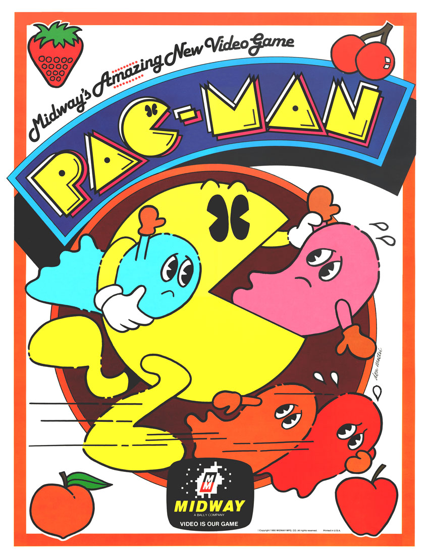
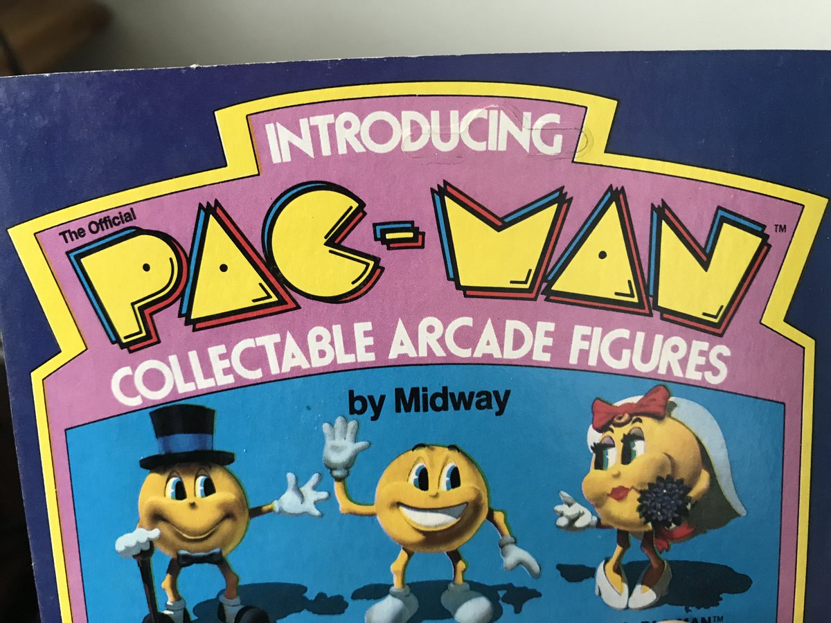
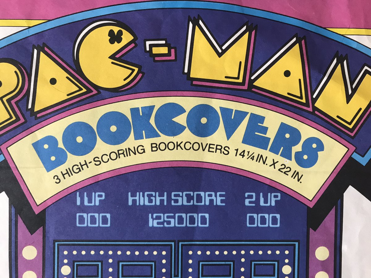
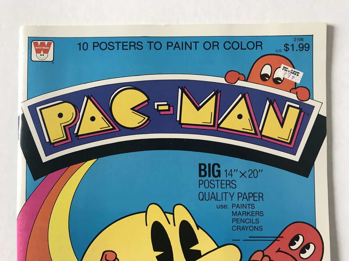
A detail to notice: The original Puck-Man logo does NOT have eyes in the letter C. The Midway arcade flyer seems to have added those eyes for the first time. (Though not on the Midway arcade marquee.) From then on, the C with eyes appears often on many 1980s licensed products.
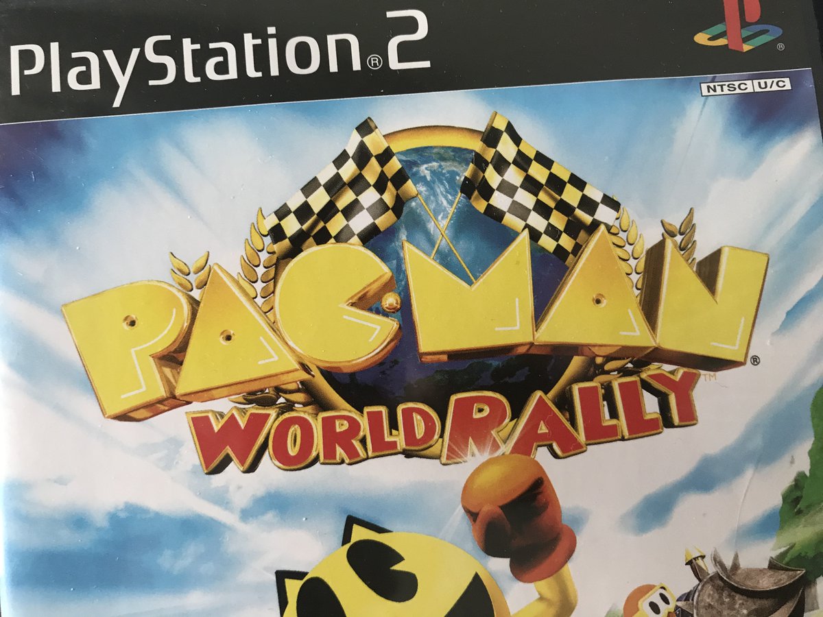
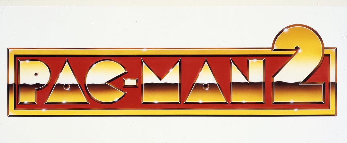
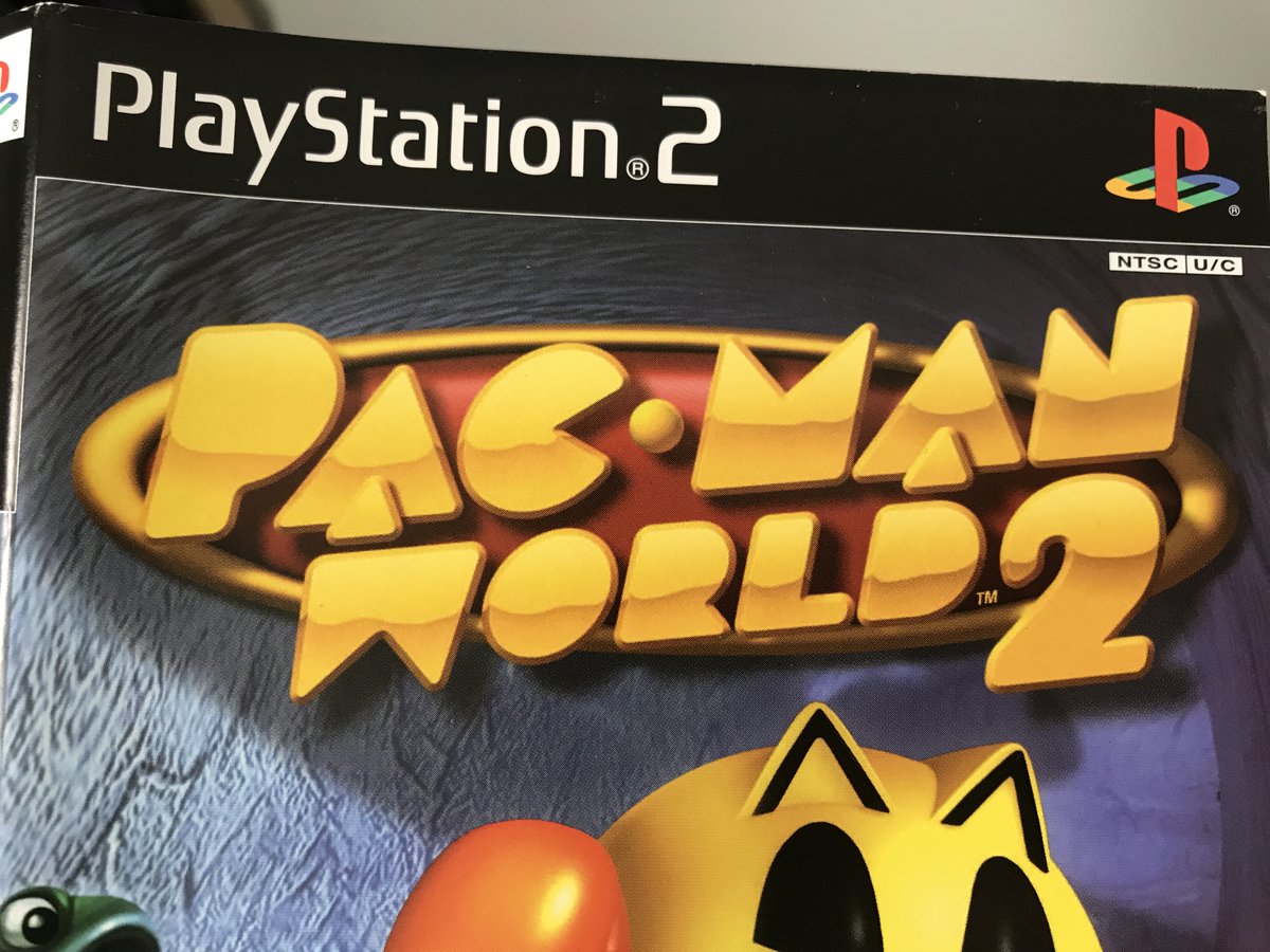
Then, in the & #39;90s & 2000s you see designers taking many more liberties with the #PacMan letterforms and logo, stretching them, adding dimension, metallic sheen, extra shadows and the like. Some of this is more successful, but the good bones are generally still present.
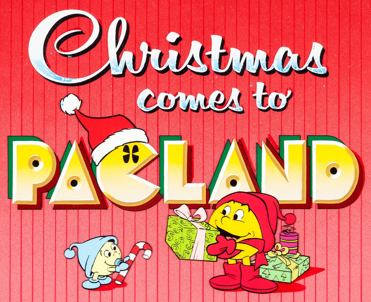
I& #39;m also interested in the oddly creative, off-model typography that still showed up on official products
during a time when it appears that brand guidelines & visual design requirements were a bit more relaxed.
during a time when it appears that brand guidelines & visual design requirements were a bit more relaxed.
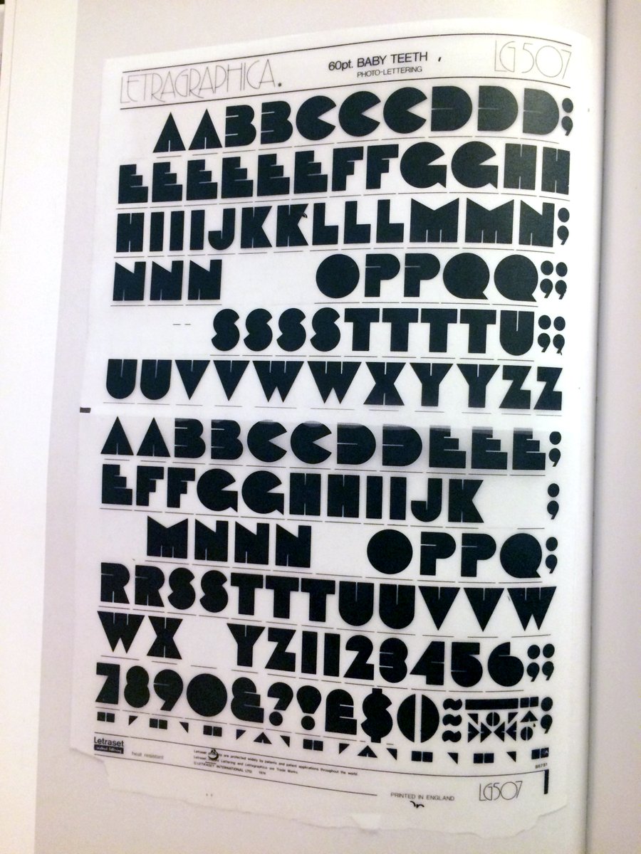
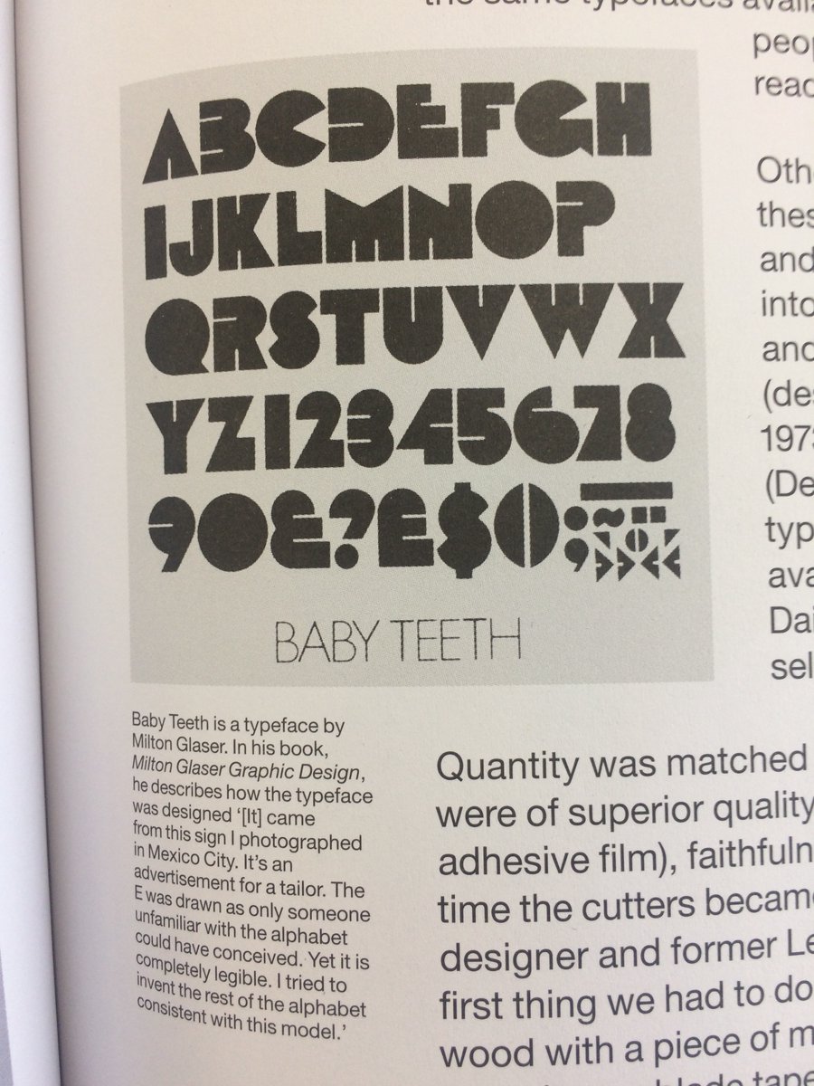
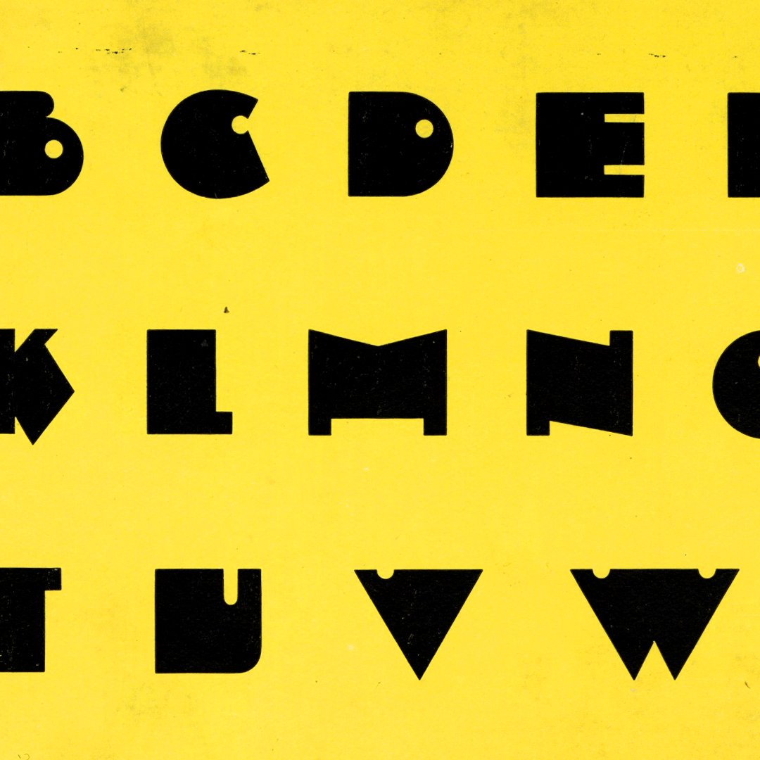
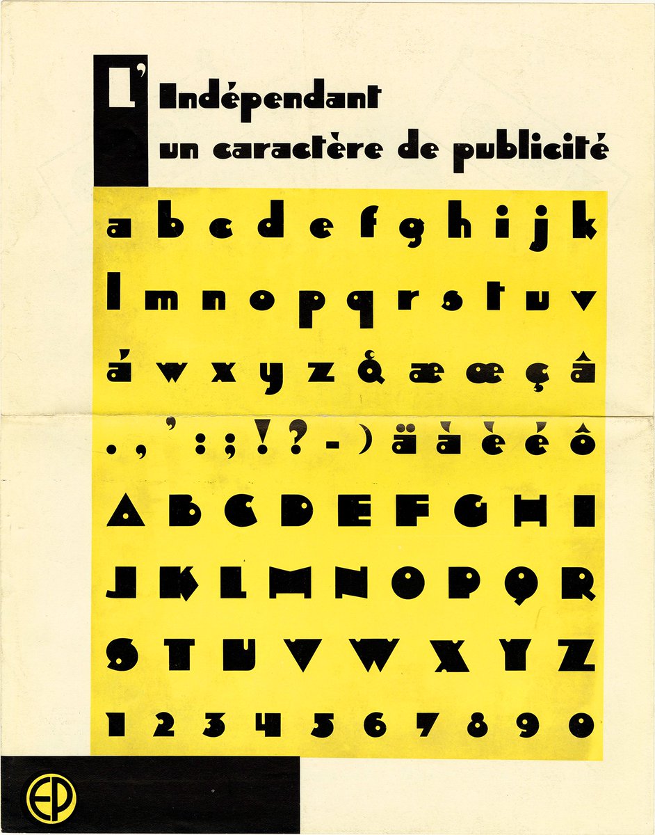
But this all still begs the question: What were the logo& #39;s origins & what inspired it? I& #39;m dying 2 know, but can only guess now. Some earlier typefaces seem similar & worth a mention. Milton Glaser& #39;s Baby Teeth typeface was based on Mexican street signage. (From @uniteditions)

 Read on Twitter