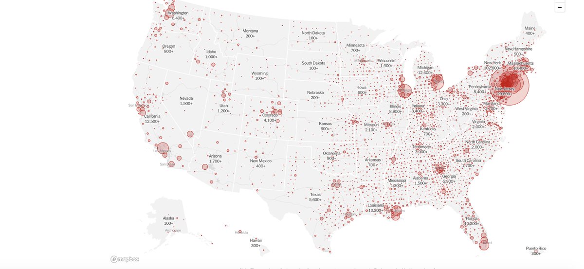
If you& #39;re interested in the U.S. COVID-19 spread, this map is spectacular:
https://www.nytimes.com/interactive/2020/us/coronavirus-us-cases.html">https://www.nytimes.com/interacti...
https://www.nytimes.com/interactive/2020/us/coronavirus-us-cases.html">https://www.nytimes.com/interacti...
Look at per capita. The difference between where I live in San Diego (33cases/100K) and Rockland County NY (1325/100K) is a 50-fold difference. The United States is no more one place than, say, Europe. We need to discuss the spread here regionally.
When I look state vs. state, I have a much clearer picture. Some of it is of course density and when and how much initial seeding occurred. Some of it is response.
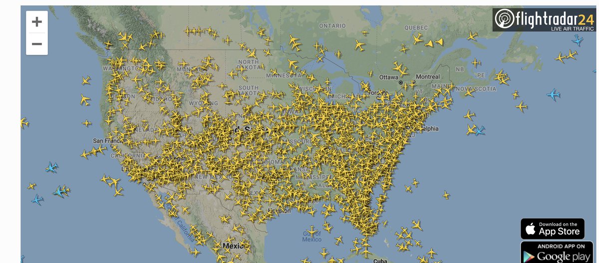
Some of it is proximity to neighboring states and the fact that we did not, until recently, have any domestic travel restrictions. And we still have massive air travel. These are flights right now in U.S. as per https://flighttracker24.net/flight-radar/ ">https://flighttracker24.net/flight-ra...
Incoming international (blue) is trivial.
Incoming international (blue) is trivial.
Now factor in the difference in shelter-in-place over time. Again @nytimes maps rock:
https://www.nytimes.com/interactive/2020/us/coronavirus-stay-at-home-order.html">https://www.nytimes.com/interacti...
https://www.nytimes.com/interactive/2020/us/coronavirus-stay-at-home-order.html">https://www.nytimes.com/interacti...

 Read on Twitter


