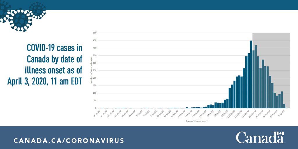
1/8 #Epidemiology 101 on #COVID19 in  https://abs.twimg.com/emoji/v2/... draggable="false" alt="🇨🇦" title="Flag of Canada" aria-label="Emoji: Flag of Canada">: We’re all in this #FlattentheCurve together so let’s get up to speed with what we’re tracking on our #PlanktheCurve for Canada mission! More Info on COVID-19 novel #coronavirus: https://bit.ly/3bLZpet ">https://bit.ly/3bLZpet&q...
2/8 An epidemic curve (epi curve) is a great way to visualise the trend of an outbreak & see the pattern of illnesses occurring over time. But the patterns are most clear in hindsight, once all the case data has been reported & plotted. https://bit.ly/3bQq4qu ">https://bit.ly/3bQq4qu&q...
3/8 While the outbreak is ongoing & still evolving, patterns can be a bit tricky to interpret. This is because we are only seeing a subset of all cases, with the most recent cases not yet reported. #COVID19 #FlattentheCurve
4/8 The key issue is the time lag between when a case first has symptoms (the date against which cases are plotted on the curve) and when PHAC receives a case report (real-time date). For #COVID19 this time lag is about 1 to 2 weeks.
5/8 Each step from illness onset to reporting adds to the time lag: a person gets sick  https://abs.twimg.com/emoji/v2/... draggable="false" alt="➡️" title="Rightwards arrow" aria-label="Emoji: Rightwards arrow"> seeks healthcare
  https://abs.twimg.com/emoji/v2/... draggable="false" alt="➡️" title="Rightwards arrow" aria-label="Emoji: Rightwards arrow"> gets tested
  https://abs.twimg.com/emoji/v2/... draggable="false" alt="➡️" title="Rightwards arrow" aria-label="Emoji: Rightwards arrow"> gets diagnosed & investigated by #PublicHealth
  https://abs.twimg.com/emoji/v2/... draggable="false" alt="➡️" title="Rightwards arrow" aria-label="Emoji: Rightwards arrow"> case info gets reported
  https://abs.twimg.com/emoji/v2/... draggable="false" alt="➡️" title="Rightwards arrow" aria-label="Emoji: Rightwards arrow"> #COVID19 case added to the epi curve.
6/8 As the latest cases are added to the epi curve, like coins into a coin sorter, a more clear & accurate trend emerges. Early on, it may look like cases have peaked & are going down but this is due to missing data in the “grey zone”.
7/8 In addition to stopping new infections, characteristics of #COVID19, like incubation time (time between exposure & onset of symptoms) & illness duration, mean it can take several weeks before you can see a real effect on the epi curve.
8/8 When & by how much we #PlanktheCurve for  https://abs.twimg.com/emoji/v2/... draggable="false" alt="🇨🇦" title="Flag of Canada" aria-label="Emoji: Flag of Canada"> is up to Every. Single. One. of. Us. The efforts of all Canadians are needed at this critical time – To get this done we need an all out collective effort. #COVID19 #DoYourPart #TeamCanada

 Read on Twitter


