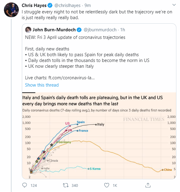
They know this is a bad way of looking at the data.
Not only is it unhelpful, it conveys a deeply incorrect impression of reality.
It gets more ridiculous every single day and it puts people in danger.
Not only is it unhelpful, it conveys a deeply incorrect impression of reality.
It gets more ridiculous every single day and it puts people in danger.
"How does looking at the data nationally put people in danger, Math?"
Well I& #39;m glad you asked, purple unicorn who is hopefully not a manifestation of my slowly deteriorating mental state!
Let& #39;s walk through it a bit. /1
Well I& #39;m glad you asked, purple unicorn who is hopefully not a manifestation of my slowly deteriorating mental state!
Let& #39;s walk through it a bit. /1
If you look at the COVID data by country and not by region, you will miss the following things:
1) COVID has probably not yet come to your city. It looks like we are in full swing for this thing, but for MOST of the country, it has barely even really started /2
1) COVID has probably not yet come to your city. It looks like we are in full swing for this thing, but for MOST of the country, it has barely even really started /2
2) COVID *can* be contained if your state/city acts. We see this powerfully in WA / OR / CA and I suspect we& #39;ll see it in OH too. That hope is important.
3) even after NYC hits the peak & cases decrease, your city or state might be at the *start* of the curve /3
3) even after NYC hits the peak & cases decrease, your city or state might be at the *start* of the curve /3
3 (cont) If we insist on looking at data by country, people will think things are safe b/c we& #39;re on the back side of the country curve when in fact they need to be *most* cautious b/c their state is still ramping up /4
Looking at the data by country is a view that simply does not reflect how this thing is spreading in the US.
It just does not.
It misses regional differences, response efficacy, population size of the US, the fact that we have multiple concurrent infection curves.
It just does not.
It misses regional differences, response efficacy, population size of the US, the fact that we have multiple concurrent infection curves.
We absolutely can not have one COVID policy (and a single set of dates for quarantine) apply to the entire country.
To continue presenting the data in this way speaks poorly of that person& #39;s experience and understanding of the data and calls into question their intent.
To continue presenting the data in this way speaks poorly of that person& #39;s experience and understanding of the data and calls into question their intent.

 Read on Twitter


