NEW: Fri 3 April update of coronavirus trajectories
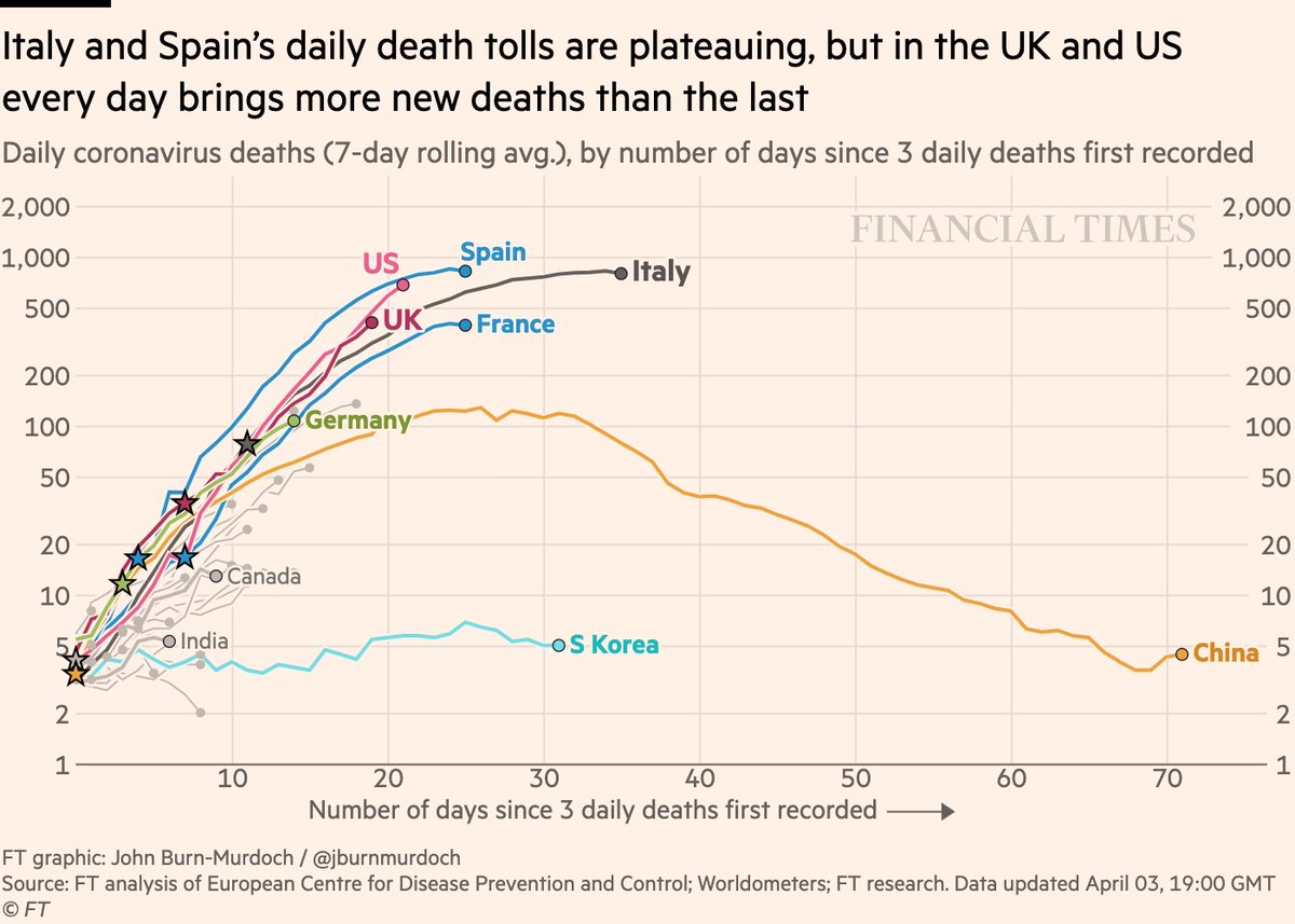
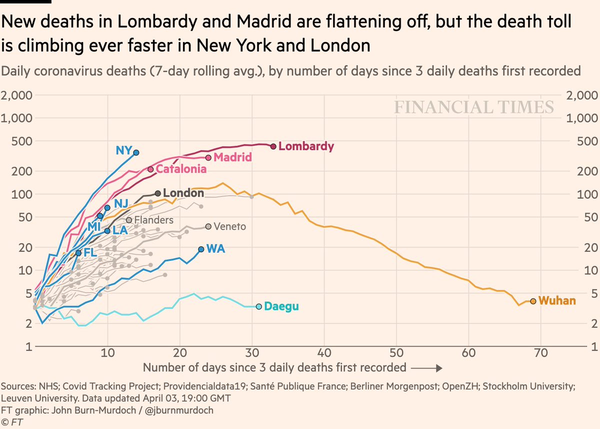
First, daily new deaths
• US & UK both likely to pass Spain for peak daily deaths
• Daily death tolls in the thousands to become the norm in US
• UK now clearly steeper than Italy
Live charts: http://ft.com/coronavirus-latest">https://ft.com/coronavir...
First, daily new deaths
• US & UK both likely to pass Spain for peak daily deaths
• Daily death tolls in the thousands to become the norm in US
• UK now clearly steeper than Italy
Live charts: http://ft.com/coronavirus-latest">https://ft.com/coronavir...
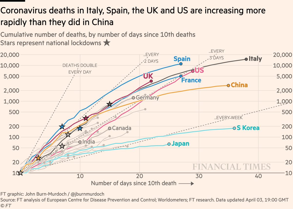
How does that look cumulatively?
• US slope still far steeper than any other at this stage. Why? US is now dealing with multiple overlapping outbreaks, keeping the pace up. US will likely have highest death toll globally within a week.
All charts: http://ft.com/coronavirus-latest">https://ft.com/coronavir...
• US slope still far steeper than any other at this stage. Why? US is now dealing with multiple overlapping outbreaks, keeping the pace up. US will likely have highest death toll globally within a week.
All charts: http://ft.com/coronavirus-latest">https://ft.com/coronavir...
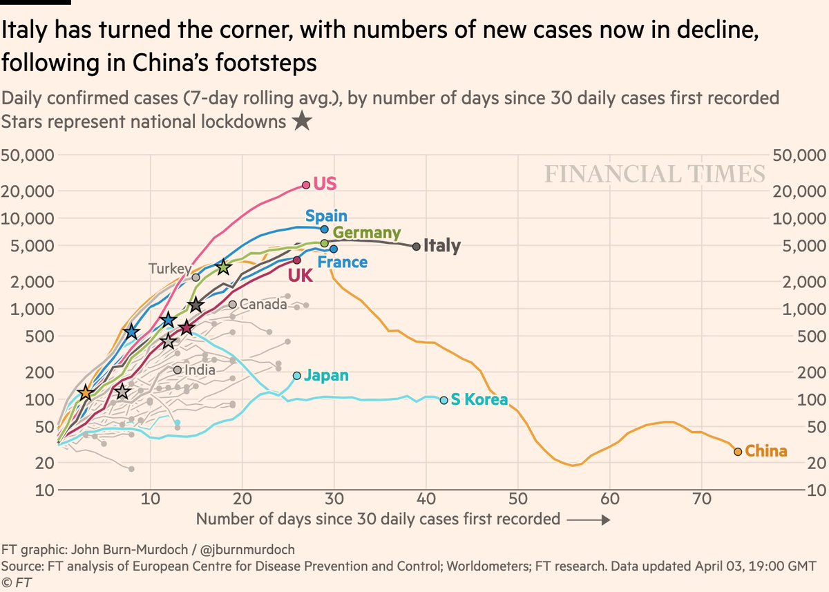
Now daily new cases:
• US still boldly going where no country has gone before, at >20k new confirmed cases per day. Destined to end up the worst-affected country in the world.
• France possibly joining Italy and Spain in seeing new cases plateau and begin to dip
• US still boldly going where no country has gone before, at >20k new confirmed cases per day. Destined to end up the worst-affected country in the world.
• France possibly joining Italy and Spain in seeing new cases plateau and begin to dip
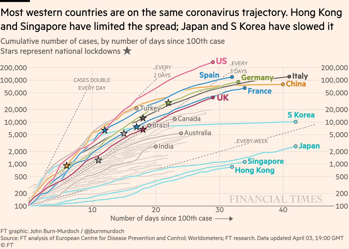
And cases in cumulative form:
• US very much in uncharted territory. Now accounts for 1-in-4 confirmed cases worldwide
• India perhaps stabilising again. Shows the importance of watching medium-term trends, not short term bumps which could be due to data backlogs
• US very much in uncharted territory. Now accounts for 1-in-4 confirmed cases worldwide
• India perhaps stabilising again. Shows the importance of watching medium-term trends, not short term bumps which could be due to data backlogs
Now subnational region daily deaths:
• NY, MI, NJ all on steep trajectories. US cities could soon be the global epicentres
• We’re using new NHS England data, which assigns deaths to date of death, not date of reporting. London seeing more daily deaths than Wuhan at same stage
• NY, MI, NJ all on steep trajectories. US cities could soon be the global epicentres
• We’re using new NHS England data, which assigns deaths to date of death, not date of reporting. London seeing more daily deaths than Wuhan at same stage
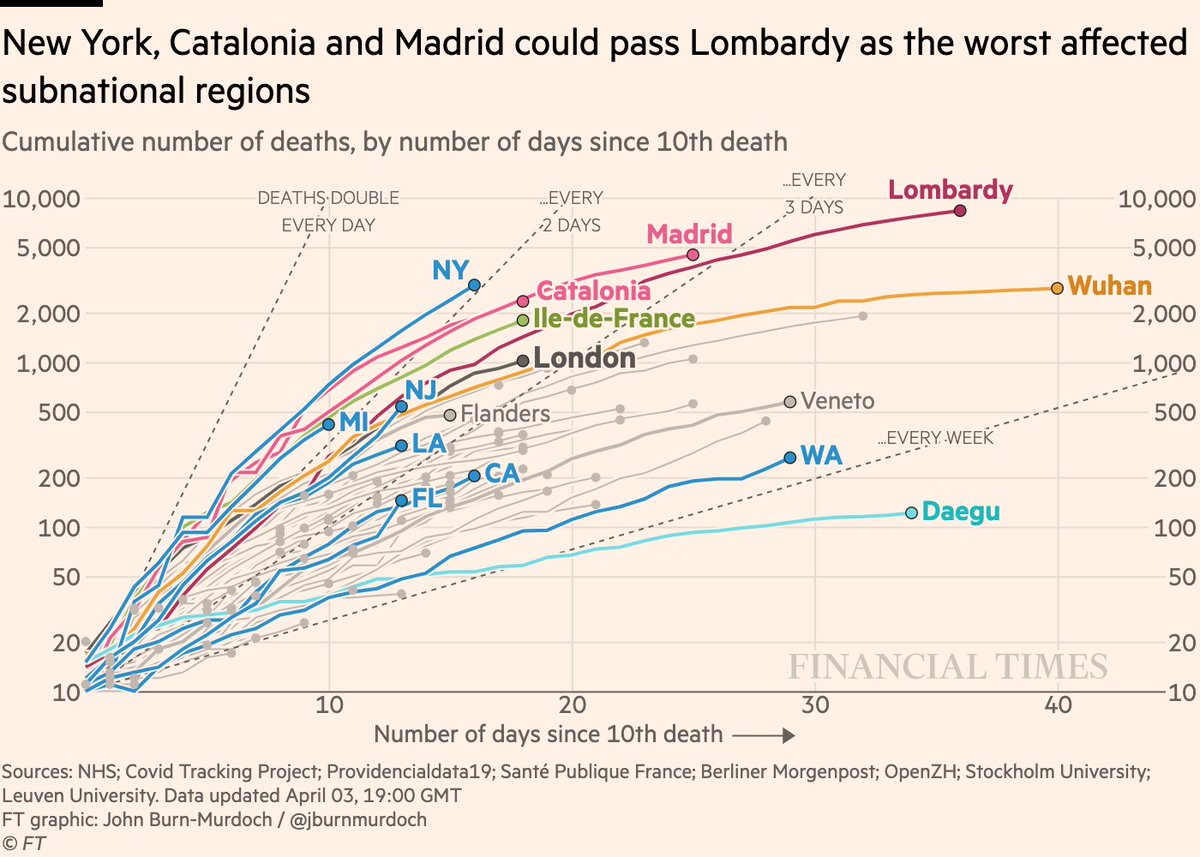
Subnational death tolls cumulatively:
• Same story. Urban US set to be the new epicentre
• London’s death toll still rising, but on a similar slope to Paris, Catalonia and Madrid at this stage, shallower than US counterparts
All charts: http://ft.com/coronavirus-latest">https://ft.com/coronavir...
• Same story. Urban US set to be the new epicentre
• London’s death toll still rising, but on a similar slope to Paris, Catalonia and Madrid at this stage, shallower than US counterparts
All charts: http://ft.com/coronavirus-latest">https://ft.com/coronavir...
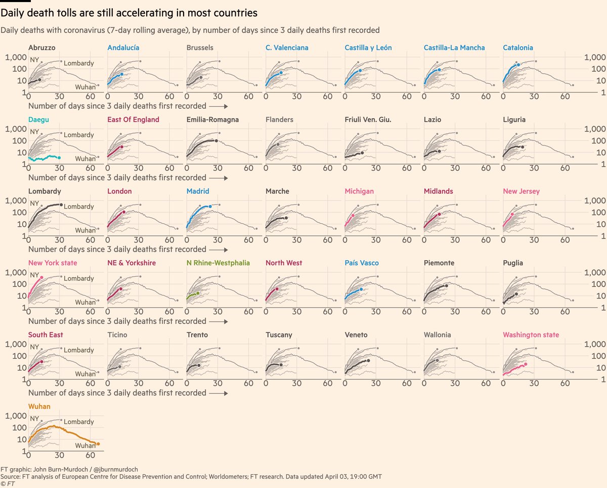
Now a new chart for tonight: small multiples of daily deaths in subnational regions:
(same country colours as in the national charts)
• Some of those US state curves are alarmingly steep
• Several English regions added. Midlands currently tracking Wuhan’s reported numbers
(same country colours as in the national charts)
• Some of those US state curves are alarmingly steep
• Several English regions added. Midlands currently tracking Wuhan’s reported numbers
Now small multiples for daily new deaths:
• Canada still on a much shallower curve than the US
• Germany still roughly tracking Italy
• Much flatter curves in warmer and more humid countries (Egypt, Iraq, Malaysia, Morocco)
• Canada still on a much shallower curve than the US
• Germany still roughly tracking Italy
• Much flatter curves in warmer and more humid countries (Egypt, Iraq, Malaysia, Morocco)
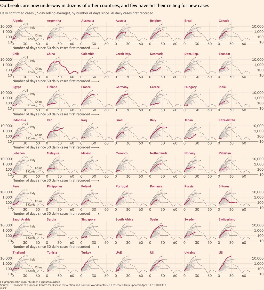
Finally, small multiples for daily cases in 56 countries:
• Sweden v Norway is instructive. Norway locked down & new cases are falling, Sweden didn’t & each day brings more new infections
• Japan’s outbreak continues
Live versions of all charts here: http://ft.com/coronavirus-latest">https://ft.com/coronavir...
• Sweden v Norway is instructive. Norway locked down & new cases are falling, Sweden didn’t & each day brings more new infections
• Japan’s outbreak continues
Live versions of all charts here: http://ft.com/coronavirus-latest">https://ft.com/coronavir...
Here’s a video where I explain why we’re using log scales, showing absolute numbers instead of per capita, and much more: https://twitter.com/janinegibson/status/1244519429825802240">https://twitter.com/janinegib...
And a chart showing why we& #39;re using absolute numbers rather than population-adjusted rates: https://twitter.com/jburnmurdoch/status/1244380095164420101">https://twitter.com/jburnmurd...
Some new analysis of Chinese movie box office revenues shows that lockdowns won’t be lifted overnight, and life may take many months to return to normal https://twitter.com/jburnmurdoch/status/1246135176461254657">https://twitter.com/jburnmurd...
And new @google data shows that people in the UK & US are still out and about much more than their counterparts in several European countries: https://twitter.com/jburnmurdoch/status/1246123616040779776">https://twitter.com/jburnmurd...
Please email coronavirus-data@ft.com with feedback, requests and subnational data.
All of these are invaluable, and we continue to incorporate your suggestions and data every day.
I’ll keep getting back to as many people as possible.
Enjoy your Friday nights, folks!
All of these are invaluable, and we continue to incorporate your suggestions and data every day.
I’ll keep getting back to as many people as possible.
Enjoy your Friday nights, folks!

 Read on Twitter