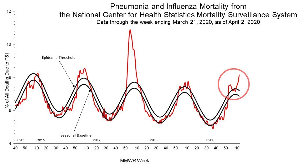
this chart is getting a lot of play.
it& #39;s extremely misleading and does not show what people think it does.
mostly, it& #39;s showing an artifact of incomplete data for wk 12 2020.
always check WHAT you are measuing.
this is not "deaths" it& #39;s "deaths as a % of all deaths"
it& #39;s extremely misleading and does not show what people think it does.
mostly, it& #39;s showing an artifact of incomplete data for wk 12 2020.
always check WHAT you are measuing.
this is not "deaths" it& #39;s "deaths as a % of all deaths"
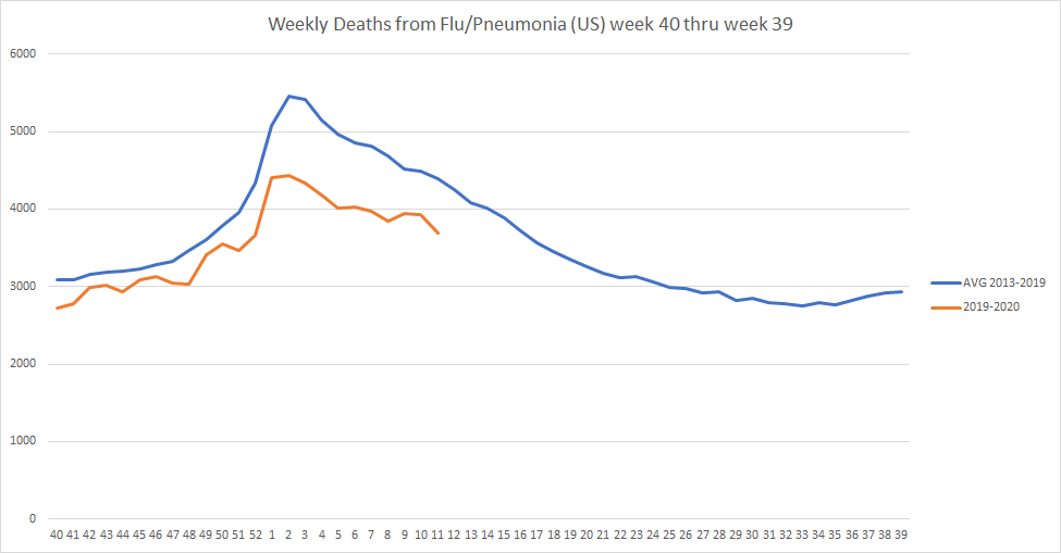
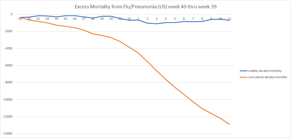
we can easily check this because they provide a link to the data they use. so i ran it. this is 2019-20 vs the avg of the 6 prior seasons. (full extent of data)
19-20 is thru wk 11 for reasons i& #39;ll get to in a minute.
actual deaths looks like this:
we& #39;re well below avg.
19-20 is thru wk 11 for reasons i& #39;ll get to in a minute.
actual deaths looks like this:
we& #39;re well below avg.
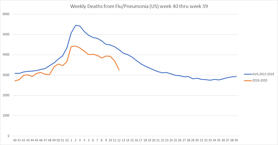
"we have wk 12, so why aren& #39;t you using it?"
because wk 12 looks badly incomplete. wk 11 did last week before they updated it.
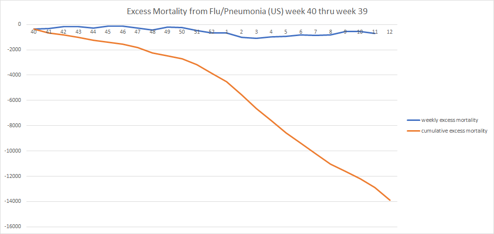
if we add wk 12, it looks like this:
and it drops our excess mortality to -13.9k
but i do not think those numbers for wk 12 are trustworthy.
because wk 12 looks badly incomplete. wk 11 did last week before they updated it.
if we add wk 12, it looks like this:
and it drops our excess mortality to -13.9k
but i do not think those numbers for wk 12 are trustworthy.
and that matters A TON for the first chart which is charting
deaths from flu+pneumonia / overall US deaths.
why? because the US deaths number is wildly incomplete, just as week 11 was a week ago.
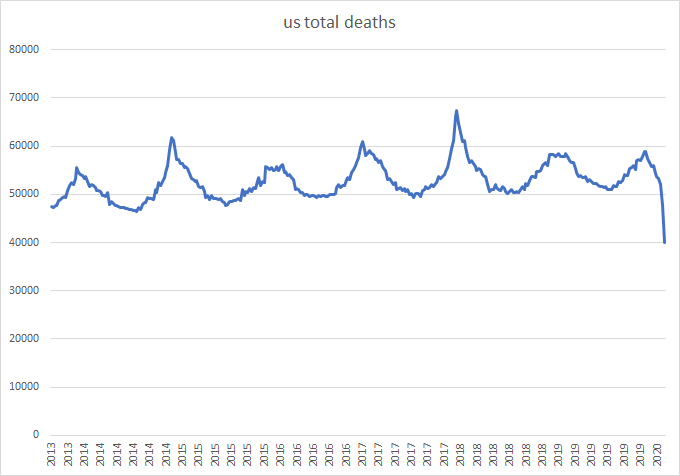
this is total US deaths. notice anything odd?
deaths are not down this much.
deaths from flu+pneumonia / overall US deaths.
why? because the US deaths number is wildly incomplete, just as week 11 was a week ago.
this is total US deaths. notice anything odd?
deaths are not down this much.
it& #39;s a data artifact and that artifact is being used as the denominator in this chart.
that sudden spike in deaths looks scary, but it& #39;s not.
it& #39;s not even real.
it& #39;s an artifact of the impossibly low denominator caused by incomplete data.
that sudden spike in deaths looks scary, but it& #39;s not.
it& #39;s not even real.
it& #39;s an artifact of the impossibly low denominator caused by incomplete data.
using the most recent week or 2 of data from this series looks like a great way to get it wrong.
they start extremely low and then get revised up.
publishing that chart based on that data is full on chart crime.
data here. click "view chart data" #S2">https://www.cdc.gov/flu/weekly/ #S2 ">https://www.cdc.gov/flu/weekl...
they start extremely low and then get revised up.
publishing that chart based on that data is full on chart crime.
data here. click "view chart data" #S2">https://www.cdc.gov/flu/weekly/ #S2 ">https://www.cdc.gov/flu/weekl...

 Read on Twitter
