After much Upshot consideration, we have decided that the best way to track coronavirus in the U.S. is by looking at what’s happening in metro areas. So we bring you many updating metro charts: https://www.nytimes.com/interactive/2020/04/03/upshot/coronavirus-metro-area-tracker.html">https://www.nytimes.com/interacti... @KevinQ @jshkatz
Will tweet a bunch of charts and some observations on today& #39;s data. But first want to thanks the amazing @nytgraphics team that is tracking this data around the country. They have made it freely available for download, too: https://github.com/nytimes/covid-19-data">https://github.com/nytimes/c...
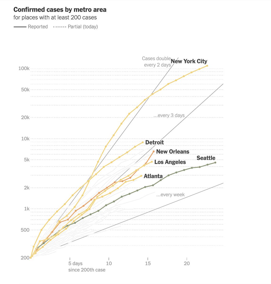
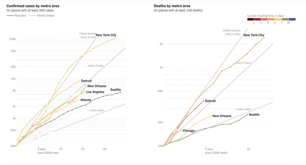
First, here& #39;s our totals map. These charts will show you every metro area once it hits 200 cases or 100 deaths. For these charts, you want to look at the steepness of the line. Steeper=worse. New York continues to stand out. https://www.nytimes.com/interactive/2020/04/03/upshot/coronavirus-metro-area-tracker.html">https://www.nytimes.com/interacti...
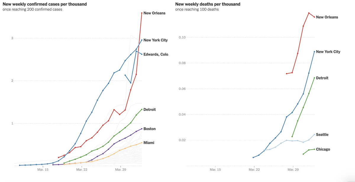
For all of these charts, we& #39;re showing you measures of both confirmed cases and deaths. The data is not perfect. Case counts depend a lot on the availability of testing. Deaths are more likely to be counted, but lag infections by weeks and depend on the health of who gets sick.
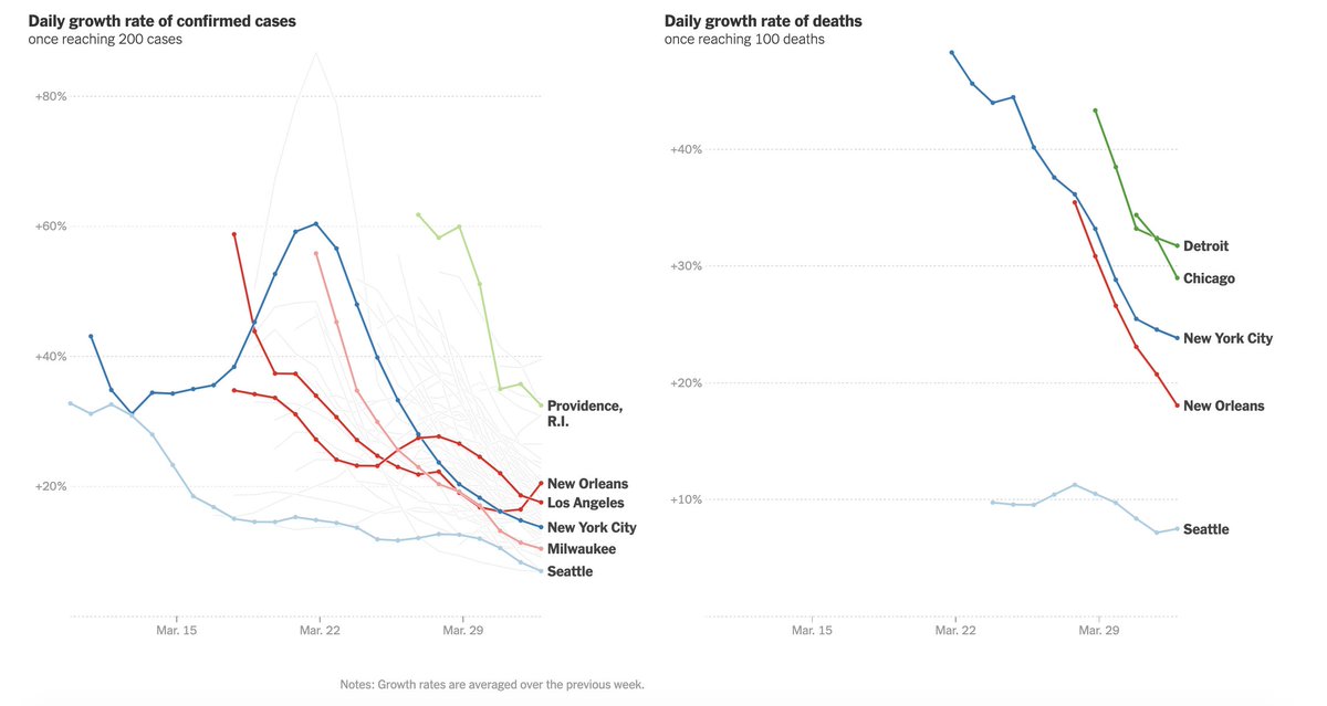
If you hate log scales, maybe you& #39;ll like this chart better. This is a direct measurement of growth rates in various places. 100% would mean cases are doubling every day. https://www.nytimes.com/interactive/2020/04/03/upshot/coronavirus-metro-area-tracker.html">https://www.nytimes.com/interacti...
Two things that stand out on these charts are: The high growth rate for cases in Providence, R.I., and the rising rate of deaths in Detroit. https://www.nytimes.com/interactive/2020/04/03/upshot/coronavirus-metro-area-tracker.html">https://www.nytimes.com/interacti...
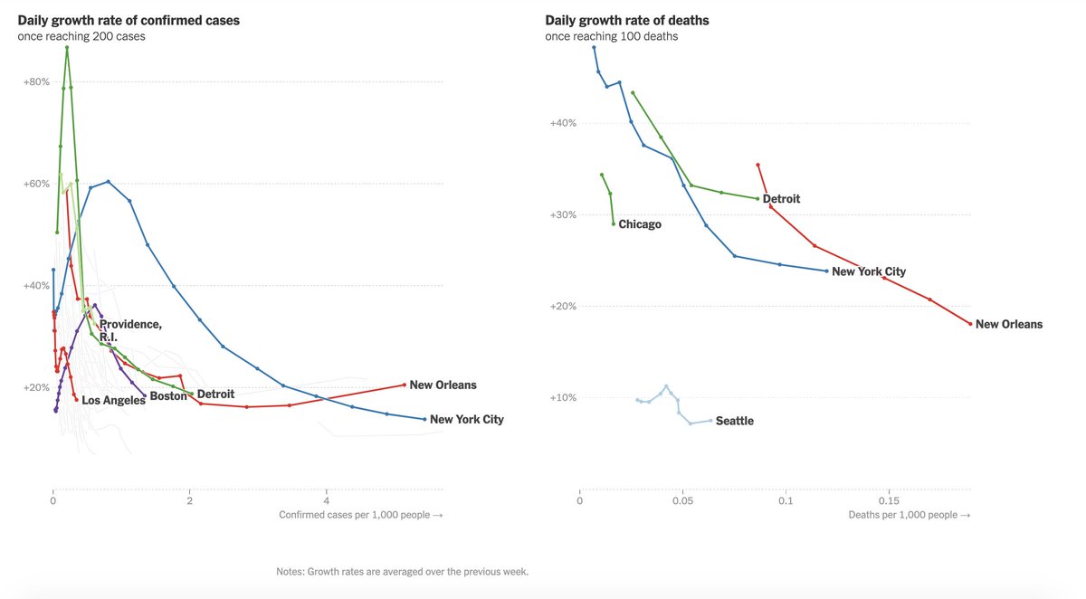
This is @Nate_Cohn & #39;s favorite chart. We call it "rate by severity." This shows you how fast the epidemic is growing based on how big it already is. High growth rates on the right side of this chart are what you worry about. New Orleans really stands out.
Our next chart adjusts for the population size of different metro areas. You want these lines to be pointing down.
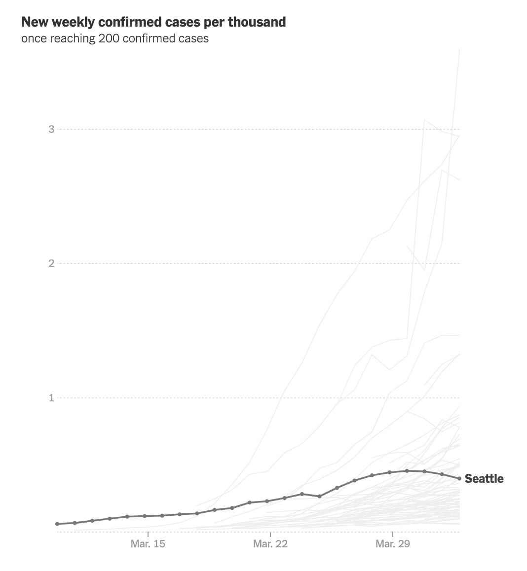
There& #39;s some possible good news in this chart about Seattle, an early hotspot for the disease. https://www.nytimes.com/interactive/2020/04/03/upshot/coronavirus-metro-area-tracker.html">https://www.nytimes.com/interacti...
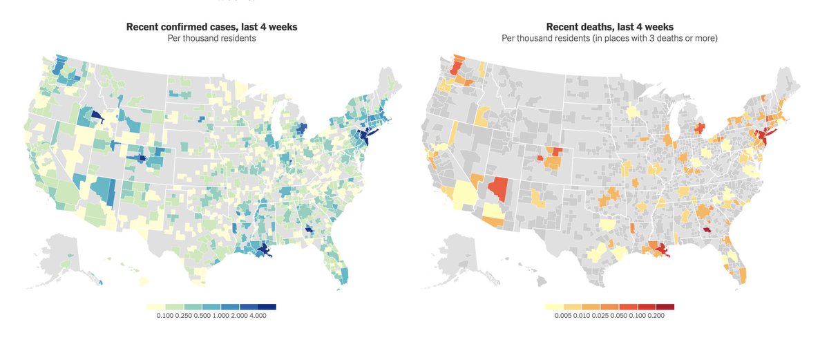
Finally, maps. These maps focus on recent cases and deaths, so they provide a snapshot of severity right now. New York, New Orleans, and Albany, Ga., pop, but so do some ski towns in the West with lot of cases per capita. That could mean a strain on health care resources.
Another thing to note in the maps. There are some parts of the U.S. that are not in a metro area. So if you& #39;re wondering whether your town is included in this data, you can look for it here. Light grey means you are outside a metro (sorry).
But, if you& #39;re not in a metro area, @nytgraphics has you covered, with great data on coronavirus cases by state and county here: https://www.nytimes.com/interactive/2020/us/coronavirus-us-cases.html">https://www.nytimes.com/interacti...

 Read on Twitter