Thread. I spent last night looking at Australia& #39;s #COVIDー19 testing data https://abs.twimg.com/emoji/v2/... draggable="false" alt="🦉" title="Owl" aria-label="Emoji: Owl">Especially after we heard the PM say Australia has one of the highest testing rates in the world. True? 1/10
http://www.covid19data.com.au"> http://www.covid19data.com.au
#COVID19au #covid19australia #coronavirusau #auspol
http://www.covid19data.com.au"> http://www.covid19data.com.au
#COVID19au #covid19australia #coronavirusau #auspol
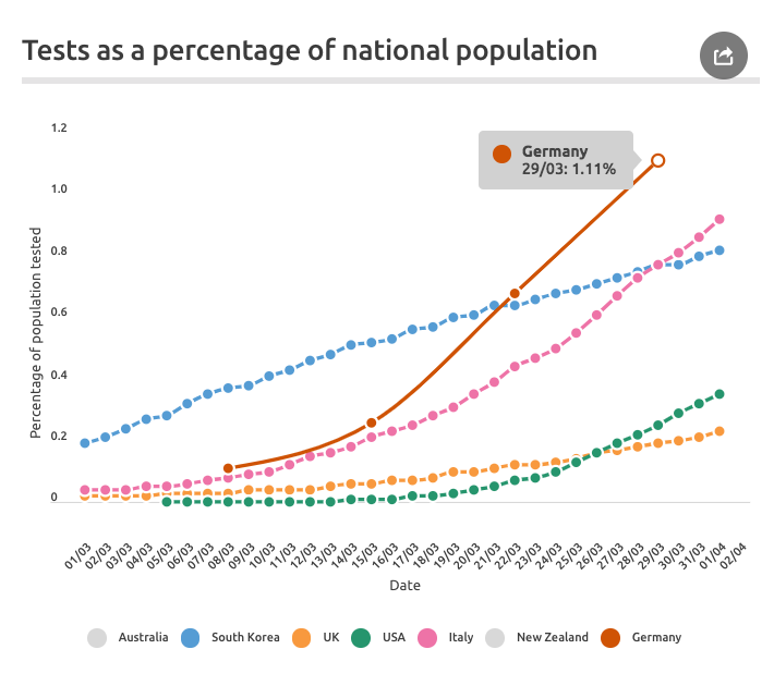
I pulled some testing data from other countries. There are a stack of caveats here b/c of the different ways countries test and report, but here& #39;s what I found ... 2/10
We all know South Korea (blue line) is the gold standard - expansive and consistent. Germany (brown line) is another leader now. And the USA (green line) has a lot of patchy data but is in the midst of a massive push. (UK is lower - more on that another time). 3/10
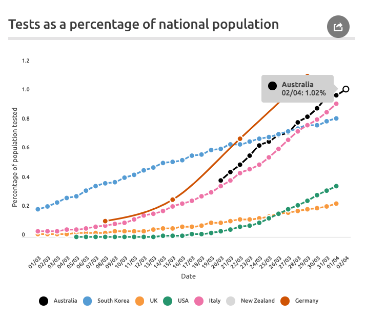
This is where Australia fits in. Our health workers and scientists have tested more than 1% of the population in a few weeks. 4/10
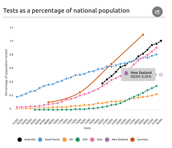
Out of interest I also charted New Zealand. I had to go directly to NZ Govt website to find any data and only managed to find one recent announcement with a specific number. Here& #39;s where NZ sits. 5/10
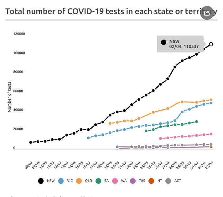
Which states and territories in Australia are testing the most? As you’d expect, NSW accounts for the vast majority (about half of all tests). 6/10
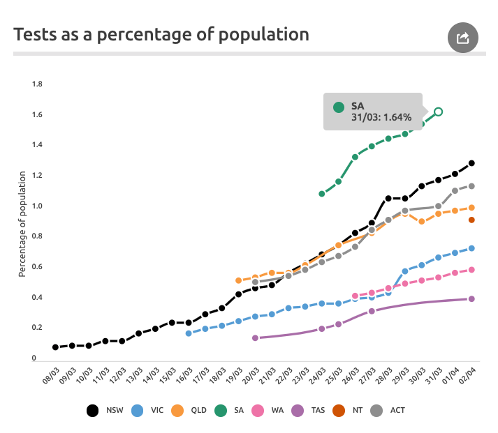
NSW also does well in the per capita analysis - testing about 1.3% of the population. But the leader here is South Australia, which has tested more than 1.6% of the state. 7/10
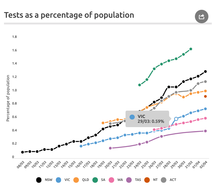
ACT and Queensland also have high rates of testing. But interestingly, Victoria seems to be lagging. You can see that on 29 March, there was a big push. 8/10
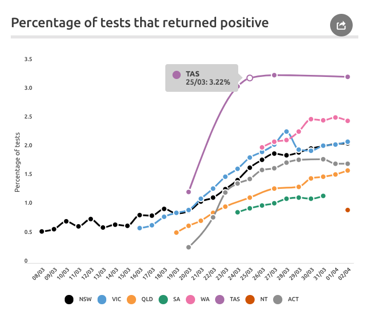
How many of these tests come back positive? Tasmania and WA have the highest percentages here, but high rates of infections from cruise ships in these states have affected the results. 9/10
With all the data we& #39;re now getting about #COVID19au imo it& #39;s useful to keep these timeline views. They show us more clearly what& #39;s happening, what& #39;s changed and where we& #39;re going. Would love to know your feedback  https://abs.twimg.com/emoji/v2/... draggable="false" alt="🤓" title="Nerd face" aria-label="Emoji: Nerd face"> 10/10 http://www.covid19data.com.au"> http://www.covid19data.com.au
ps. all the domestic data came from state / territory / federal sources and cross-checked with -
http://www.covidlive.com.au"> http://www.covidlive.com.au - @migga
@COVID_Australia
https://www.theguardian.com/news/datablog/ng-interactive/2020/mar/26/how-many-cases-of-coronavirus-are-there-in-australia-live-covid-19-numbers-and-statistics">https://www.theguardian.com/news/data... - @NickEvershed
https://www.abc.net.au/news/2020-03-17/coronavirus-cases-data-reveals-how-covid-19-spreads-in-australia/12060704">https://www.abc.net.au/news/2020... - @ingating

 Read on Twitter