OK let& #39;s try this as a vote.
Which do you prefer to visualize COVID-19 case status?
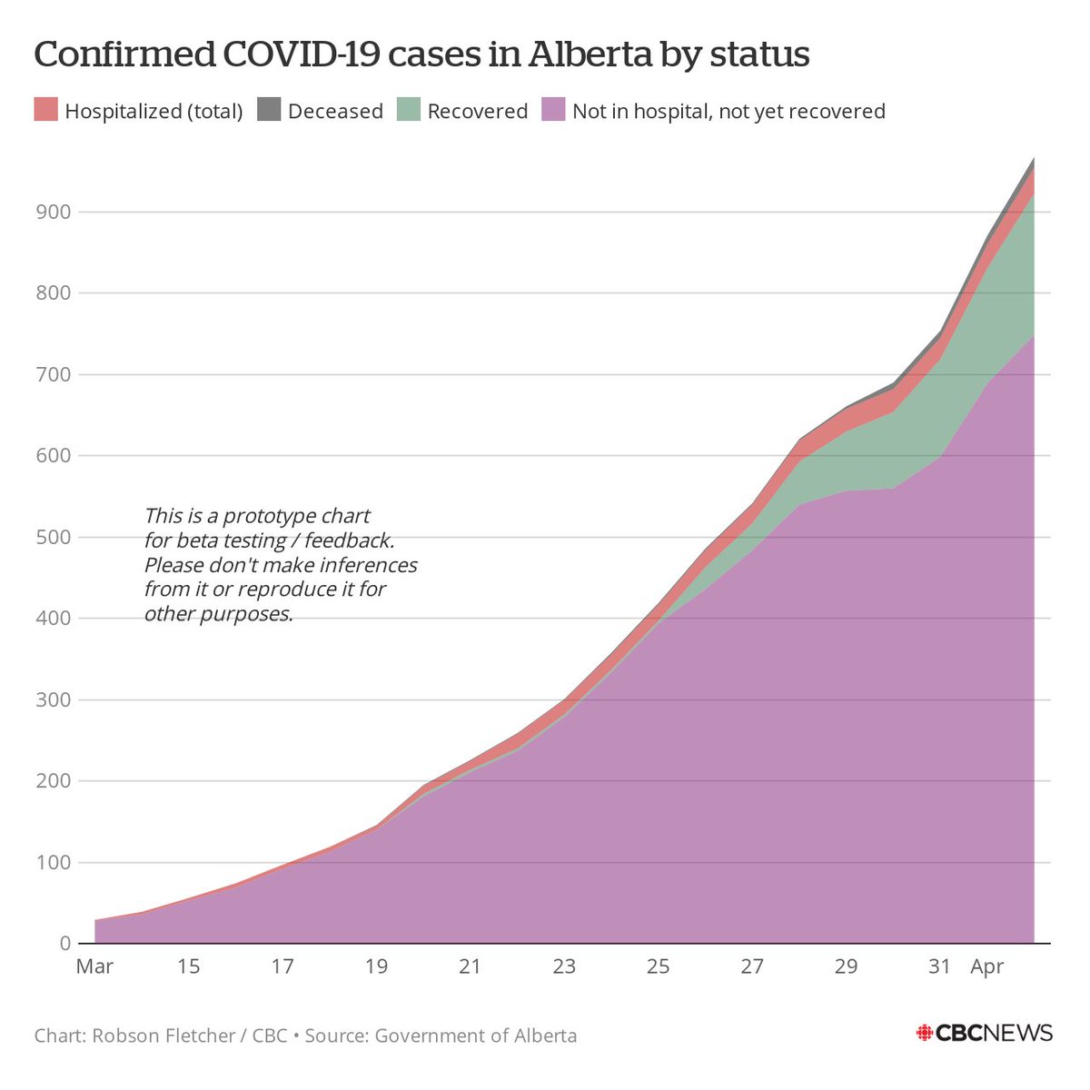
1. Stacked area chart: All values "above" zero
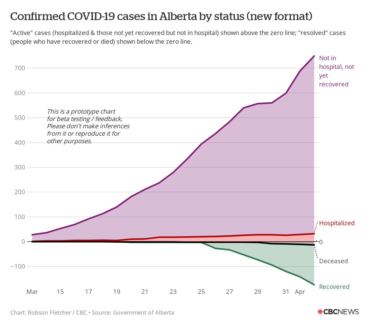
2. Line chart: Active cases "above" zero, resolved cases "below"
I& #39;ll put a poll in the next tweet in this thread.
Comments also welcome!
Which do you prefer to visualize COVID-19 case status?
1. Stacked area chart: All values "above" zero
2. Line chart: Active cases "above" zero, resolved cases "below"
I& #39;ll put a poll in the next tweet in this thread.
Comments also welcome!
Which data visualization (described i the tweet above) do you prefer?

 Read on Twitter


