1) Saw a great quote yesterday from @AlbertoCairo: "Data viz isn’t about rules, it’s about reasons."
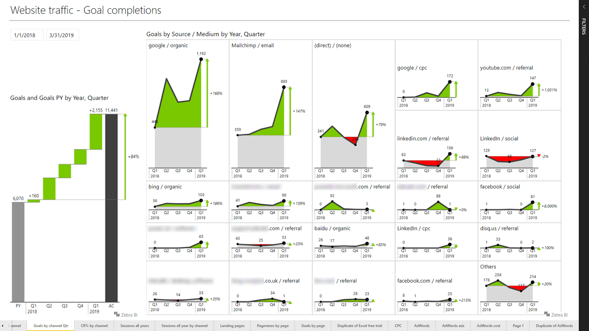
Last night I watched a webinar featuring @lapajne from @ZebraBI. Their custom visuals are just jaw dropping in their implementation. What& #39;s that got to do with the quote?
Last night I watched a webinar featuring @lapajne from @ZebraBI. Their custom visuals are just jaw dropping in their implementation. What& #39;s that got to do with the quote?
2) The team at @ZebraBI do NOTHING without damn good reason. EVERY CHOICE they make in their product is solid, from what font they should use, to what line thickness, to how interaction should work. Every single aspect of their visuals screams & #39;cut NO corners& #39;. What guides them?
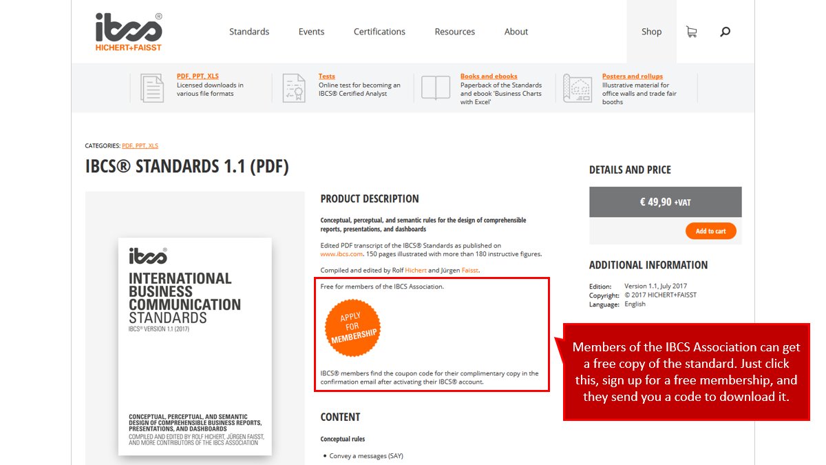
3) Among other things, @lapajne follows the IBCS standard. It& #39;s a great guide towards crystal clear communication; it& #39;s KA-CHING *free* for members, and membership is KA-CHING *free* for all. https://www.ibcs.com/product/ibcs-standards-pdf/">https://www.ibcs.com/product/i...
4) I like this standard. It sets out REASONS why you should prefer choice A over choice B.
Too many dashboards I see have both visual A and visual B purely to make a dashboard look "Interesting" through variety.
Believe me: That is the WRONG REASON to choose what users see.
Too many dashboards I see have both visual A and visual B purely to make a dashboard look "Interesting" through variety.
Believe me: That is the WRONG REASON to choose what users see.
5) @AlbertoCairo said "The best advice I can give a young student is to read." So if you& #39;re learning #PowerBI, go download that standard, and give it a read.
And then go check out the design choices @ZebraBI make in their sample files. Because @lapajne is *very* well read.
And then go check out the design choices @ZebraBI make in their sample files. Because @lapajne is *very* well read.
6) Also follow @AlbertoCairo, @storywithdata, @DataRevelations, @HighVizAbility, @DataRemixed, @visualisingdata, @infowetrust; read what THEY have to say, follow who they praise.
Don& #39;t build #PowerBI dashboards in a vacuum of not reading. Because (like a vacuum) they will suck.
Don& #39;t build #PowerBI dashboards in a vacuum of not reading. Because (like a vacuum) they will suck.
7) Lastly, here& #39;s where you can find more on @ZebraBI:
https://zebrabi.com/
https://zebrabi.com/">... href=" https://www.youtube.com/channel/UCzPJ-mUqUuHowoLBVwgIVnA
And">https://www.youtube.com/channel/U... if you were on yesterday& #39;s webinar and found it useful, please give @lapajne and the @ZebraBI team a shout out. https://abs.twimg.com/emoji/v2/... draggable="false" alt="👏" title="Clapping hands sign" aria-label="Emoji: Clapping hands sign">
https://zebrabi.com/
And">https://www.youtube.com/channel/U... if you were on yesterday& #39;s webinar and found it useful, please give @lapajne and the @ZebraBI team a shout out.

 Read on Twitter


