NEW: Thurs 2 April update of coronavirus trajectories
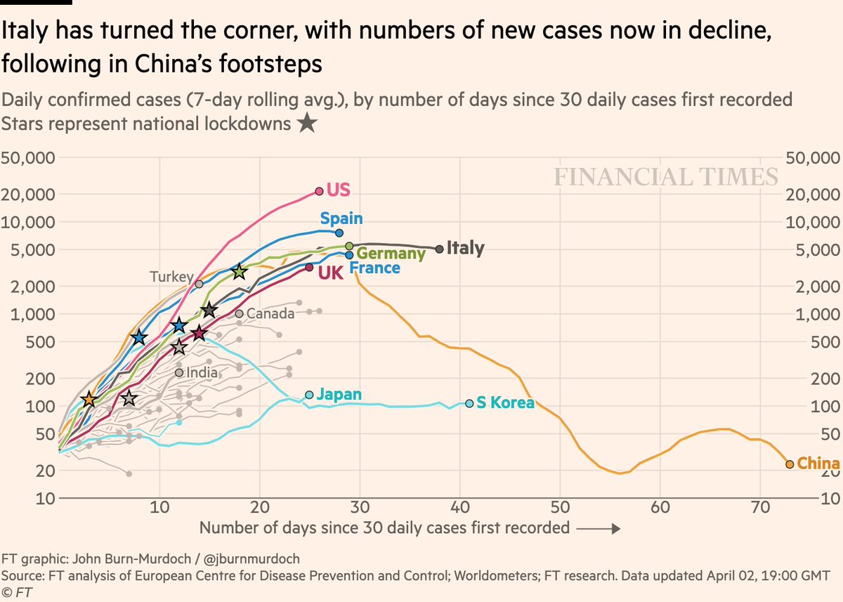
First, daily new cases
• American exceptionalism. More than 20k new cases per day, each day more than the last
• Spain & Italy both seeing fewer new cases
• Japan’s outbreak continues
Live charts: http://ft.com/coronavirus-latest">https://ft.com/coronavir...
First, daily new cases
• American exceptionalism. More than 20k new cases per day, each day more than the last
• Spain & Italy both seeing fewer new cases
• Japan’s outbreak continues
Live charts: http://ft.com/coronavirus-latest">https://ft.com/coronavir...
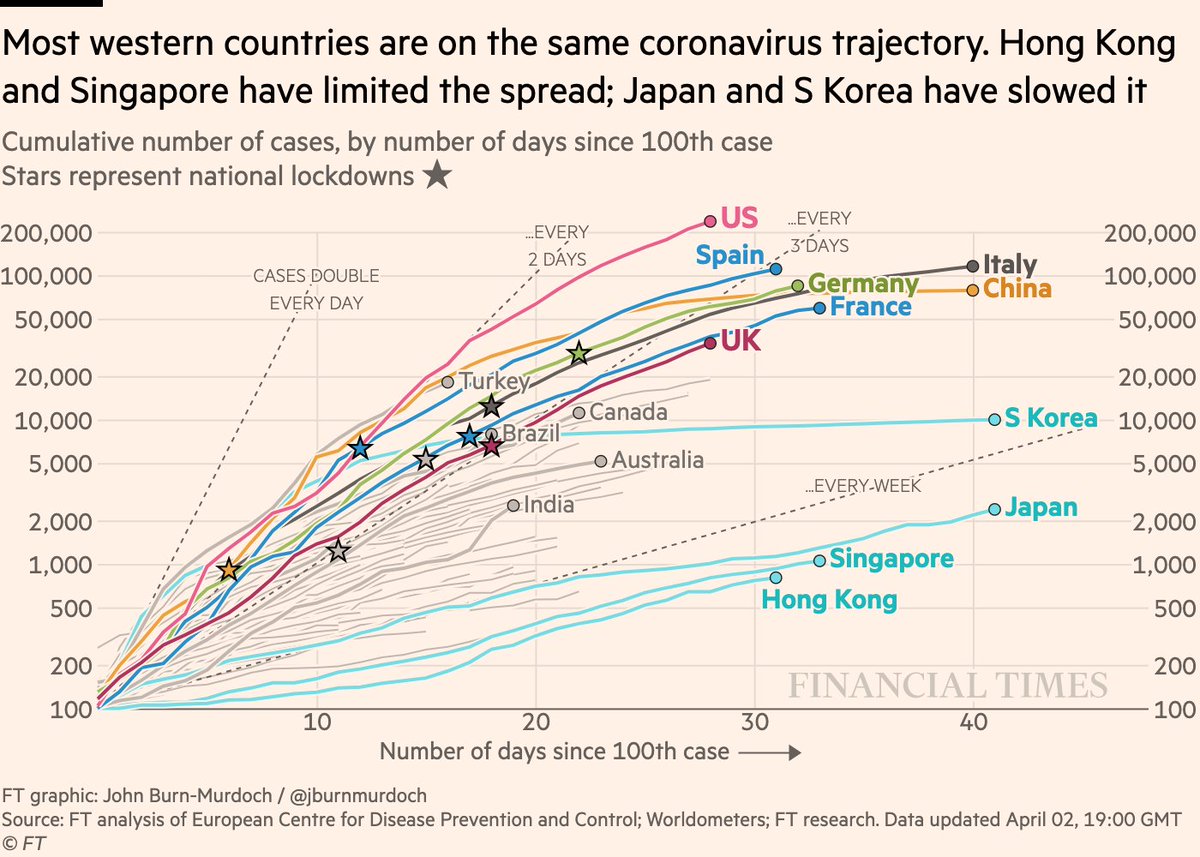
How does that look on the old cumulative chart?
• Globally we’ve now passed 1m confirmed cases. Almost 25% are in the US
• Fauci reckons US alone could easily pass 1m
• No signs yet of US curve flattening
All charts: http://ft.com/coronavirus-latest">https://ft.com/coronavir...
• Globally we’ve now passed 1m confirmed cases. Almost 25% are in the US
• Fauci reckons US alone could easily pass 1m
• No signs yet of US curve flattening
All charts: http://ft.com/coronavirus-latest">https://ft.com/coronavir...
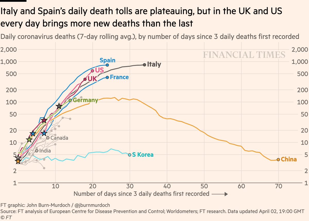
Now daily new deaths:
• US & UK are straight lines angling upwards on a log scale. This is not good.
• In both countries, over the last week every day brings ~25% more new deaths than the day before
• No other countries are on that steep a trajectory at this stage of outbreak
• US & UK are straight lines angling upwards on a log scale. This is not good.
• In both countries, over the last week every day brings ~25% more new deaths than the day before
• No other countries are on that steep a trajectory at this stage of outbreak
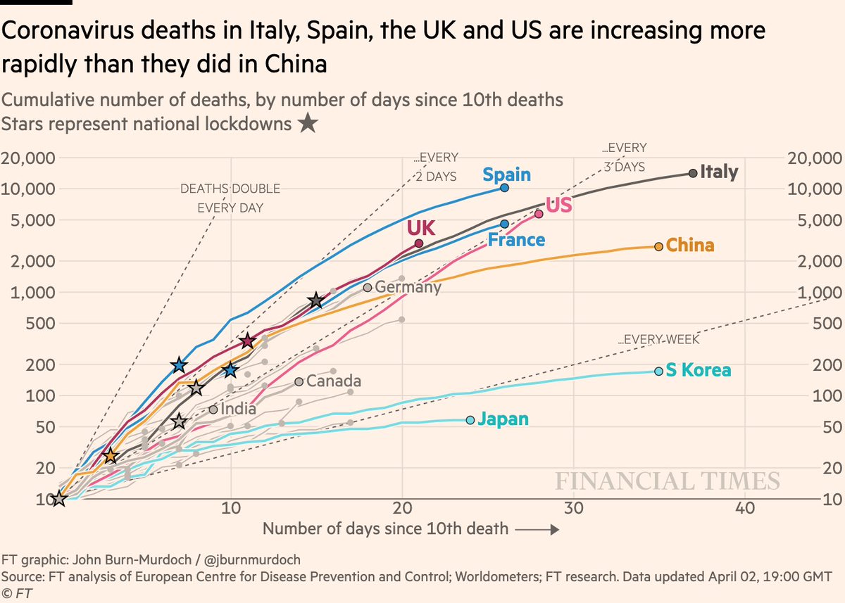
Deaths in cumulative form:
• Again, it’s the slopes that stand out (that’s what these charts are all about)
• US still hugging that "doubling every 3 days" line. No other line that steep after 28 days
• UK steeper than Italy at same stage
All charts: http://ft.com/coronavirus-latest">https://ft.com/coronavir...
• Again, it’s the slopes that stand out (that’s what these charts are all about)
• US still hugging that "doubling every 3 days" line. No other line that steep after 28 days
• UK steeper than Italy at same stage
All charts: http://ft.com/coronavirus-latest">https://ft.com/coronavir...
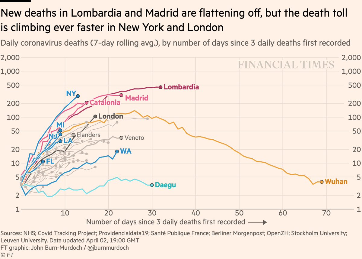
Now subnational regions’ daily new deaths:
• London has shot past Wuhan’s death rate, >100 deaths for 3rd straight day. New deaths increasing by ~25% a day
• New York’s death toll angling steeply upwards. Hundreds of deaths per day, and rising
• Madrid & Catalonia plateauing?
• London has shot past Wuhan’s death rate, >100 deaths for 3rd straight day. New deaths increasing by ~25% a day
• New York’s death toll angling steeply upwards. Hundreds of deaths per day, and rising
• Madrid & Catalonia plateauing?
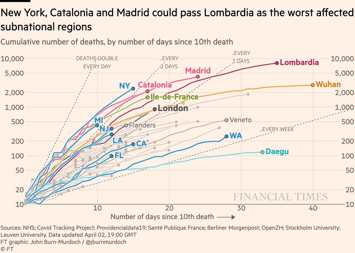
Now subnational death tolls cumulatively:
• Michigan (Detroit, in particular) could join New York and Spanish cities as major urban epicentres
• NY has as many deaths by today as Lombardia had 8 days further in
All charts: http://ft.com/coronavirus-latest">https://ft.com/coronavir...
• Michigan (Detroit, in particular) could join New York and Spanish cities as major urban epicentres
• NY has as many deaths by today as Lombardia had 8 days further in
All charts: http://ft.com/coronavirus-latest">https://ft.com/coronavir...
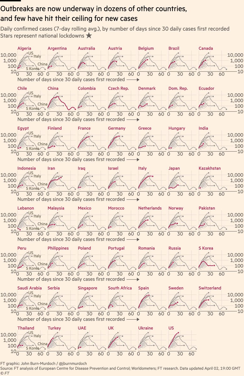
Finally, the "small multiples" showing all 55 countries where we have data:
• Signs that new confirmed cases in Germany may be flattening
• Norway vs Sweden: one locked down & new cases are flat, one didn’t & cases are rising
• Japan passes Korea for new cases at same stage
• Signs that new confirmed cases in Germany may be flattening
• Norway vs Sweden: one locked down & new cases are flat, one didn’t & cases are rising
• Japan passes Korea for new cases at same stage
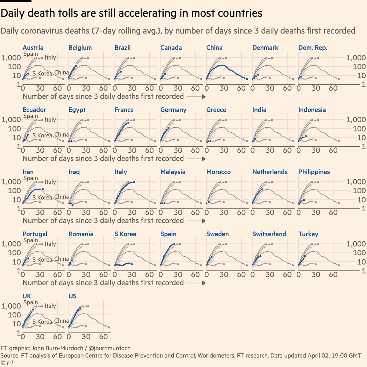
Daily new deaths for 30 countries:
• Daily deaths in Sweden & Belgium matching Spain & Italy
• German death toll still rising: low case fatality rate was misleading when most of those tested were less vulnerable to the virus
Live versions of all charts: http://ft.com/coronavirus-latest">https://ft.com/coronavir...
• Daily deaths in Sweden & Belgium matching Spain & Italy
• German death toll still rising: low case fatality rate was misleading when most of those tested were less vulnerable to the virus
Live versions of all charts: http://ft.com/coronavirus-latest">https://ft.com/coronavir...
Here’s a video where I explain why we’re using log scales, showing absolute numbers instead of per capita, and much more: https://twitter.com/janinegibson/status/1244519429825802240">https://twitter.com/janinegib...
And a chart showing why we& #39;re using absolute numbers rather than population-adjusted rates: https://twitter.com/jburnmurdoch/status/1244380095164420101">https://twitter.com/jburnmurd...
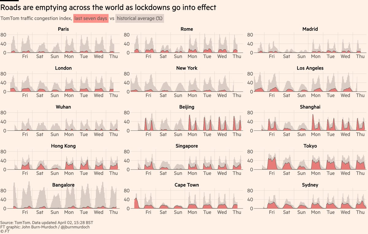
We’re also monitoring traffic levels around the world to track lockdowns. Wuhan’s outbreak may have ended, but its roads are still empty.
If we accept that NY, London etc are heading the way of Wuhan, that means lockdown for months longer
Daily updates: https://www.ft.com/content/0c13755a-6867-11ea-800d-da70cff6e4d3">https://www.ft.com/content/0...
If we accept that NY, London etc are heading the way of Wuhan, that means lockdown for months longer
Daily updates: https://www.ft.com/content/0c13755a-6867-11ea-800d-da70cff6e4d3">https://www.ft.com/content/0...
Please email coronavirus-data@ft.com with feedback, requests and subnational data.
All of these are invaluable, and we continue to incorporate your suggestions and data every day.
I’ll keep getting back to as many people as possible.
Enjoy the rest of your night, folks!
All of these are invaluable, and we continue to incorporate your suggestions and data every day.
I’ll keep getting back to as many people as possible.
Enjoy the rest of your night, folks!

 Read on Twitter