Just attended a fascinating webinar by @mslima glad to see some cuneiform mentioned alongside the enigmatic spanish theologian Ramon Llull, the history of data visualization is (very) long and fascinating! A brief foray into a 5000 year old cuneiform example below...
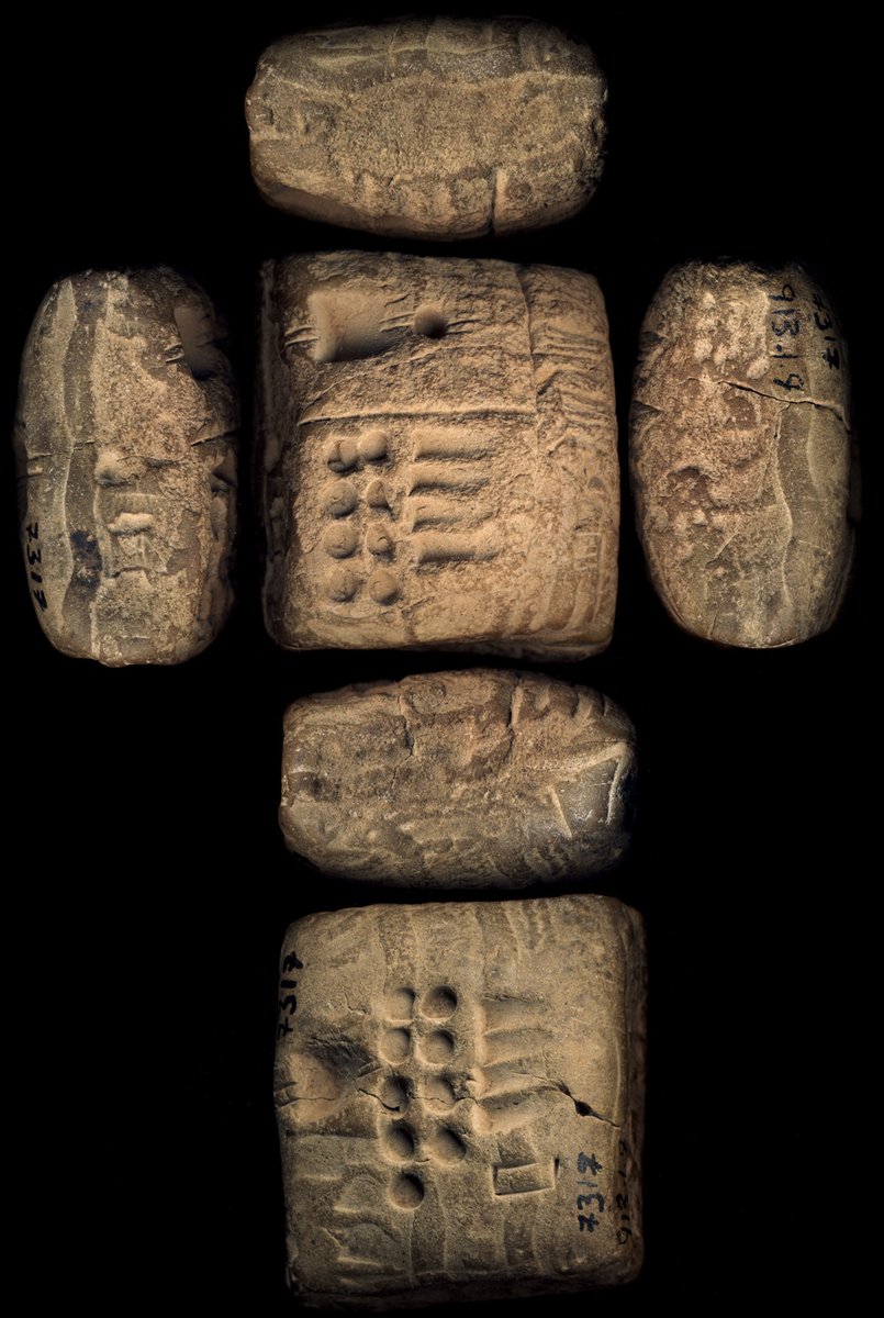
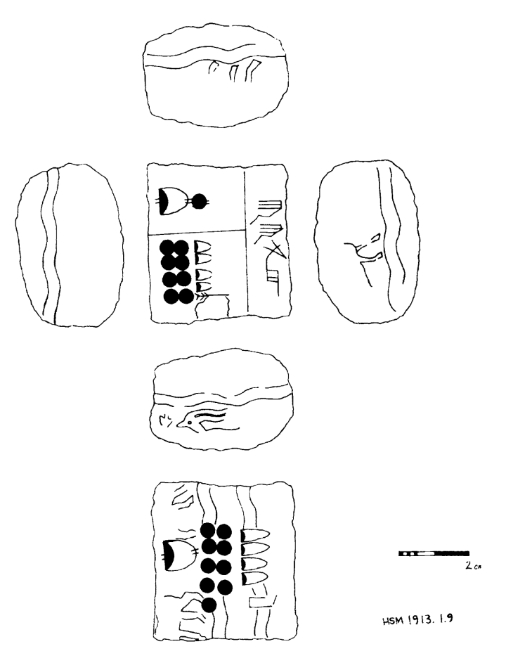
The image on the left is a tablet in the Harvard Semitic Museum& #39;s collection that dates to around 3000 BCE. It has two numbers on the front (the middle square at the top) and a summary on the back (the square at the bottom of the image). https://cdli.ucla.edu/P005402 ">https://cdli.ucla.edu/P005402&q...
I think it& #39;s a good demonstration of the power of thinking about visualization, because the summary, the actual process of calculating the total sum is quite easy! There is no conversion of units, in fact the layout of the two entries looks very similar to layout of the sum.
By just removing the line that separates the two entries on the front you pretty much get the sum on the back (here& #39;s a drawing to help). So that means that this visualizations encodes much more than a simple procedure, instead it preserves intentionality, context, and theory.

 Read on Twitter


