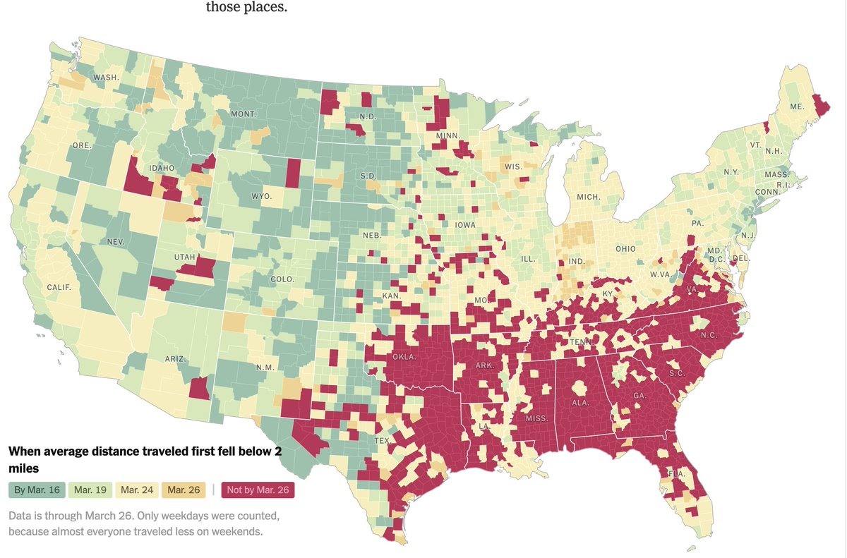
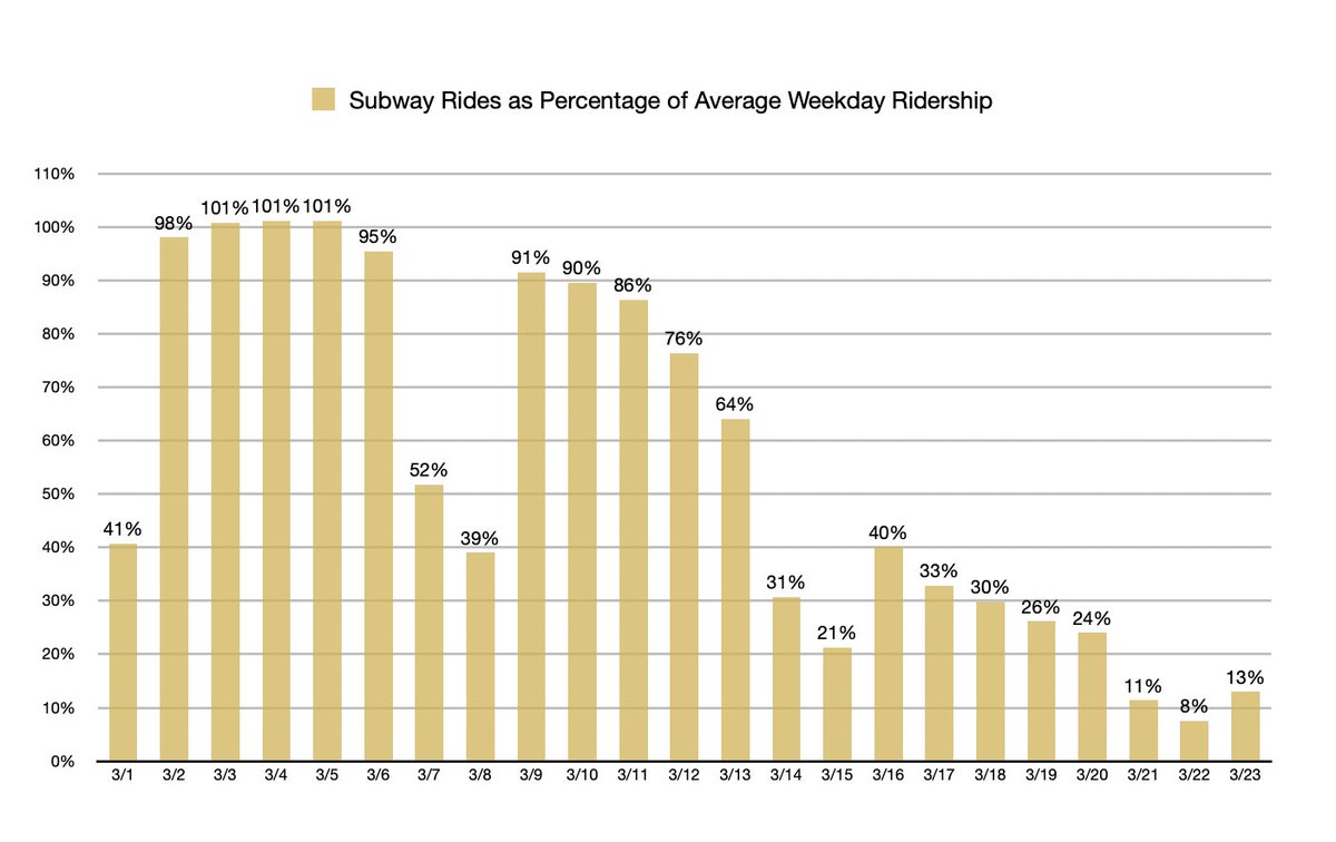
Incredibly revealing graphic about when locking down really happened and where. https://www.nytimes.com/interactive/2020/04/02/us/coronavirus-social-distancing.html">https://www.nytimes.com/interacti...
You can follow @joshtpm.
Tip: mention @twtextapp on a Twitter thread with the keyword “unroll” to get a link to it.

 Read on Twitter


