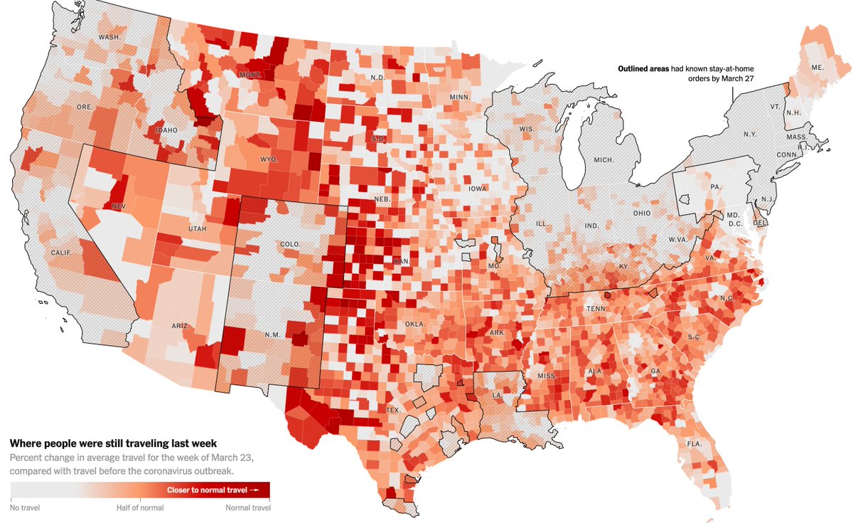
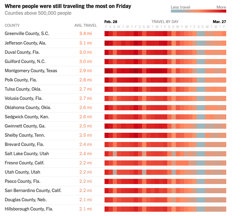
here is what I have to say about these two maps: the first one lacks a ton of context that the second one includes. if you& #39;re using the first map to make sweeping judgments about the South, please rethink. I& #39;ll explain.
there& #39;s a reason why so many of the places where distance traveled fell below 2 miles earlier are in cities. a lot of the South is rural, and, more importantly, a lot of places don& #39;t have access to essential goods and services (groceries, internet, healthcare) w/o travel.
there& #39;s also a policy reason, obviously: Southern governors and, in many cases, Southern mayors have been slow to institute stay-at-home orders. plus, you& #39;re dealing with a lack of information access: the rural South has some of the lowest rates of internet access in the country.
all of which becomes much clearer in the second map. you can see that **relative** rates of travel have fallen in Southern counties at ~same level as many Western counties, which is context you don& #39;t get at all in the first map.
so yeah, things are bad in the South and are only going to get worse. but it& #39;s a very complex situation that is not helped by your "hur hur hur look at those idiots" takes.
if you made it all the way to the end of this thread, please read this story. https://www.theatlantic.com/politics/archive/2020/04/coronavirus-unique-threat-south-young-people/609241/">https://www.theatlantic.com/politics/...
I should say: both of those maps were NYT maps and I think the accompanying story is actually great. https://www.nytimes.com/interactive/2020/04/02/us/coronavirus-social-distancing.html">https://www.nytimes.com/interacti...
Their list of where people are still traveling the most only includes counties of >500,000 people (for context, I reported a story on a rural county of just 2,000 people last year), and does include a lot of urban Southern counties.
to add one last thing: healthcare in the rural South is in a very, very bad state right now. if you& #39;re in the rural South and know of a hospital or clinic closing near you and/or healthcare workers being furloughed, please DM or email me (in bio). https://www.facingsouth.org/2020/03/covid-19-exposes-precarious-state-rural-health-care-south">https://www.facingsouth.org/2020/03/c...

 Read on Twitter


