I& #39;m going to get back to writing this morning...working on some stuff about age distributions and invisibility of epidemics in "young" countries. But first...
I want to do a tweetorial about epidemic curves, lags and the genesis of epidemiological optimism. As some Canadians noticed, Ontario made partial data from the provincial line list available public yesterday. A big deal, given the culture around data in this province.
You can download the data here. It& #39;s not totally complete, but it& #39;s the real deal: https://data.ontario.ca/dataset/confirmed-positive-cases-of-covid-19-in-ontario">https://data.ontario.ca/dataset/c...
"accurate case date" signifies an approach used by epidemiologists to fill onset dates when they& #39;re sometimes missing. They will use onset date if available, replace with test submission date if that& #39;s missing, and replace with test-received-by-lab date if THAT& #39;s missing.
Epi nerds reading this will know there are probably better ways to do this, but whatevs, that& #39;s what people do.
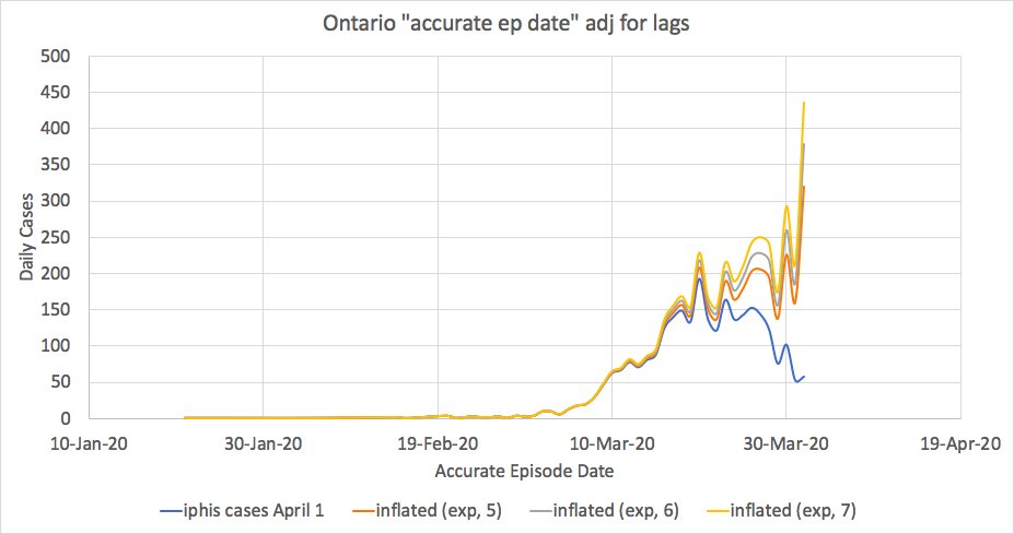
The natural response to such a curve is to say: "woohoo. We have flattened that curve."
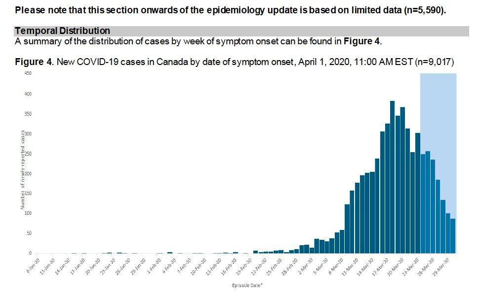
But of course, we EXPECT the cases to trail off on the right hand side of the curve, because of lags between onset and reporting. In other words, we expect April 1 cases to be an under-count, because most of those cases have yet to be reported.
This issue is acknowledged by good epidemiologists, like whichever smarty at @PHAC_GC made this figure for their Canadian national epi report ( https://www.canada.ca/content/dam/phac-aspc/documents/services/diseases-maladies/2019-novel-coronavirus-infection/SURV_COVID19%20Epi%20update%20APR1.pdf).">https://www.canada.ca/content/d...
So what do we do about that? How do we know whether we& #39;re flattening this mofo or not?
We treat this as a time-to-event or survival analysis problem. We can impute lags between case onset and reporting by comparing epi curves released on different days.
We treat this as a time-to-event or survival analysis problem. We can impute lags between case onset and reporting by comparing epi curves released on different days.
Today is April 2. We have 32 cases (I think) for April 1. If by tomorrow (April 3) the April 1 count goes to 96, then goes to 128 on April 4, then stops increasing, we know that we have 25% of cases reported with a 1 day lag, 75% of cases reported with 2 day lag, 100% at d 3.
Simplistic to make the math easier, and oh that our lags were that short, but you get the idea.
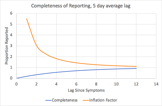
If this is consistent, then we can look at the count from April 1 (today) and say: divide by 0.25 to inflate. March 31 is 2 days ago so divide by 0.75.
If this is consistent, then we can look at the count from April 1 (today) and say: divide by 0.25 to inflate. March 31 is 2 days ago so divide by 0.75.
If you have delays between onset and case report, you can create a table of "failure times" using survival analytic methods, and do this with actual data. We did (late last night) get access to the good stuff (the real iphis data), but I will be executed or something if we share
so I can& #39;t. But we can also do this just based on varying assumptions around the average lag between onset and report in Ontario. Our tests are coming back slowly, so let& #39;s say we have an average time from onset to report of 5 days (I know, I know, it& #39;s longer).
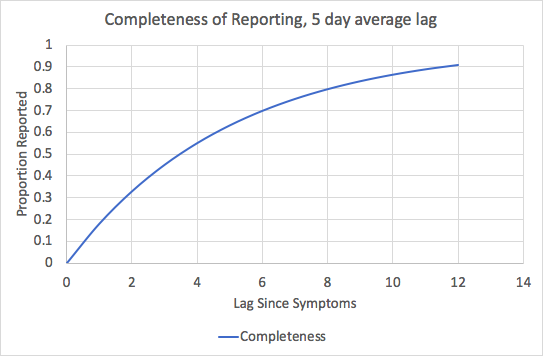
If we assume that there& #39;s an exponential hazard here for reporting, completeness of test reporting by some time "t" is going to be:
Completeness = 1-exp(-r t)
Completeness = 1-exp(-r t)
Sorry, math and now some will flee. But this isn& #39;t that big a deal...exp just means exponent. On your calculator that& #39;s the e^x thing.
r is the daily reporting rate, and the beauty of exponential hazards is that r is equal to 1/(average time from onset to reporting)
r is the daily reporting rate, and the beauty of exponential hazards is that r is equal to 1/(average time from onset to reporting)
If we assume average time from onset to reporting is 5 days that& #39;s just 1/5. 6 day average TAT and it& #39;s 1/6 and so on.
So let& #39;s circle back to those Ontario data that looked so awesome and encouraging, and assume varying lag functions. Our lag-corrected epi curves look like this:
So sadly we must now retract our high-fives. But it& #39;s important to actually know where we& #39;re at.
I& #39;m going to spare you all my grumbling about the March break travellers, but I ain& #39;t seeing a whole lot of the ol& #39; flattenin& #39; happening here.
I& #39;m going to spare you all my grumbling about the March break travellers, but I ain& #39;t seeing a whole lot of the ol& #39; flattenin& #39; happening here.
Kudos to our amazing Dr. de Villa and Mayor Tory for doubling down physical/social distancing. We are not out of the soup yet.
Thus endeth ye epi tweetorial.
I& #39;m going to put the spreadsheet up on figshare if any under-employed quants want to take this and make a nice app...you can choose your own adventure wrt which survival time function you choose. But the tldr is: don& #39;t believe the RHS of epi curves. They& #39;re trying to trick you.
Here is the figshare link: now nerd out!
First one to make a shiny app gets a chocolate! https://figshare.com/articles/Adjusting_for_reporting_lags_using_public_iPHIS_file/12063744">https://figshare.com/articles/...
First one to make a shiny app gets a chocolate! https://figshare.com/articles/Adjusting_for_reporting_lags_using_public_iPHIS_file/12063744">https://figshare.com/articles/...
@JPSoucy @ishaberry2 we should do this for your awesome data resource, except you don& #39;t have onset date yet (I don& #39;t think).

 Read on Twitter


