(English version)
Mortality and use of intensive care due to coronavirus in Sweden, Norway, Denmark, Finland, Iceland and Estonia; updated with data from yesterdays (1.4) reports.
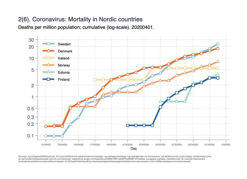
Fig 1(6). Mortality per million population: /1
Mortality and use of intensive care due to coronavirus in Sweden, Norway, Denmark, Finland, Iceland and Estonia; updated with data from yesterdays (1.4) reports.
Fig 1(6). Mortality per million population: /1
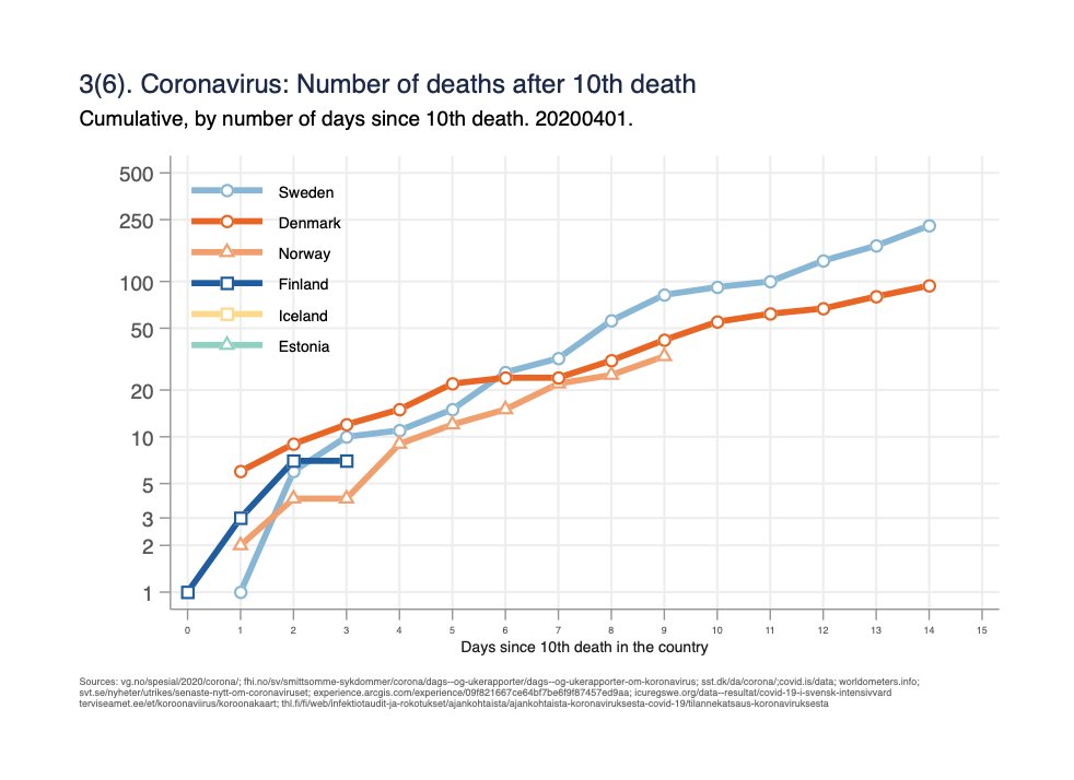
Fig 3(6). Absolute number of deaths since 10th death in the country.
(Attempts to get same starting point/phase of the epidemic for all countries. Not sure how well this actually works): /2
(Attempts to get same starting point/phase of the epidemic for all countries. Not sure how well this actually works): /2
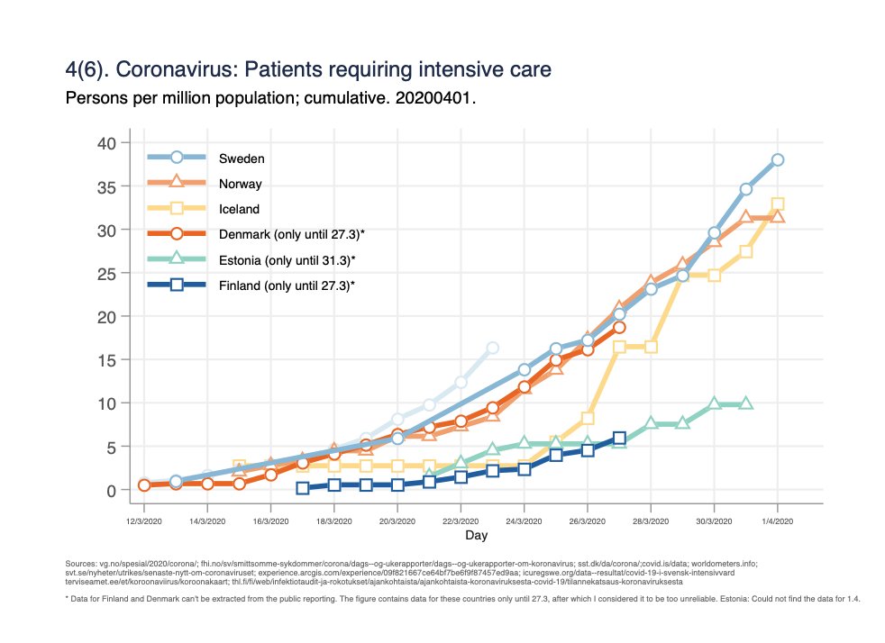
Fig 4(6). Intensive care per million population.
(Data for Finland and Denmark available only until 27.3; can’t get the cumulative data from their public reporting). /4
(Data for Finland and Denmark available only until 27.3; can’t get the cumulative data from their public reporting). /4
Fig 5(6). Intensive care per million population on log-scale.
(Data for Finland and Denmark available only until 27.3). /5
(Data for Finland and Denmark available only until 27.3). /5
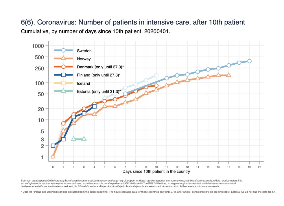
Fig 6(6). Number of patients in intensive care, cumulative since 10th patient. (Finland and Denmark only until 27.3) /6
Different graphs try to answer different questions:
- 1&4: Burden of disease relative to the population size.
- 2&5: Rate of change in burden relative to the population size.
- 3&6: Rate of change in absolute numbers, trying to accounting for diffs. in phase of epidemic. /7
- 1&4: Burden of disease relative to the population size.
- 2&5: Rate of change in burden relative to the population size.
- 3&6: Rate of change in absolute numbers, trying to accounting for diffs. in phase of epidemic. /7
Note: I use mortality/intensive care data here to support monitoring of diagnosed patients, which can be challenging as test practices can vary between countries and change over time.
Happy to get comments and suggestions!
8/8
Happy to get comments and suggestions!
8/8

 Read on Twitter


