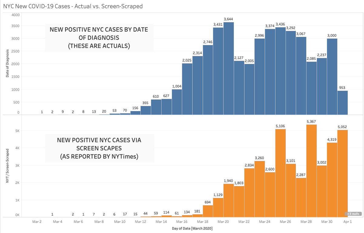
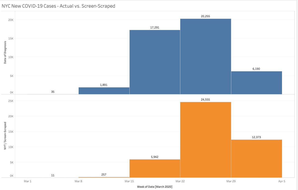
OK. Here& #39;s example #323 on how the data around #COVID19 is SO BAD!
NYC just put out data on cases by the DATE OF DIAGNOSIS.
Why does that matter? Because y& #39;all been freaking out over data that was freaking SCREEN-SCRAPED.
"Reported Date" is LATENT!
NYC just put out data on cases by the DATE OF DIAGNOSIS.
Why does that matter? Because y& #39;all been freaking out over data that was freaking SCREEN-SCRAPED.
"Reported Date" is LATENT!
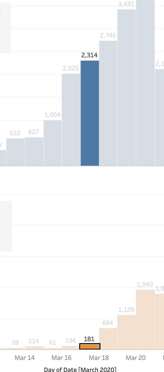
Put another way... While everyone was twiddling their thumbs on March 17th saying nothing to see here in NYC... little did they know that 6000 people in NYC had just been diagnosed with #COVID19 it just hadn& #39;t made it to the webmaster yet for every dashboard to scape it. We suck.
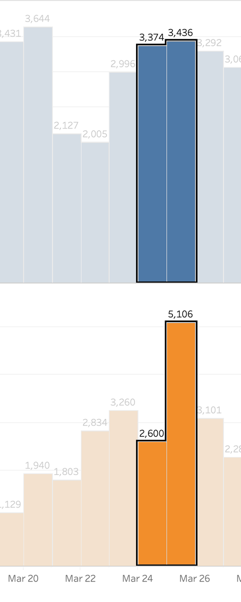
And while EVERYONE was freaking out about the massive jump in new cases between the 24th and 25th... the true number of case jumps was pretty mild and was already LOWER than the REALLY daily high point on March 20th!
So, in terms of the HIGHEST positive case day... that happened over 10 days ago.
Tomorrow morning I& #39;ll show you some crazy crap around deaths...
Think of the resource planning, the tweets, the tears, the grocery store rush... all of it from SCREEN-SCRAPING.
The data is awful.
Tomorrow morning I& #39;ll show you some crazy crap around deaths...
Think of the resource planning, the tweets, the tears, the grocery store rush... all of it from SCREEN-SCRAPING.
The data is awful.
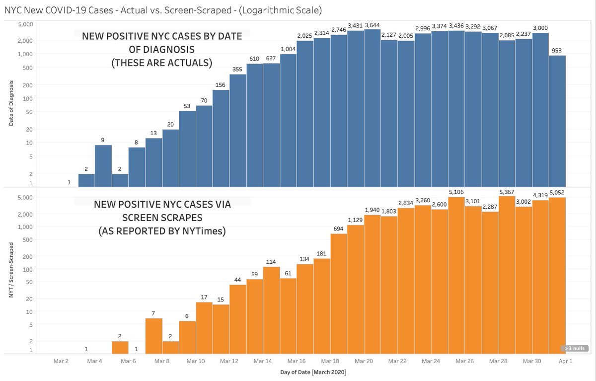
Log. version. Slight differences but those can mean everything in these cases of turning a corner or not.

 Read on Twitter