Time for my COVID graphs!
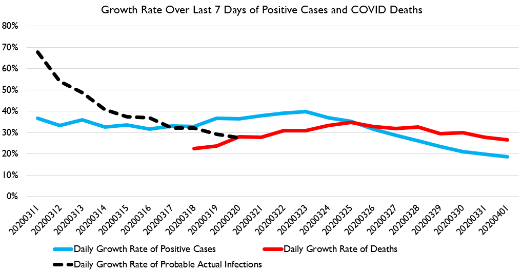
First up, the graph I& #39;m increasingly thinking is the best summary: average daily % growth over the previous week in deaths, confirmed positive cases, AND now my estimate of probable-actual cases, estimated retrospectively from deaths.
First up, the graph I& #39;m increasingly thinking is the best summary: average daily % growth over the previous week in deaths, confirmed positive cases, AND now my estimate of probable-actual cases, estimated retrospectively from deaths.
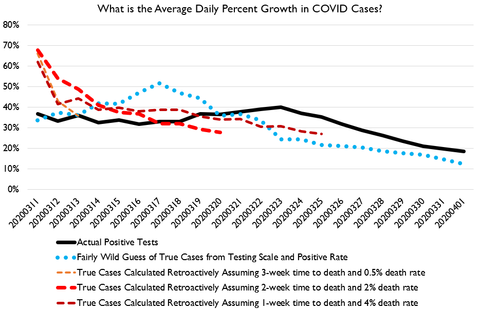
By ANY metric, the US appears to be flattening the curve.
This is true in terms of measured positive cases, COVID deaths, or likely past cases estimated from deaths.
This is true in terms of measured positive cases, COVID deaths, or likely past cases estimated from deaths.
If you buy the estimates of infections derived from deaths, then the spread rate was cut in HALF between the weeks of March 4-11 and March 13-20.
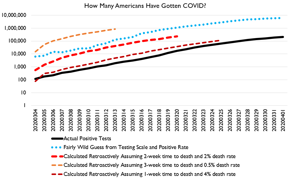
But nonetheless, extrapolating that estimate based on testing patterns since suggests that as of April 1 probably 1.3 million Americans had been infected.
Note that this curve-bending comes *before* most lockdowns were in effect. https://twitter.com/ElonBachman/status/1245524923789062147">https://twitter.com/ElonBachm...
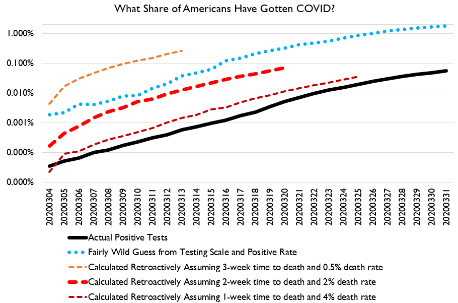
And here& #39;s a variety of ways of looking at different estimates of how many people have been infected at various times.
So that was the good news.
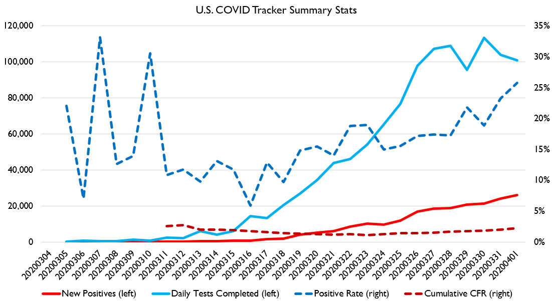
The bad news is.... testing is flatlining, positive share of tests is rising, and case fatality rates are rising.
The bad news is.... testing is flatlining, positive share of tests is rising, and case fatality rates are rising.
So what we& #39;re seeing is that in early and mid-march we did a very good job of having a big social response, flattening the curve, expanding testing, etc. But now things have kinda tailed off. Unclear what implication this& #39;ll have for near future.
Here& #39;s growth in estimated cases using the 2%/2 week method, for all states with at least 20 deaths.
Washington deserves the hype, but Wisconsin and Georgia have also done better than I would have guessed.
And OMG Mississippi.
Washington deserves the hype, but Wisconsin and Georgia have also done better than I would have guessed.
And OMG Mississippi.
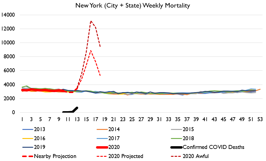
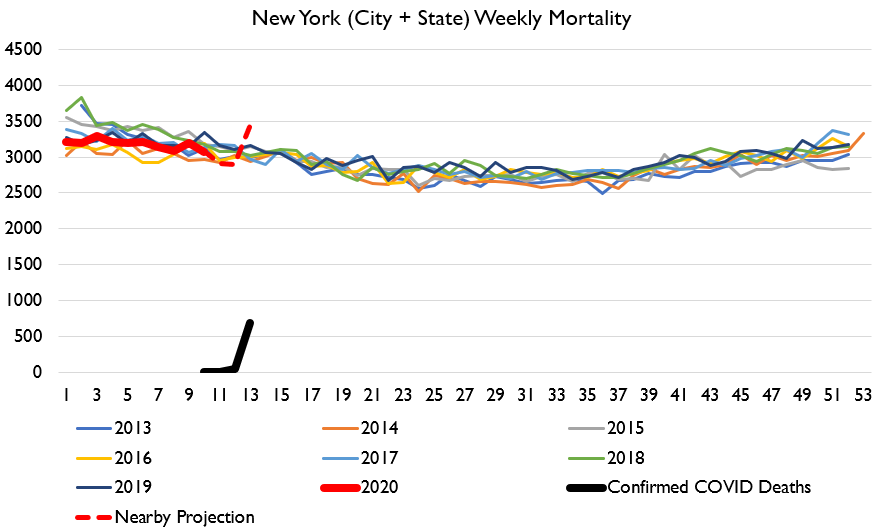
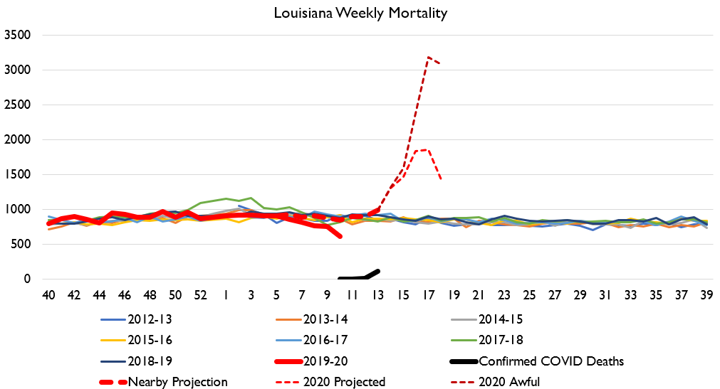
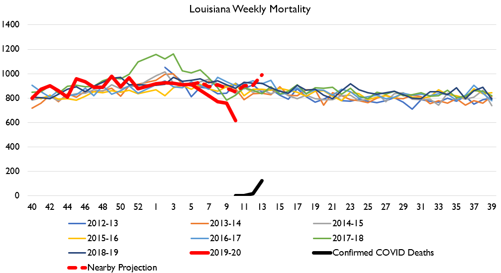
And here& #39;s my New York and Louisiana charts, updated. Getting rough out there folks.

 Read on Twitter