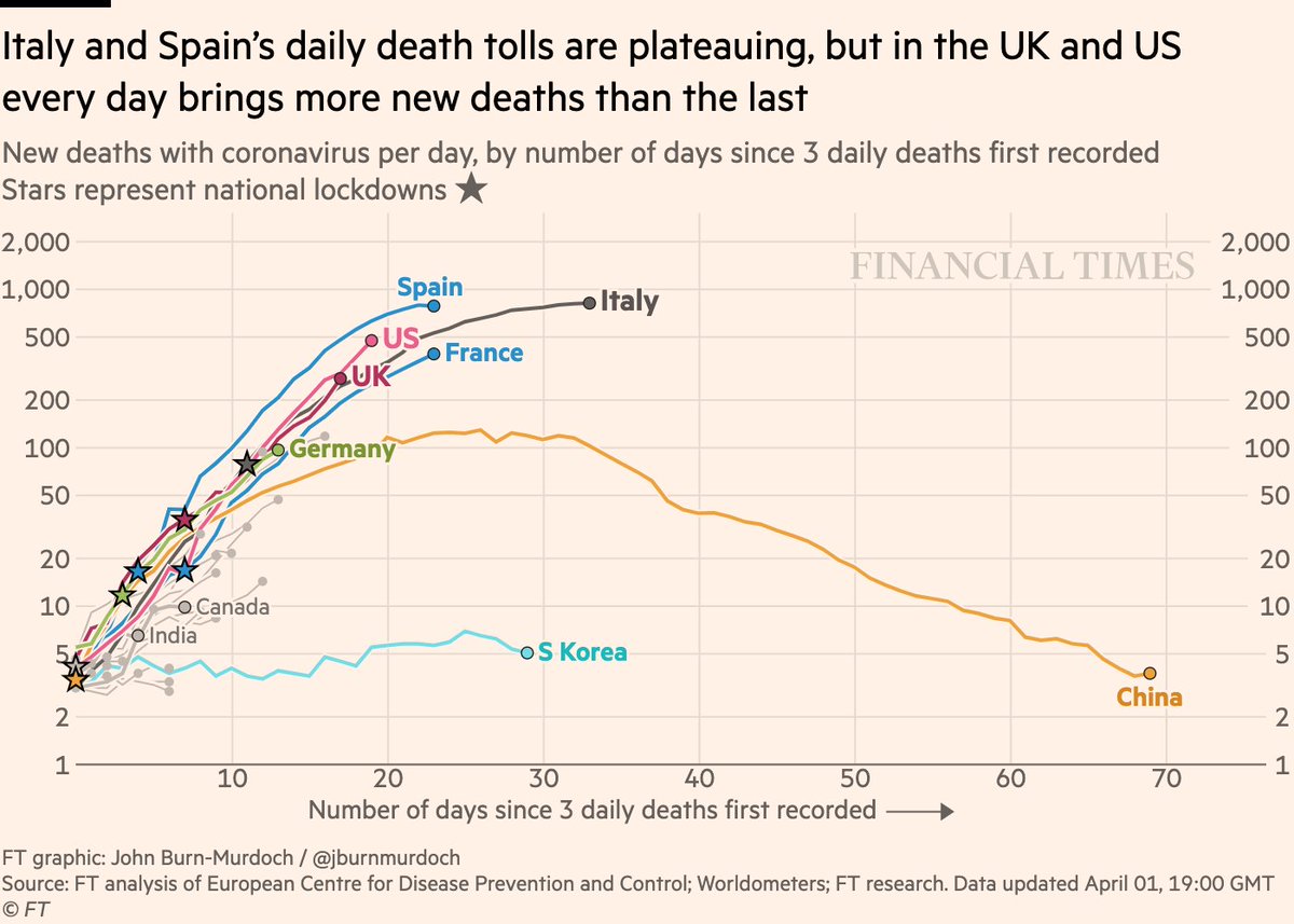
Now onto *daily new deaths*:
• Daily death tolls flattening in Italy & Spain: each new day brings fewer deaths
• But in UK & US the death toll is accelerating. More dead every day than the last, and rate of increase also rising
Live charts: http://ft.com/coronavirus-latest">https://ft.com/coronavir...
• Daily death tolls flattening in Italy & Spain: each new day brings fewer deaths
• But in UK & US the death toll is accelerating. More dead every day than the last, and rate of increase also rising
Live charts: http://ft.com/coronavirus-latest">https://ft.com/coronavir...
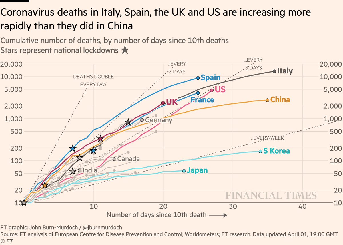
Again let’s look at the same in cumulative form:
• The US now has more deaths than France had a day earlier in its outbreak
• UK death toll is now higher than Italy’s at the same stage
Live charts: http://ft.com/coronavirus-latest">https://ft.com/coronavir...
• The US now has more deaths than France had a day earlier in its outbreak
• UK death toll is now higher than Italy’s at the same stage
Live charts: http://ft.com/coronavirus-latest">https://ft.com/coronavir...
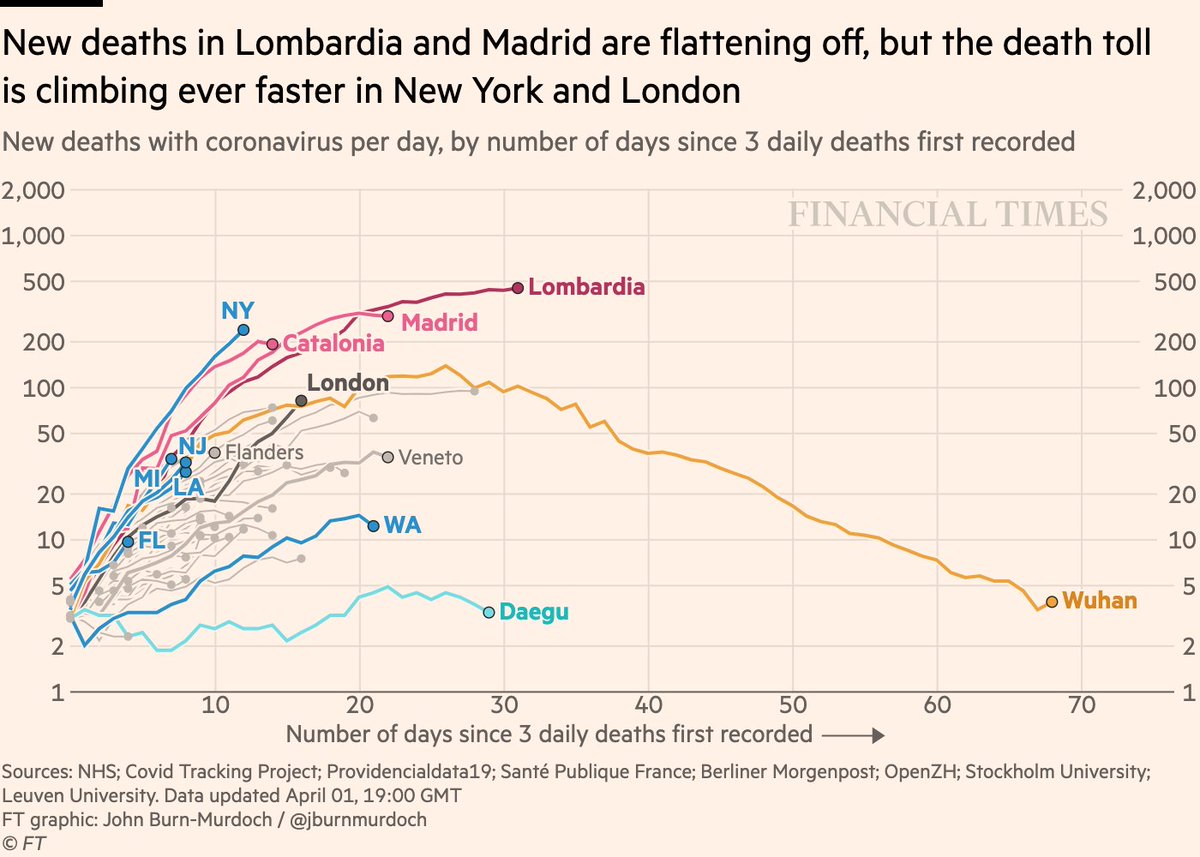
Now onto subnational regions, starting with *daily new deaths*:
• Madrid has turned the corner https://abs.twimg.com/emoji/v2/... draggable="false" alt="👍" title="Thumbs up" aria-label="Emoji: Thumbs up">
• New York is now global epicentre of coronavirus. Every day brings far more deaths than the last
• London’s daily death toll higher than Wuhan’s at same stage of its outbreak https://abs.twimg.com/emoji/v2/... draggable="false" alt="⚠️" title="Warning sign" aria-label="Emoji: Warning sign">
• Madrid has turned the corner
• New York is now global epicentre of coronavirus. Every day brings far more deaths than the last
• London’s daily death toll higher than Wuhan’s at same stage of its outbreak
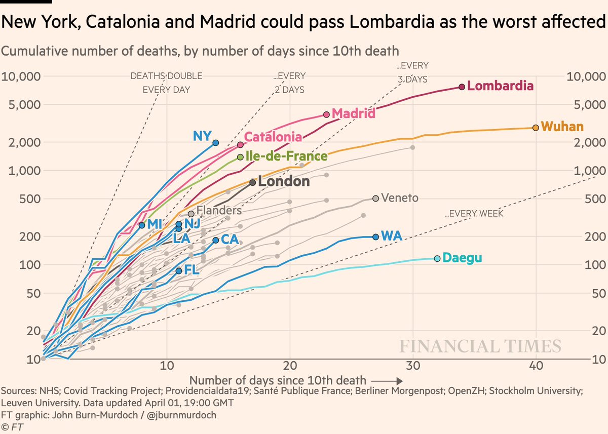
And subnational death tolls cumulatively:
• London is where Wuhan was, but accelerating much faster
• New York entering uncharted territory for deaths
Live charts: http://ft.com/coronavirus-latest">https://ft.com/coronavir...
• London is where Wuhan was, but accelerating much faster
• New York entering uncharted territory for deaths
Live charts: http://ft.com/coronavirus-latest">https://ft.com/coronavir...
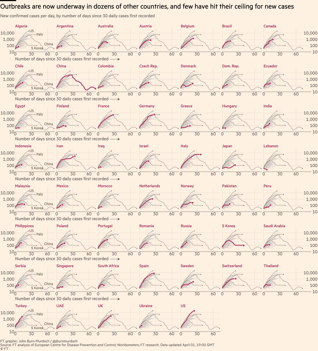
Finally, the "small multiples" showing all countries for which we have data.
Here are *daily new cases* for 54 countries:
• Turkey still looking bad
• Cases in India rise sharply https://abs.twimg.com/emoji/v2/... draggable="false" alt="⚠️" title="Warning sign" aria-label="Emoji: Warning sign">
• Iran & Sweden had plateaued, but rising again
• Japan battling its first real outbreak
Here are *daily new cases* for 54 countries:
• Turkey still looking bad
• Cases in India rise sharply
• Iran & Sweden had plateaued, but rising again
• Japan battling its first real outbreak
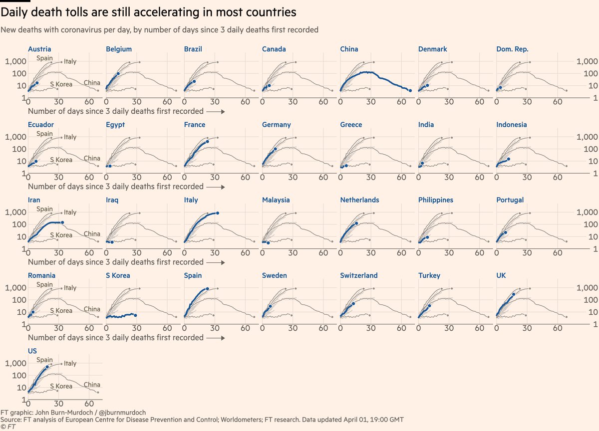
And here are *daily new deaths* for 29 countries:
• Belgium joins UK and US with steeply accelerating daily death rolls
• Sweden has avoided lockdown, and its daily death toll is rising rapidly
• Low German fatality rate masked the fact that its death toll is tracking Italy’s
• Belgium joins UK and US with steeply accelerating daily death rolls
• Sweden has avoided lockdown, and its daily death toll is rising rapidly
• Low German fatality rate masked the fact that its death toll is tracking Italy’s
Here’s a video where I explain why we’re using log scales, showing absolute numbers instead of per capita, and much more: https://twitter.com/janinegibson/status/1244519429825802240">https://twitter.com/janinegib...
And a chart showing why we& #39;re using absolute numbers rather than population-adjusted rates: https://twitter.com/jburnmurdoch/status/1244380095164420101">https://twitter.com/jburnmurd...
Please email john.burn-murdoch@ft.com with feedback, requests and subnational data.
All of these are invaluable, and we continue to incorporate your suggestions and data every day.
I’ll keep getting back to as many people as possible.
Stay safe, well and sane, everyone!
All of these are invaluable, and we continue to incorporate your suggestions and data every day.
I’ll keep getting back to as many people as possible.
Stay safe, well and sane, everyone!
Finally a side-note for the #dataviz nerds:
This was the first day that every chart has been made start to finish in the browser using #d3js, including PNG export. Not one manual tweak in Illustrator etc.
Huge efficiency gain.
I’ll post a video tomorrow showing how this works.
This was the first day that every chart has been made start to finish in the browser using #d3js, including PNG export. Not one manual tweak in Illustrator etc.
Huge efficiency gain.
I’ll post a video tomorrow showing how this works.
And *finally* finally, some comments on common views that I believe need pushback:
• UK gov is using a 50-death cut-off for its comparisons of cumulative death toll. This puts us behind rather than ahead of Italy. It’s not incorrect, but it is a *choice* that flatters the UK
• UK gov is using a 50-death cut-off for its comparisons of cumulative death toll. This puts us behind rather than ahead of Italy. It’s not incorrect, but it is a *choice* that flatters the UK
• It’s equally a choice for me to use the 10-death cut-off, but I made this choice weeks before the UK was an interesting case, so no agenda involved. All I’d say is: a) look at multiple cut-offs, and b) "we’re narrowly behind Italy" is not great as positive spin goes
• For too long people focused on Germany’s low rate of deaths to cases, suggesting its outbreak would be milder because of this low case fatality rate. This was always a mistake, since loads of Germany’s positive tests were in groups known to be much less vulnerable to the virus
• If UK, Spain, Italy etc had also tested tens of thousands of young adults, their CFRs would also be much lower. Comparing CFRs is useful, but only if the denominators are demographically similar
• None of this is to deny that in the long run the scale of Germany’s testing will be hugely beneficial to its fight against covid, but I’m specifically calling out the poorly-thought-through narrative that a low CFR when testing loads of young people means fewer deaths

 Read on Twitter
 • New York is now global epicentre of coronavirus. Every day brings far more deaths than the last• London’s daily death toll higher than Wuhan’s at same stage of its outbreak https://abs.twimg.com/emoji/v2/... draggable="false" alt="⚠️" title="Warning sign" aria-label="Emoji: Warning sign">" title="Now onto subnational regions, starting with *daily new deaths*:• Madrid has turned the corner https://abs.twimg.com/emoji/v2/... draggable="false" alt="👍" title="Thumbs up" aria-label="Emoji: Thumbs up">• New York is now global epicentre of coronavirus. Every day brings far more deaths than the last• London’s daily death toll higher than Wuhan’s at same stage of its outbreak https://abs.twimg.com/emoji/v2/... draggable="false" alt="⚠️" title="Warning sign" aria-label="Emoji: Warning sign">" class="img-responsive" style="max-width:100%;"/>
 • Iran & Sweden had plateaued, but rising again• Japan battling its first real outbreak" title="Finally, the "small multiples" showing all countries for which we have data.Here are *daily new cases* for 54 countries:• Turkey still looking bad• Cases in India rise sharply https://abs.twimg.com/emoji/v2/... draggable="false" alt="⚠️" title="Warning sign" aria-label="Emoji: Warning sign">• Iran & Sweden had plateaued, but rising again• Japan battling its first real outbreak" class="img-responsive" style="max-width:100%;"/>
